Elsayed A. H. Elamir1, 2
1Department of Statistics and Mathematics, Benha University, Egypt
2Egypt & Management & Marketing Department, College of Business, University of Bahrain, Kingdom of Bahrain
Correspondence to: Elsayed A. H. Elamir, Department of Statistics and Mathematics, Benha University, Egypt.
| Email: |  |
Copyright © 2016 Scientific & Academic Publishing. All Rights Reserved.
This work is licensed under the Creative Commons Attribution International License (CC BY).
http://creativecommons.org/licenses/by/4.0/

Abstract
A new graphical technique is proposed as a tool for studying the distributional behaviour of a set of observations since it is more intuitive and easily interpretable. This graph is based on minimum and maximum order statistics of the distribution. It has advantage of being stable at the extreme tails of the distribution unlike quantile quantile plot. Moreover, Minima-Maxima plot captures all information not only about the tails of the distribution but also about the whole distribution of the data and characterizes the distribution of the data completely. Therefore, the idea behind this plot is focusing on valuable information at the extreme tails while few numbers can describe the middle of the distribution. Accurate estimates of the location, scale and shape parameters may be obtained from the graph.
Keywords:
Extreme values, Histogram, Order statistics, Pareto distribution, Q-Q plot
Cite this paper: Elsayed A. H. Elamir, Minima-Maxima Plot, International Journal of Statistics and Applications, Vol. 6 No. 5, 2016, pp. 314-324. doi: 10.5923/j.statistics.20160605.06.
1. Introduction
Graphical presentation of data is a vital tool in sciences. Good graph conveys a great deal of information and can be used to extract new conclusions while bad graph can be misleading and confusing. Given a random sample of univariate data points, a pertinent question is whether this sample comes from some specified distribution F. Decision techniques are based on how close the empirical distribution of the sample and the distribution F are for some sample size n. A histogram is a graphical representation of the distribution of numerical data and was first introduced by Pearson (1895). The most common form of the histogram is obtained by splitting the range of the data into equal-sized bins. Then for each bin, the numbers of points from the data set that fall into each bin are counted. The classes can either be defined arbitrarily by the user or via some systematic rules. A number of theoretically derived rules have been proposed by Scott (1992). The purpose of a histogram is to graphically summarize the distribution of a univariate data set. The histogram graphically shows the location, spread, skewness and presence of multiple modes in the data. Quantile-quantile (Q-Q) plot is commonly used device to graphically and informally test the goodness-of-fit of a sample in an exploratory way. It is used to plot the sample quantiles against the theoretical quantiles or other sample quantiles and then a visual check is made to see whether or not the points are close to a straight line; see, Chambers et al (1983), Cleveland (1994) and Cleveland and McGill (1988).The pattern of points in the plot is used to compare the shapes of distributions, providing a graphical view of how properties such as location, scale and skewness. The use of Q–Q plots to compare two samples of data can be viewed as a non parametric approach to comparing their underlying distributions. A Q–Q plot is generally a more powerful approach to do this than the common technique of comparing histogram of the two samples, but requires more skill to interpret; see, Makkonen (2008), Wilk and Gnanadesikan (1968), Wicklin (2011). The minima-maxima plot (M-M plot) is proposed based on the minimum and maximum of order statistics that can be theoretically computed from a specific distribution and can be estimated from a sample data. The M-M plot depends on giving more weights to the data at the extreme tails than the data at the centre of the distribution; therefore, its philosophy is “most important information for a distribution at the tails”. This plot captures all information not only about the tails of the distribution but also about the whole distribution of the data. The pattern of points in the M-M plot is used to compare the shapes of distributions and providing a graphical view of how properties such as location, scale, skewness and kurtosis. Like Q-Q plot, M-M plot is used to plot the data against theoretical extreme order statistics or sample extreme order statistics and then a visual check is made to see whether or not the points are close to a straight line but the M-M plot has more stability at the tails of the distribution than Q-Q plot. Note that all graphs and programming are done by R-software and the program is given in Appendix A. The minimum and maximum order statistics and their characteristics to probability distributions are presented in Section 2. The M-M plots are proposed in Section 3 for one variable and two variables. An application to blood plasma levels one hour following chocolate consumption data is studied in Section 4. Section 5 is devoted for conclusion.
2. Minimum and Maximum Order Statistics
Let  be a sample from a distribution function F, probability function
  and quantile function
  When the
  are arranged in ascending order of magnitude and then written as
 is the
  order statistic. Since the event
  occurs if and only if at least
  of the
  are less than or equal to
  is expressible in terms of
  as the binomial tail probability
  The expected value of order statistics is
 This can be re-written as
  see; David (1981).Let
  Denote the maximum of the first n random variables. Its distribution function is given by
 As pointed out by Arnold et al. (2008) and Alpay (2016), clearly knowledge of the distribution of
  determines
  completely. This is true since
  Moreover, Chan (1967) has shown that if
  then
then  is uniquely determined by the sequenc
 Let
Let  Denote the minimum of the first n random variables. The distribution function is given by
 Clearly knowledge of the distribution of
  determines F completely. This is true since
  Also, Chan (1967) has shown that if
  then
then  is uniquely determined by the sequence
 For example,
  if and only if
  is unit exponential
 if and only if
  is triangular
  and
and if and only if
  is geometric
 see, for example, Huang (1989).
3. Minima-Maxima Plot
M-M plot is proposed through two functions or curves plotted on the same graph as following.Single variableFor a given data of size  the theoretical minima curve based on the expected value of order statistics is defined as
  From Downtown (1966) and Elamir and Seheult (2003) this can be estimated as
  The theoretical maxima curve based on the expected value of order statistics is defined as
  From Downton (1966) and Elamir and Seheult (2004) this can be estimated as
  The M-M plot consists of two curves, the minima curve is plotted as
 This curve starts from the average
  to the minimum value
  Also the maxima curve is plotted as
 This curve starts from the average
  to the maximum value
  Both curves should tell us the whole picture about the distribution function of random variable
  for a given data. Also each curve in its own should reflect all the information about the whole distribution for the random variable
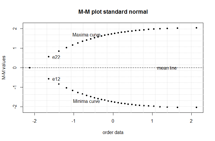
  for a given data.Figure 1 is created for standard normal distribution at n = 30 based on the quantile fuction using plotting position
  on the x-axis and M-M values on y-axis using exact extreme order statistics from package EnvStats in R software as
  | Figure 1. M-M plot for standard normal distribution at n = 30 |
 and
and There are a lot of information can be captured from M-M plot about the whole distribution. Some of these features are1. the joint point between the two curves is the average. Figure 1 shows the average is 0.2. the gini’s measure of the scale of the distribution can always be obtained from the second value in each curve,
  . Figure 1 shows that
  and
and  therefore,
 3. if
3. if  the Gini index of inequality can be estimated as
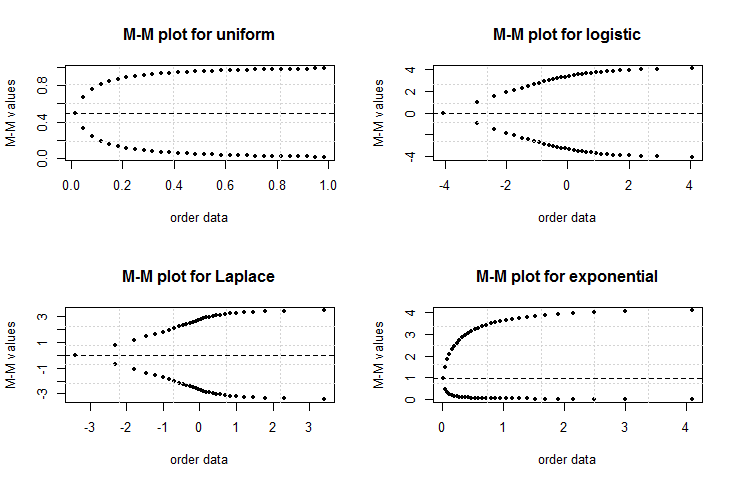
  see, Cowell (2011) and Elamir (2013).4. the skewness can be detected easily. For symmetric distributions the two curves will be at equal distances from the mean line. Figure 1 shows the two curves at the same distances from the mean line. For right skewed distribution the maxima curve will be wider than minima curve from mean line. Also, the minima curve will be wider than maxima curve for the left skewed distribution.5. the starting and ending of the two curves should give a clear picture about peak and tail of the distribution. As the order statistics are available for uniform, logistic, Laplace and exponential distributions, Figure 2 shows the behaviour of M-M plot for these distributions at n = 30. The differences among them are clear and some features are1. the joint point for two curves at averages 0.5, 0,0 and 1.2. the first three distributions are symmetric about average and fourth one is asymmetric to the right.3. the sharpness is clear for the second and third distributions while others are more flat. The long tails are clear for third and fourth distributions while short tail is clear for first distribution.
 | Figure 2. M-M plot for uniform, logistic, Laplace and exponential distributions at n = 30 |
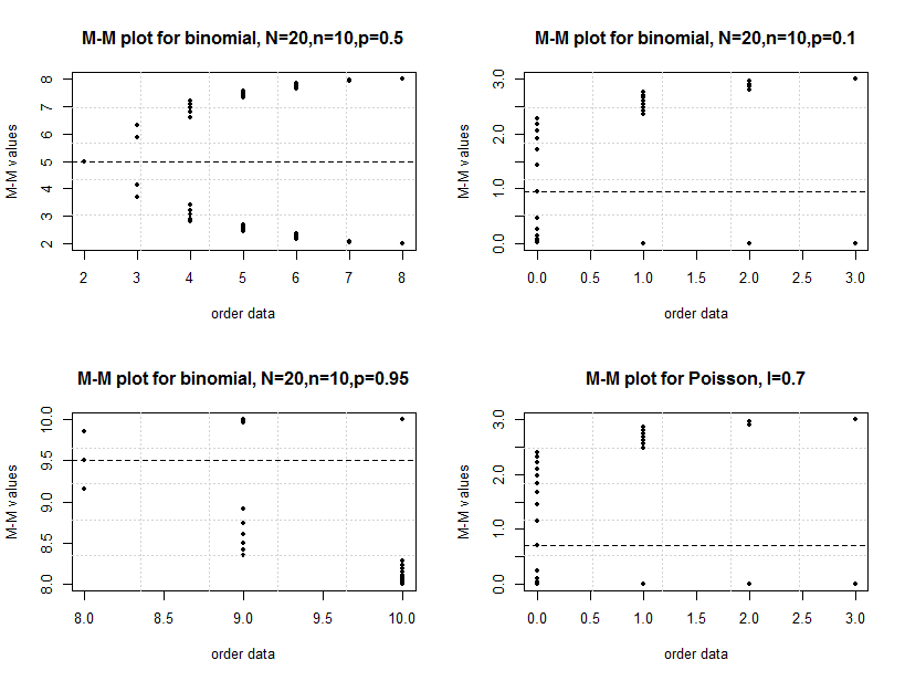
Also the M-M plot can be done for discrete distributions. From Arnold et al. (2008) the extreme order statistics for binomial distribution can be obtained as  and
and From Arnold et al. (2008) the extreme order statistics for Poisson distribution are
 and
and Figure 3 shows the M-M plot for binomial and Poisson distributions for selected parameters. Some features may be concluded as1. the discreetness of the distributions is obvious.2. the joint points or averages are 5, 1, 9.5 and 0.7, respectively.3. the right skeweness is clear for second and fourth distributions while left skewness for third distribution and symmetric for the first distribution are obvious.
 | Figure 3. M-M plot for binomial and Poisson distributions for selected parameter. Note that  for Poisson for Poisson |
The Pareto distribution is a heavy tailed distribution which is used a lot in economics, has a probability density function that can be written as  Where
Where  is the shape parameter which measures the heaviness of the right tail and
  is a scale parameter; see, Arnold (1983) and Michael (2010). The corresponding cumulative distribution function is
  The expected value is
  Also from Malik (1966) the order statistics are defined as
 For extreme order statistic,
 and
and Figure 4 shows the M-M plot for Pareto distribution with parameters (10,8), (10,5), (10,2) and (10,1.25). Note the changes for the curves with changes of
  n terms of skewness and tails especially at the beginning and ending of curves.
 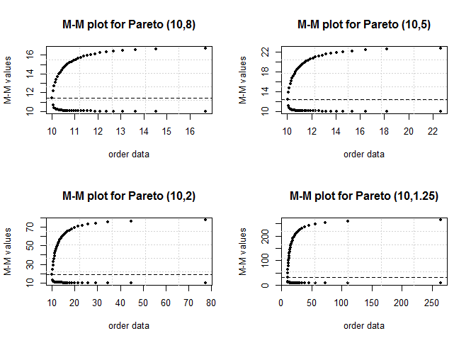 | Figure 4. M-M plot for Pareto distribution with different values for shape parameter  and n = 30 and n = 30 |
Two variables and M-M line plotIn the sense of Q-Q plot, M-M plot can be used to compare any data with some specified distribution or with any other data. M-M line plot considers the sample as a whole and plots the sample minima and maxima against the theoretical minima and maxima of the specified target distribution F. If a correct target distribution is given, the M-M plot hugs a straight line. Therefore, it can assess if a set of data plausibly came from some theoretical distribution by constructing M-M line plot. If there is another distribution for a random variable Y, therefore, the theoretical versus theoretical is and theoretical versus estimated is
  If this closes to straight line, the data follows the theoretical distribution. Like Q-Q plot, M-M line plot can be plotted without knowing the location and scale parameters where
  can be computed from standard distributions. Moreover, M-M line plot can be used to check if two data have the same distribution using
  The points plotted in a M–M line plot are non-decreasing when viewed from left to right. If the two distributions being compared are identical, the M–M line plot follows the 45° line. If the differences between points e22 and e12 in M–M line plot is more for horizontal variable than vertical variable, the distribution plotted on the horizontal axis is more dispersed than the distribution plotted on the vertical axis and vice versa. If the difference between e22- mean and mean – e12 is nearly zero the variable is symmetric, negative (left skewed) and (positive) right skewed. When M–M line plot is often S shaped this is indicating that one of the distributions has more than one mode and when it is often J shaped this is indicating that one of the distributions has much heavier tails than the other. This can be shown in the following cases.Case 1: theoretical versus estimatedFigure 5 shows M-M line and Q-Q plots for theoretical and simulated data from Pareto and normal distributions. It is clear that the M-M line plot is more stable than Q-Q plot for heavy tail distributions. For the normal distribution most of the data for M-M plot are concentrated at the extreme tails while few data at the middle. On the other hand most of the data for Q-Q plot are concentrated on the middle and few of them at the extreme tails.
 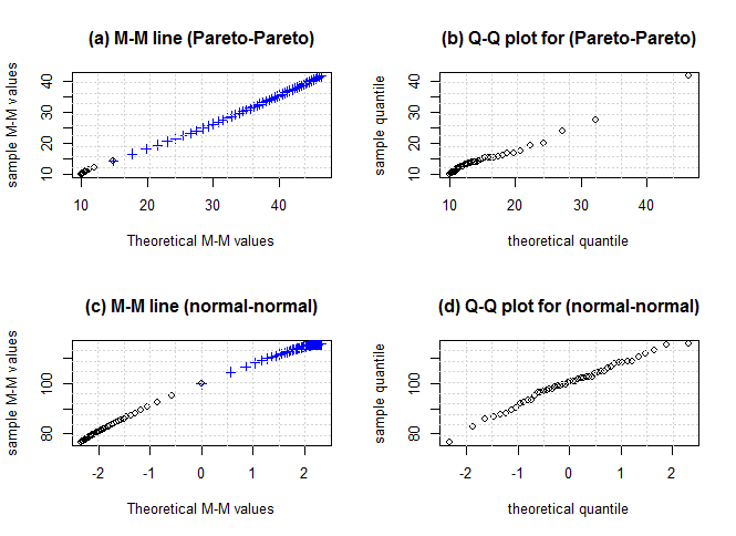 | Figure 5. M-M and Q-Q plots for theoretical Pareto (10,3) versus simulated Pareto (10,3) in (a) and (b), and theoretical normal (0,1) versus simulated normal (100,8) in (c) and (d) and n = 50 |
Case 2: estimated versus estimatedFigure 6 shows two shapes for M-M line when one distribution has more than one mode like Beta distribution (0.5, 0.5), the shape is near from ‘S’ and when one distribution is very heavy, it shows ‘J’ shape.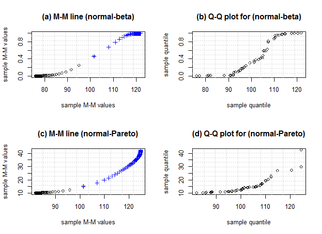 | Figure 6. M-M and Q-Q plots for simulated normal (100,10) versus simulated Beta (0.5,0.5) in (a) and (b), and simulated normal (100,10) versus simulated Pareto (10,2.5) in (c) and (d) and n = 50 |
Figure 7 shows the M-M line and Q-Q plots for simulated data from lognormal distribution (5, 0.5) and it is clear the difference between two curves at the extreme tails; see, Elamir (2016).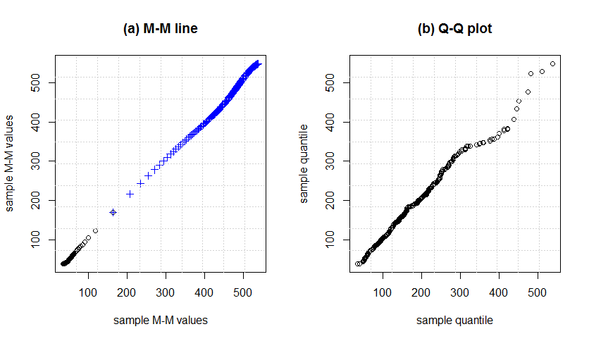 | Figure 7. M-M and Q-Q plot for simulated data from lognormal distribution (5,0.5) and n = 500 |
Also the Min and Max normal plots will complete the picture of QQ-norm plot especially at the extreme tails of the distribution. The Min-norm plot is proposed by plotting the exact minimum order statistics of size  from standard normal distribution that can be obtained from package EnvStats in R software versus estimated minimum order statistics from a data as
  The pattern of points in the Min-normal and Max-normal plots must show straight line or close to straight line; see for more details, Elamir (2016).Standard M-M plotAway from M-M line, M-M plot still has a great value in comparisons between data where it is possible to do more than one M-M plot on the graph paper to compare between actual data and theoretical data but one has to take care of location and scale. In this aspect, standard M-M plot can be proposed as exactly M-M plot except is done for standardised values
  where
where  and
and  are the sample mean and standard deviation, respectively. Standard M-M plot is focusing on the shape of the data after excluding the location and scale parameters.Figure 8 shows M-M and standard M-M plot theoretical data from uniform and normal distributions versus simulated data from same distributions.
 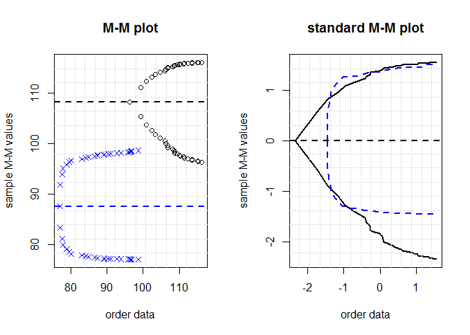 | Figure 8. M-M and standard M-M plots for simulated data from uniform (75,100), normal (110,5) distributions and n = 25 |
4. Application
M-M, standard M-M and MM-line plots can be used to compare among several variables. For example, in the analysis of variance the data are assumed to be normally distributed and have equal variances. An article in Nature describes an experiment to investigate the effect of consuming chocolate on cardiovascular health (“Plasma Antioxidants from Chocolate,” Nature, Vol. 424, 2003). The experiment consisted of using three different types of chocolates: 100g of dark chocolate, 100g of dark chocolate with 200mL of full-fat milk, and 200g of milk chocolate. Twelve subjects were used, 7 women and 5 men, with an average age range of  years, an average weight of
  kg, and body-mass index of
  kg m-2. On different days a subject consumed one of the chocolate-factor levels and one hour later the total antioxidant capacity of their blood plasma was measured in an assay; see, Montgomery (2013). Data is summarized in Table 1.
Table 1. Blood plasma levels one hour following chocolate consumption*
 |
| |
|
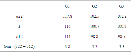
Figure 9 presents M-M plots for the data from this experiment. The result is an indication that the blood antioxidant capacity one hour after eating the dark chocolate is higher than for the other two treatments. The variability in the sample data from all three treatments seems very similar. Also the shape for three treatments looks similar to normal distribution. Moreover, Table 2 gives some measures can be estimated from the graph.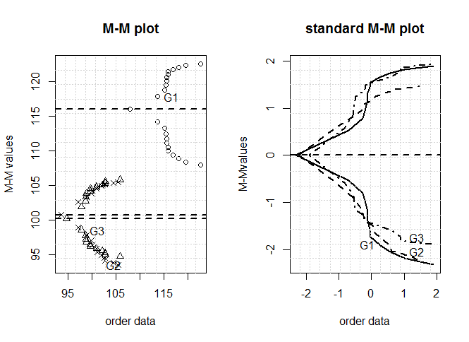 | Figure 9. M-M and standard M-M plots for blood plasma levels one hour following chocolate consumption data |
Table 2. Estimated measures from figure 9 for blood plasma levels data
 |
| |
|
Figure 10 shows M-M line plot using theoretical standard normal distribution versus the three treatments for blood plasma levels one hour following chocolate consumption data with linear regression line added to each line based on Sample MM values = a+b Theoretical MM valuesThe same conclusion can be made from this plot as M-M plot. 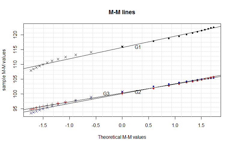 | Figure 10. M-M line plot based on theoretical standard normal distribution versus the three treatments for blood plasma levels one hour following chocolate consumption data |
5. Conclusions
Minima-maxima plot depends on extreme order statistics and it is introduced to capture all information not only about the tails of the distribution but also about the whole distribution of the data. The pattern of points in the M-M plot is used to compare the shapes of distributions and providing a graphical view of how properties such as location, scale and skewness. Also, it used to plot the sample data against the theoretical extreme order statistics or sample extreme order statistics and then a visual check is made to see whether or not the points are close to a straight line. The main advantage of M-M plot over Q-Q plot is its stability at the extreme ends of the distribution. Actually, the main idea behind M-M line plot is that the average is a good representative for data at the middle but the extreme tails must be given most attention or weights.One limitation of M-M plot is when the extreme order statistics are not defined such as the Cauchy distribution where few extreme order statistics are not defined. But the M-M plot may still be plotted by using the available information and ignoring undefined values. Of course, in this case some information will be lost.
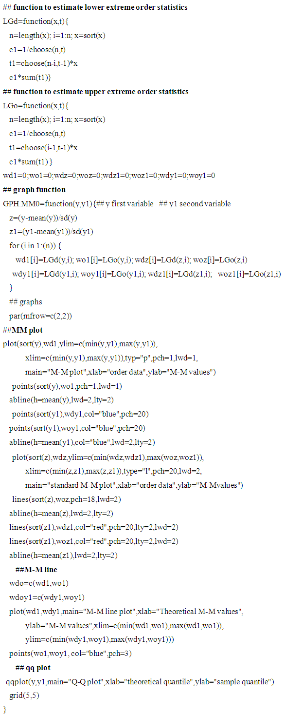
Appendix A: R program for M-M plots and Q-Q plot
References
| [1] | Alpay, O. (2016) On the local dependence function of extreme order statistics. Ege University of Faculty of Sciences, 40, 10-16. |
| [2] | Arnold, B.C., Balakrishnan, N. and Nagataja, H.N. (2008) A first course in order statistics. 2nd Ed., Society for Industrial and Applied Mathematics, SIAM. |
| [3] | Arnold, B.C. (1983) Pareto Distributions. International Co-operative Publishing House. |
| [4] | Chambers, J., Cleveland, W., Kleiner, B. and Tukey, P. (1983) Graphical methods for data Analysis. 1st Ed., Wadsworth. |
| [5] | Chan, L.K. (1967) On a characterization of distributions by expected values of extreme order statistics. Am. Math. Monthly, 74, 950-951. |
| [6] | Cleveland, W.S. (1994) The Elements of Graphing Data. 1st Ed., Hobart Press. |
| [7] | Cleveland, W. and McGill, M. (1988) Dynamic Graphics for Statistics. Wadsworth. |
| [8] | Cowell, F. (2011) Measuring inequality. 1st Ed., OUP UK. |
| [9] | David, H. A. (1981) Order Statistics. 2nd ed., Wiley, New York. |
| [10] | Downton, F. (1966) Linear estimates with polynomial coefficients. Biometrika, 53,129-141. |
| [11] | Elamir, E.A.H. and Seheult, A. (2003) Trimmed L-moments. Computational Statistics and Data Analysis. 43, 299-314. |
| [12] | Elamir, E.A.H. and Seheult, A. (2004) Exact variances of sample L-moments. Journal of Statistical Planning and Inference, 124, 337-359. |
| [13] | Elamir, E A. H. (2013) On estimation of some abbreviated social welfare measure. Quality & Quantity: International Journal of Methodology, 63, 245-268. |
| [14] | Elamir, E.A.H. (2016) Extreme order statistics plot versus quantile quantile plot: Nonparametric visualization for a data. International Journal of Applied Mathematics & Statistical Sciences, 5, 47-62. |
| [15] | Haung, J.S. (1989) Moment problem of order statistics. A review. International Statistical Review, 57, 59-66 (1989) |
| [16] | Makkonen, L. (2008) Bringing closure to the plotting position controversy. Communications in Statistics - Theory and Methods, 37, 460–467. |
| [17] | Malik H. J. (1966) Exact Moments of Order Statistics from Pareto Distribution. Skand. Aktuarie Tidskr, 49, 144-157. |
| [18] | Michael, H. (2010) Pareto's Law. Mathematical Intelligencer. 32, 38–43. |
| [19] | Montgomery, D.C. (2013) Design and Analysis of Experiments. 8th Ed., John Wiley & Sons. |
| [20] | Scott, D. (1992) Multivariate Density Estimation: Theory, Practice and Visualization. John Wiley and Sons. |
| [21] | Pearson, K. (1895) Contributions to the mathematical theory of evolution. II. skew variation in homogeneous material. Philosophical Transactions of the Royal Society A: Mathematical, Physical and Engineering Sciences, 186, 343–414. |
| [22] | Wicklin, R. (2011) Modeling the distribution of data? Create a Q-Q plot. The Do Loop. OCT. 28. |
| [23] | Wilk, M.B.; Gnanadesikan, R. (1968) Probability plotting methods for the analysis of data. Biometrika, 55, 1–17. |


 be a sample from a distribution function F, probability function
  and quantile function
  When the
  are arranged in ascending order of magnitude and then written as
 is the
  order statistic. Since the event
  occurs if and only if at least
  of the
  are less than or equal to
  is expressible in terms of
  as the binomial tail probability
  The expected value of order statistics is
 This can be re-written as
  see; David (1981).Let
  Denote the maximum of the first n random variables. Its distribution function is given by
 As pointed out by Arnold et al. (2008) and Alpay (2016), clearly knowledge of the distribution of
  determines
  completely. This is true since
  Moreover, Chan (1967) has shown that if
  then
then  is uniquely determined by the sequenc
 Let
Let  Denote the minimum of the first n random variables. The distribution function is given by
 Clearly knowledge of the distribution of
  determines F completely. This is true since
  Also, Chan (1967) has shown that if
  then
then  is uniquely determined by the sequence
 For example,
  if and only if
  is unit exponential
 if and only if
  is triangular
  and
and if and only if
  is geometric
 see, for example, Huang (1989).
  the theoretical minima curve based on the expected value of order statistics is defined as
  From Downtown (1966) and Elamir and Seheult (2003) this can be estimated as
  The theoretical maxima curve based on the expected value of order statistics is defined as
  From Downton (1966) and Elamir and Seheult (2004) this can be estimated as
  The M-M plot consists of two curves, the minima curve is plotted as
 This curve starts from the average
  to the minimum value
  Also the maxima curve is plotted as
 This curve starts from the average
  to the maximum value
  Both curves should tell us the whole picture about the distribution function of random variable
  for a given data. Also each curve in its own should reflect all the information about the whole distribution for the random variable
  for a given data.Figure 1 is created for standard normal distribution at n = 30 based on the quantile fuction using plotting position
  on the x-axis and M-M values on y-axis using exact extreme order statistics from package EnvStats in R software as
 and
and There are a lot of information can be captured from M-M plot about the whole distribution. Some of these features are1. the joint point between the two curves is the average. Figure 1 shows the average is 0.2. the gini’s measure of the scale of the distribution can always be obtained from the second value in each curve,
  . Figure 1 shows that
  and
and  therefore,
 3. if
3. if  the Gini index of inequality can be estimated as
  see, Cowell (2011) and Elamir (2013).4. the skewness can be detected easily. For symmetric distributions the two curves will be at equal distances from the mean line. Figure 1 shows the two curves at the same distances from the mean line. For right skewed distribution the maxima curve will be wider than minima curve from mean line. Also, the minima curve will be wider than maxima curve for the left skewed distribution.5. the starting and ending of the two curves should give a clear picture about peak and tail of the distribution. As the order statistics are available for uniform, logistic, Laplace and exponential distributions, Figure 2 shows the behaviour of M-M plot for these distributions at n = 30. The differences among them are clear and some features are1. the joint point for two curves at averages 0.5, 0,0 and 1.2. the first three distributions are symmetric about average and fourth one is asymmetric to the right.3. the sharpness is clear for the second and third distributions while others are more flat. The long tails are clear for third and fourth distributions while short tail is clear for first distribution.
 and
and From Arnold et al. (2008) the extreme order statistics for Poisson distribution are
 and
and Figure 3 shows the M-M plot for binomial and Poisson distributions for selected parameters. Some features may be concluded as1. the discreetness of the distributions is obvious.2. the joint points or averages are 5, 1, 9.5 and 0.7, respectively.3. the right skeweness is clear for second and fourth distributions while left skewness for third distribution and symmetric for the first distribution are obvious.
 for Poisson
 Where
Where  is the shape parameter which measures the heaviness of the right tail and
  is a scale parameter; see, Arnold (1983) and Michael (2010). The corresponding cumulative distribution function is
  The expected value is
  Also from Malik (1966) the order statistics are defined as
 For extreme order statistic,
 and
and Figure 4 shows the M-M plot for Pareto distribution with parameters (10,8), (10,5), (10,2) and (10,1.25). Note the changes for the curves with changes of
  n terms of skewness and tails especially at the beginning and ending of curves.
 and n = 30
 and theoretical versus estimated is
  If this closes to straight line, the data follows the theoretical distribution. Like Q-Q plot, M-M line plot can be plotted without knowing the location and scale parameters where
  can be computed from standard distributions. Moreover, M-M line plot can be used to check if two data have the same distribution using
  The points plotted in a M–M line plot are non-decreasing when viewed from left to right. If the two distributions being compared are identical, the M–M line plot follows the 45° line. If the differences between points e22 and e12 in M–M line plot is more for horizontal variable than vertical variable, the distribution plotted on the horizontal axis is more dispersed than the distribution plotted on the vertical axis and vice versa. If the difference between e22- mean and mean – e12 is nearly zero the variable is symmetric, negative (left skewed) and (positive) right skewed. When M–M line plot is often S shaped this is indicating that one of the distributions has more than one mode and when it is often J shaped this is indicating that one of the distributions has much heavier tails than the other. This can be shown in the following cases.Case 1: theoretical versus estimatedFigure 5 shows M-M line and Q-Q plots for theoretical and simulated data from Pareto and normal distributions. It is clear that the M-M line plot is more stable than Q-Q plot for heavy tail distributions. For the normal distribution most of the data for M-M plot are concentrated at the extreme tails while few data at the middle. On the other hand most of the data for Q-Q plot are concentrated on the middle and few of them at the extreme tails.


 from standard normal distribution that can be obtained from package EnvStats in R software versus estimated minimum order statistics from a data as
  The pattern of points in the Min-normal and Max-normal plots must show straight line or close to straight line; see for more details, Elamir (2016).Standard M-M plotAway from M-M line, M-M plot still has a great value in comparisons between data where it is possible to do more than one M-M plot on the graph paper to compare between actual data and theoretical data but one has to take care of location and scale. In this aspect, standard M-M plot can be proposed as exactly M-M plot except is done for standardised values
  where
where  and
and  are the sample mean and standard deviation, respectively. Standard M-M plot is focusing on the shape of the data after excluding the location and scale parameters.Figure 8 shows M-M and standard M-M plot theoretical data from uniform and normal distributions versus simulated data from same distributions.
 years, an average weight of
  kg, and body-mass index of
  kg m-2. On different days a subject consumed one of the chocolate-factor levels and one hour later the total antioxidant capacity of their blood plasma was measured in an assay; see, Montgomery (2013). Data is summarized in Table 1.


 Abstract
 Reference
 Full-Text PDF
 Full-text HTML
