-
Paper Information
- Next Paper
- Previous Paper
- Paper Submission
-
Journal Information
- About This Journal
- Editorial Board
- Current Issue
- Archive
- Author Guidelines
- Contact Us
International Journal of Sports Science
p-ISSN: 2169-8759 e-ISSN: 2169-8791
2013; 3(3): 74-80
doi:10.5923/j.sports.20130303.03
National Performance Versus Population at the Olympic Games: A Methodology for Determining Elite Performers
 Abstract
 Reference
 Full-Text PDF
 Full-text HTML
Graeme D. Putt
Honorary Academic, Department of Physics, The University of Auckland, Private Bag 92019, Auckland 1142, New Zealand
Correspondence to: Graeme D. Putt, Honorary Academic, Department of Physics, The University of Auckland, Private Bag 92019, Auckland 1142, New Zealand.
| Email: |  |
Copyright © 2012 Scientific & Academic Publishing. All Rights Reserved.
The Summer Olympic Games always arouse great international interest and subsequent comment from national media, sports analysts and administrators on how its nation performed, often in relation to its population size. These determinations are usually based on gold medal tally and previous Olympic results rather than a sober quantitative analysis of overall medal tally. This happens because the official IOC medal table published is hierarchical, based primarily on gold medal winning tally. Inevitably, this table highlights achievement of the ‘superpower’ countries but obscures extraordinary achievement by smaller countries. While the IOC table ranking can be indicative of relative comparative achievement between two countries of similar population size, it is nevertheless useless for indicating the relative quality of performance for those countries that differ in population size by factors of a thousand like The Bahamas and the USA. This study develops a quantitative metric that enables rational comparisons to be made between the performances of countries despite their population size. It does so using respective national populations and appropriately weighted medal tallies to develop an empirical power law refinement technique that determines the criterion for elite performance appropriate to a nation’s population.
Keywords: Olympics, NOC, IOC Medal Table, Populations, Weighted Medal Points Tally, per capita WMT, Power Law Refinement methodology, Top 10 performing Nations
Cite this paper: Graeme D. Putt, National Performance Versus Population at the Olympic Games: A Methodology for Determining Elite Performers, International Journal of Sports Science, Vol. 3 No. 3, 2013, pp. 74-80. doi: 10.5923/j.sports.20130303.03.
Article Outline
1. Introduction
- The charter of the International Olympic Committee (IOC) specifically states that:“The Olympic Games are competitions between athletes in individual or team events and not between countries.”Countries nevertheless compete as national members of the worldwide Olympic movement known as National Olympic Committees (NOCs) that represent sovereign countries and other territories to avoid political disputes that might otherwise arise. Furthermore, the IOC publishes a medal table for nations ‘for information purposes’. The convention it uses is hierarchical, ordering nations on the number of gold medals won, then silver medals won when the number of gold medals won is the same, then bronze medals after that. If two countries are equal in both medal type and number won, they are ordered in the table alphabetically by their IOC country code. People interested in quantifying national performance at the Olympics range from national sports administrators and funding agencies, to academics, journalists and the general public. The academic investigations have in the main soughtto determine the economic and political factors that determine success at the Olympic Games, namely: Ball et al[1], Levine[2], Grimes et al[3], Johnson & Ali[4], Bernard &Busse[5] and Forrest et al[6]. The latter, Forrest et al, builds on the framework of Bernard &Busse, the most comprehensive and influential of these studies. Bernard &Busse primarily addressed the naked question “How many medals qualify as a successful performance by a national team?” It folded the following factors into its formulation:•population•per capita gross domestic product (GDP)•host effect (whether a country is a host country or not)•sportseconomy type (e.g. planned, Soviet-bloc management style)•history of Summer Olympic performance to arrive at a predictive formula based on the past 30 years results up to and including the 1996 Atlanta Games. This model did quite well by most statistical metrics based on its predictions for the actual outcomes of medal tally successes by participating countries at the 2000 Sydney Olympics. However, as Amateur[7], an informed Canadian blogger noted shortly thereafter, its prediction for success was no better than he could have done himself by using the results of the 1996 Olympics. This led him to conjecture that past history alone was as good as any sophisticated grab bag of other determinants (as for example those used by Bernard and Busse) in predicting medal tallies for the next Olympic Games.While this in itself doesn’t necessarily detract from the achievement of the Bernard and Busse model, it does invite some critical reflection.While interesting and scholarly, Bernard and Busse’s model does have some drawbacks. First it does not discriminate between the quality of the medals won i.e. a country that won three gold medals was equivalent in its medal tally achievement as one than won three bronze medals. While this is a questionable assertion for some critics, it could easily be resolved by using a weighted points tally system similar to that adopted here. If so one anticipates only marginal, if indeed any alterations to the existing mainstream predictions. However, there is a more disturbing drawback than this that lies in its core premise. This is to take “countries as being arbitrary divisions of the world population” such that the medal share is directly proportional to population size before modifications due to GDP, targeted political and economic goals, an enhancement effect to the host country and past history of Olympic performance is folded into their final formulation. This has the corollary that if all countries had the same per capita GDP, the same politico-economic commitment to successand the host enhancement effect of the event (estimated to be as high as 20% in medal count increase for Beijing 2008[8] and subsequently 2% of total medal share – about 19 medals - for London 2012[9]) abstracted, then one should expect (within appropriate econometric error statistics) a common per capita success rate! This does not tally at all with common sense. Do we really believe that athletic ability is distributed randomly across countries whose inhabitants differ widely in physical, genetic and cultural makeup as well as live in significantly different geographical environments? It is inconsistent with the results obtained here and is dramatically different to what Bernard and Busse model their way to in their final formulation’s predictions. Ultimately it suggests that their work will be compromised if an incomplete rather than complete bag of the determinants is used in their modelling. An unfortunate outcome is that it invites naïve, flawed interpretations of national Olympic performance, particularly in the more successful smaller countries, that a superior per capita medal tally amounts to a superior level of achievement over that of current sporting superpowers like USA and China that currently head the IOC Medal Tables.For many years the two major superpowers of the world – the USA and the USSR dominated the medal hauls with Germany (albeit divided into East and West zones) usually leading the European chase. More recently, China has replaced the dissolved USSR as the primary rival to the USA, surpassing them on the IOC table at the Beijing Games. Russia and Germany remain highly visible around the top of the IOC medal tallyand Great Britain has assumed increasing prominence in recent years with a dominant performance for a country of its population size at the XXXth Olympiad, recently hosted in London. However, other countries that regularly punch above their weight like Australia, Cuba, Hungary and New Zealand are left to wonder how they might compare against these heavyweights if some reliable metric could be found that took reasonable account of population size. Hence the purpose of this article is to search for a suitable metric to quantify the quality of a nation’s performance otherwise guessed at from the official IOP table. Such a metric should be simple if it is to be widely understood and accepted. Accordingly, this study bases its development on two measures only – absolute quantifiable achievement in terms of the type and number of medals won by a country’s entire Olympic team and its population at the time. The question of why a particular country achieves or fails to achieve in winning medals is not addressed. The study is analytical, not predictive. Identifying those countries whose comparative achievement at a particular Olympiad is outstanding, based on their relative population size, and using that to benchmark elite national performance, is the sole motivation of this investigation.
2. Method and Materials
- The crudest form of quantification for national Olympic performance is total number of medals won, irrespective of type. This gives equal weighting to the medals – 1 point be it gold, silver or bronze. We label it the 1:1:1 system. Adopted for the 2008 Beijing Olympiad it would have had the unacceptable effect of placing USA with its 110 medals (36 gold, 38 silver and 38 bronze) ahead of host country China that excelled with 51 gold, 28 silver and 21 bronze but only 100 medals. While the choice of any weighted system to overcome this deficiency is inevitably arbitrary, we ultimately seek a system that promotes the pre-eminence of the gold medal winning performance. In doing so we require the system to ensure that the silver and bronze medals awarded in any outcome for an event do not outpoint the gold medal winning performance. Furthermore, it should also ensure that in the case where two bronze medals are awarded (as is done regularly in the combative individual sports like boxing where two bronze medals are automatically awarded to the losing semi-finalists) that the placegetters’ (the runner up and the two losing semi-finalists) tally does not outpoint the gold medal winning performance. A simple attempt to recognise the different relative worth of the medals is the3:2:1 ratio for gold, silver and bronze – the so called ‘Fibonacci system’ insomuch as a gold is seen as equal to silver plus a bronze medal. Another linear system, first used by a London newspaper in 1908, is the 5:3:1 system. This enhances the difference in relative worth over the 3:2:1 with a gold now equal to a silver plus two bronzes. It is superior to the 3:2:1 system insomuch as, in the case where two bronze medals are awarded in an event (for whatever reason), the three placegetters’ tally does not outpoint the gold medal winning performance. However, both have the drawback that two silver medal recipients following a dead-heat for second (with no third, bronze medal recipient) elevates the minor placings to precedence over the gold medal victory. But another system with a 4:2:1 weighting[10], the so called exponential sequence, removes this flaw. Here a gold equates to two silver medals, while a silver equates to two bronze medals. This is the system chosen to quantify achievement in this study. Before embarking on a formulation of elite performance between the weighted medal points tally (WMT) of a nation and its population, we pause to put a popular furphy to rest. A simplistic, but demonstrably false method of comparing relative national performance, is to do so on a per capita basis irrespective of any type of points tallying system. It is a metric used in the social sciences when handling statistics like national youth suicide rates, child abuse, etcetera, but is utterly flawed when measuring excellence of any kind. A simple hypothetical example for ridiculing this metric on practical grounds for the Olympics is the following. Assume China (population 1325.5 million in 2008) won all the medals available at Beijing except the single silver medal that Iceland (population 0.32 million) won. China’s per capita WMT index would be 1.63 (= 2165 ÷ 1325.5) points per million people (ppm) compared with Iceland’s 6.25 (= 2 ÷ 0.32) ppm on the basis of the 4:2:1 weighting system. It is absurd to assert that Iceland’s exceptional individual achievement ranks its national performance superior to the highly contrived, hypothetical achievement of a China winning all but one of the medals at the Olympics it hosted. Nevertheless we can use the per capita WMT index to make some useful assertions about what general graphical form a plot of this index as a function of population size might follow. By definition, the per capita weighted medal tally μ (in units of ppm) is:
 where∑ is the weighted medal tally expressed in points and P the population expressed in millions of people. Whatever the nonzero value of ∑, even if it is only 1 (for a single bronze medal) then simple mathematics dictates that μtends to infinity as P tends to zero and conversely tends to zero as P tends towards infinity (e.g. the vast population sizes of China or India). In other words we anticipate that the trendline for the scatter plot of the μ versus P will significantly correlate to the shape of a rectangular hyperbola.In formulating the metric sought, we anchor it to the data of the 2008 Beijing Games. This is done because it was this Olympiad that the most populous nation in the world, China, came of age as a sporting super-power eclipsing the other great sporting superpower, USA, comfortably at the head of the IOC Medal Table. Furthermore of the past Olympiads it provides us with the largest pool of NOC medal winning candidates, including populations stretching over four orders of magnitude, namely, a billion plus (China) down to hundreds of thousands (Bahamas). The data required for our study, namely, populations and medal counts was sourced from World Bank population tables[11] and the official IOC medal tables of the day that are reproduced and updated for subsequent drug detected offences by Wikipedia[12]. The spreadsheet of the results for WMT, population P and per capita WMT μ for the 86 medal winning nations can be supplied on request.Although μis dismissed as a suitable national performance metric, it can be exploited as a useful parameter to guide us towards the formulation we seek. We know it behaves asymptotically with population size, so we commence our investigation with a scatter plot of μ versus population P. The resulting scatter plot of per capita weighted medal tally versus population for the 86 medal winning nations at Beijing appears as figure 1. Inevitably a greater percentage of the smaller populated nations perform at elevated levels on this plot tailing off to the modest levels the normal populous superpowers like Russia, USA and China are anticipated to have. There is a great cluster of nations in the region of the origin caused by having to fit countries as small as Bahamas (0.32 million) and as large as China (1325.5 million) on a linear scale. The best way to sensibly fit the data revealed in figure 1 is by a power fit with a negative power index to ensure it returns the necessary asymptotic properties of a rectangular hyperbola. The relationship for the (lower) power law trendline fitted and shown in figure 1 is:
 | (1) |
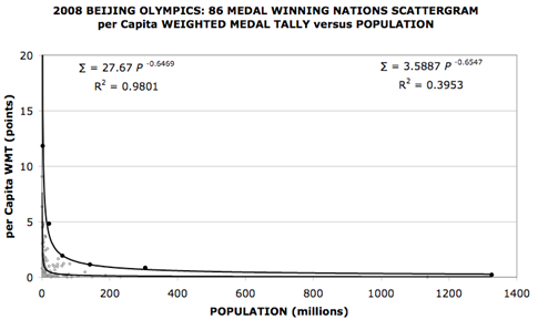 | Figure 1. Plot of per capita Weighted Medal Points Tally versus Population for Beijing. The upper six filled circle data points represent the ‘visually elite’ NOC’s while the lower 80 smaller unfilled circles the rest of the data. The expression in the upper right is the power law fit to all 86 data points while the one in the upper left the fit for the visually elite six nations highlighted as black dots |
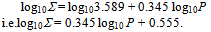
 The coefficient has increased by a factor of 7.71 over the best fit for the entire group of medal winning nations but the power index alters marginally from -0.654 to -0.647. There is only a minor variation in the index (and so curve shape), the larger coefficient of 27.67 is expected because we have raised the bar from mediocrity amongst the medal winning nations to excellence in achievement within this group. However, the process used here is based on a selective, visual inspection that is not entirely objective. We need a methodology more rigorous than this in deciding on an elite top-10. Meanwhile, the likelihood of a power law methodology providing a sensible metric for assessing elite performance for any country of any size competing at an Olympic Games, is most encouraging, if not compelling.Rather than progress matters in terms of the dubious per capita WMT (μ) dependence on population P when determining elite performance we abstract it to make ∑, the WMT itself,the subject of our attention. We do this by multiplying the fitted power law of Eqn (1) by P. In so doing we obtain:
 | (2) |
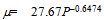
 For a log-log plot, this is a linear equation of the form:
 withy as log10∑, x as log10P, and m (= 0.345) the gradient of straight line of best fit with an intercept on the y-axis of c = 0.555. This logarithmic representation of the data not only removes the clutter in the near vicinity of the origin, but the trendline for the data now takes the more congenial visual form of a simple straight line as illustrated later in figure 2. We use this formulation and a power law refining (PLR) methodology for sequentially purging the original medal winning nations group of its inferior performers, whatever their population level, to project out an elite group of top-10 performers irrespective of population size. The modus operandi for our PLR methodology is:1. First plotting log∑versus log P for all the medal winning NOCs of an Olympics and fitting a straight, linear trendline to it.2. Selecting nations that retain a log∑value above this trendline as a 1st cut.3. Extracting and replotting this 1st cut group as another log∑versus log P graph and fitting a new linear trendline.4. Selecting the nations that retain a log∑above this trendline as a 2nd cut. 5. Iterating the previous two steps to arrive at a 3rd and final cut of top-10 from which we obtain the elite trendline and benchmark formulation we seek.
3. Results
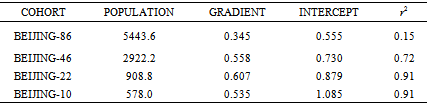
- Applying the methodology to the 86 medal winning NOCs of the XXIXth Olympiad at Beijing we find 40 nations have negative residuals when log∑ of the trendline value is subtracted from the actual log∑ value. The 46 NOCs with positive residuals, when subsequently analysed produce a 2nd cut of 22 nations. Of the two population extremes in the 1st cut mix, host nation China (1325.5 million) and Bahamas (0.320 million), the former just misses and the latter just makes the 2nd cut. The graph of the final iteration to identify the top-10 from this 22 nations is displayed in figure 2. It reveals the final spread of elite performing nations at Beijing extends from Jamaica (population 2.71 million) to USA (population 304.9 million), The ten nations distilled in order of positive residual size and ranked according to the PLR fitting methodology are: 1-Australia (AUS), 2-Jamaica (JAM), 3-Great Britain (GBR), 4-United States (USA), 5-Russia (RUS), 6-Cuba (CUB), 7-Belarus (BLR), 8-Norway (NOR), 9-Netherlands (NED) and 10-New Zealand (NZL). The aggregated population of these ten nations is 578 million, approximately one quarter of the Beijing-86 NOCs aggregated population and less than one tenth of the world’s population. Furthermore if we extract this top-10 group we can fit a trendline to them that benchmarks elite performance for any population size. The formula obtained in doing this with the top-10 PLR ranked nations for Beijing is:
 | (3) |
|
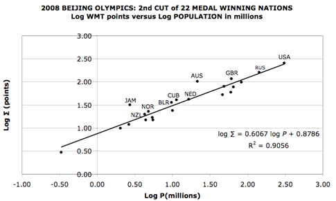 | Figure 2. Log-log plot of the fit of the second cut of top-22 nations at Beijing. The top-10 that sit above the line of best fit are labelled with their official IOC code. The line segment shown stretches from Bahamas (bottom left) to USA, the former falling short of the final cut for the elite top-10 |
4. Discussion
- It is interesting to compare the top-10 PLR rankings against the top-10 nations of the IOC Table rankings for Beijing. The IOC ranking for Beijing was 1-China, 2-USA, 3-Russia, 4-Great Britain, 5-Australia, 6-Germany, 7-South Korea, 8-Japan, 9-Italy and 10-France. Those NOCs presented in bold type are common to both PLR and IOC rankings. The aggregated population of the IOC top-10 is 2237 million compared with the PLR’s 578 million, a ratio of 3.87 which is typical of the ratio for the other three Olympiads. Of the four nationsthat appear in both rankings, Australia, with 21.4 million in 2008, is the smallest in population. In the analysis of the other three Olympiads, Netherlands (16.4 million in 2008), Cuba (11.3 million in 2008) and Hungary (10.0 million in 2008) appear significantly in the PLR rankings although not with the same potency as Australia which conspicuously leads in all but the London Olympiad where it ranked fifth. This suggests that countries aspiring to make the top-10 of the IOC Table need a population base threshold similar to that of Australia as a necessary, but not necessarily sufficient, condition to realise this goal.Countries wishing to establish the quality of their performance at the recent London Olympics against the PLR metric can do so by substituting their 2012 population expressed in millions into the formula:
 Using the host country Great Britain (P = 62.262 million) as an example, we obtain a predicted value of 117 WMT points against which to benchmark its performance. It actually accrued a massive 169 WMT points from its 29 gold, 17 silver and 19 bronze medal haul. The USA, which topped the IOC Table, is predicted to require 272 WMT as a comparative statistic using the PLR method as the benchmark. It fell only 1 short of this target in accruing 271 WMT points. Nevertheless, this comparative difference reveals how dominantly the host nation performed at the XXXth Olympiad as most international observers, and the British media in particular, noted.The PLR methodology identifies countries like USA and Russia amongst the elite of sporting nations as their ranking on the IOC medal tables has long suggested, as well as acknowledges the re-emergence of Great Britain as a country now performing at the top level of European athletic achievement. Australia emerges as the dominant player in PLR rankings for Beijing but likewise dominates at Athens and Sydney. Although its performance was relatively subdued at London, it nevertheless ranked within the best five of the PLR top-10. This suggests a consistent depth and commitment to its national sporting ethos that provides a clue as to why it continually dominates a selective, secondary sporting fixture like the Commonwealth Games ahead of other Commonwealth countries of larger population and especially its principal member England. It will be interesting to see how Australia and England match up against each other in Glasgow at the 2014 Commonwealth Games.
 5. Concluding Comments
- We have formulated a plausible power law relationship between weighted medal tally points ∑and population size P (millions) that provides a benchmark for elite performance at the Olympic Games based on population size. It has the general form:
 Over a 12 year period spanning four Olympiads the power index m varies from 0.481 and 0.571, while the co-efficient C, which corresponds to the expected WMT count for elite performance by a country of population 1-million fluctuates from 11 to 17. The latter discrepancy equates to a difference of a gold plus silver medal in the tally that is not significant in the event of an individual talent like Usain Bolt suddenly emerging within its small national boundary. The PLR method of ranking fills a void by projecting small countries like New Zealand, Jamaica and at times sub-million population NOCs like The Bahamas into the limelight of Olympiads at which they excel. This is done in a way the IOP Table or the international sports media seem incapable of properly acknowledging. The IOP table inevitably swamps that achievement in highlighting the achievement of the superpowers advantaged by population base, wealth and resources the smaller member countries do not enjoy. Furthermore it should enable smaller countries (population say in the one to five million zone) to not just restrict their respective Olympic medal tally to comparisons with other countries within this population zone to gauge their achievement. Now they can credibly rationalise their achievement against the sporting superpowers like USA and China, as well as the sporting powerhouses of moderate population size like Australia, a nation that regularly punchesaboveits(population) weight. Finally it endorses in a definitive, quantitative way what most international observers qualitatively sensed and reported on the outstanding performance of British athletes at the recent London Games. Great Britain certainly excelled in its presentation and conduct of the XXXth Olympiad as the host nation, but so too did its athletes.
 ACKNOWLEDGEMENTS
- The author thanks Professor Winston Byblow (Sports & Exercise Science) and Associate Professor Paul Barker (Physics) of The University of Auckland for their careful reading and helpful comments on the initial draft of the manuscript.
EPILOGUE
- It is interesting to note that the PLR methodology applied here for the Olympics, an environment that highlights excellence in sporting achievement, produces a consistent pattern of behaviour for excellence in a completely alternative sphere of achievement, namely, Nobel Prize winners. A plot of national per capita award winning medal tallies (all Nobel Prizes tallied from inception in 1901 to 2012) versus 2012 national population figures produces a rectangular hyperbola profilesimilar to that shown in figure 1. Such is not the case if one analyses annual national per capita statistics for child abuse, murder rates, or other sociological indices representing failure. While this is really an aside to the study reported here it is nevertheless an interesting empirical finding worth noting.
References
| [1] | Ball, D. W., “Olympic Games Competition: Structural Correlates of National Success,” International Journal of Comparative Sociology, 15 (1972), 186-200 |
| [2] | Levine, E., “Why Do Countries Win Olympic Medals? Some Structural Correlates of Olympic Games Success: 1972,” Sociology and Social Science Research, 588 (1974), 353-360 |
| [3] | Grimes, A.R., Kelly W. J. and Rubin, P.H., “A Socioeconomic Model of National Olympic Performance,” Social Science Quarterly, 55 (1974), 777-782 |
| [4] | Johnson, D. K. N., and Ali, A., “Coming to Play or Coming to Win: Participation and Success at the Olympic Games,” Wellesley College mimeo (2000). |
| [5] | Bernard, A. B., and Busse, M. R.,“Who Wins the Olympic Games: Economic Resources and Medal Totals,” The Review of Economics and Statistics, 86(2004), 413-417 |
| [6] | Forrest, D., Flores, R., McHale, I., Sanz., I. and Tena, J. D., “Going for Gold, Silver & Bronze- Structural Determinants of Olympic Medals Totals,” Madrid Sportometrics Study Group Project Report, 2012 |
| [7] | Amateur, “Medal Predictions Part 1: Debunking Bernard &Busse,“ Now That’s Amateur Blogspot, 8 January 2005, website: now-that’s-amateur.blogspot.com Note: This anonymous but informed Halifax sports blogger describes himself as a “Canadian, sports volunteer, former Olympic athlete and rational thinker. |
| [8] | Hawksworth, J.C., “Modelling Olympic Performance,” PricewaterhouseCoopers Economic Briefing Paper, June 2008 |
| [9] | Hawksworth, J.C., “Modelling Olympic Performance,” PricewaterhouseCoopers Economic Briefing Paper, June 2012 |
| [10] | Klein, J.Z., “The Medal Rankings: Which country leads the Olympics?” New York Times, 23 August, 2008. |
| [11] | The World Bank, World Country Populations, website: data.worldbank.org/indicator/SP.POP.TOTL |
| [12] | Wikipedia, the Free Encyclopedia, website: en.wikipedia.org/wiki/2008_Summer_Olympics_medal_tables. |