Mehrnoosh Pirhayati 1, Farzaneh Haratyan 2
1M.A. Student of English Language Translation, Department of English Language, Science and Research Branch, Islamic Azad University, Tehran, Iran
2Assistant Professor, Department of Foreign Languages, Garmsar Branch, Islamic Azad University, Garmsar, Iran
Correspondence to: Mehrnoosh Pirhayati , M.A. Student of English Language Translation, Department of English Language, Science and Research Branch, Islamic Azad University, Tehran, Iran.
| Email: |  |
Copyright © 2018 The Author(s). Published by Scientific & Academic Publishing.
This work is licensed under the Creative Commons Attribution International License (CC BY).
http://creativecommons.org/licenses/by/4.0/

Abstract
Nowadays visual language as the tool of comprehension and communication, is considered very significant and important in our contemporary societies. In fact, visual language, as a communicative tool can be used for various reasons and aims for drawing people’s attention. In addition, visual language is especially used by the writers and the translators for better and quick understanding the subject and message(s) of their books-when the reader tries to take a decision for buying a book. Therefore, visual language like verbal language, encounters with various ideologies. In this regard, this study attempted to analyze the textual features, and the cover page design of the Persian translated versions of the feminist book-length essay, “A Room of One’s Own” written by Woolf (1995), which were translated after the Islamic Revolution of Iran in 1979, for revealing the ideological implication(s). To do so, this study was conducted based on Kress and Van Leeuwen’s (2006) semiotic framework, and Machin’s (2007) model of typographical analysis was also employed in this research. This study as a descriptive, explanatory and comparative research adopted the qualitative method. The findings showed that the feminist ideological load of the original book was manipulated by the decisions, choices, and selections of the Iranian translators. But, the manipulations and changes, which were done at the semiotic level, did not significantly affect writer’s feminist messages, the subject, and the feminist ideological load of the English book, A Room of One’s Own.
Keywords:
A Room of One’s Own, Critical Study, Ideology, Kress and Van Leeuwen’s (2006) Semiotic Framework, Machin’s (2007) Model of Typographical Analysis, Manipulation, Virginia Woolf
Cite this paper: Mehrnoosh Pirhayati , Farzaneh Haratyan , Judging Books by Their Visual Features: A Case Study of the Three Persian Translations of Virginia Woolf’s Feminist Book-length Essay “A Room of One’s Own”, American Journal of Linguistics, Vol. 6 No. 4, 2018, pp. 63-71. doi: 10.5923/j.linguistics.20180604.01.
1. Introduction
Nowadays visual language as the tool of comprehension and communication, is considered very significant and important in our contemporary societies. We see ourselves surrounded by various visual concepts such as, pictures, images, logos, etc. In fact, visual language as a communicative tool can be used for various reasons and aims for drawing people’s attention. In addition, visual language is especially used by the writers and translators for better and quick understanding the subject, and message(s) of their books-when the reader tries to take a decision for buying a book. As Kress (1993, p. 174) said, “no sign is innocent”. Thus, all languages (verbal language, and non-verbal languages, like visual language) can be critically analyzed, since they reflect the ideological orientation(s) of their producer(s) (Kress, 1993). In this regard, this study attempted to analyze the textual features, and the cover page design of the Persian translated versions of the feminist book-length essay, “A Room of One’s Own” written by Woolf (1995), which were translated after the Islamic Revolution of Iran in 1979, for comparing and contrasting their ideological implication(s) with the ideological implication(s) of the textual features, and cover page design of the correspondent English book. This book contains the western viewpoint about the rights of woman, that can be ideologically rejected by the religious and patriarch societies like Iran. Thus, the translator must inevitably take a position during the translation of this book at the all levels, from textual to semiotic levels. On the other hand, critical study, as the branch of applied linguistics, has recently been employed in Translation Studies (TS), and visual concepts have been rarely studied in the field of translation. Virginia Woolf’s works are ideological and their translations can be considered as the good materials and resources for the critical studies.
2. Literature Review
2.1. Ideology and Translation
Undoubtedly, the role of ideology is very significant in TS. Fawcett (1998, pp. 106-107) stated that “an ideological approach to translation can be found in some of the earliest examples of translation known to us”. Schäffner (2003) expressed that, translation deals with the various ideologies, in such a way that the choice of the source text and its use are determined by the aims, and interests of the social agents. Likewise, Robinson (1997 as cited in Pérez, 2003, p. 7) believed that, “If you want to become a translator you must submit to the translator’s submissive role, submit to being ‘possessed’ by what ideological norms inform you…”. In addition, Pérez (2003, p. 7) said that “Feminists, functionalists, descriptive and poly-systemic scholars, sociolinguistic researchers, postcolonial exegetes, corpus studies propounders, critical linguistic theorists, gay and lesbian academics, semioticians, contrastive linguists embody some of the very many ‘ideologies’ that make up TS”. Moreover, Mason (2009) in his book, “Discourse, Ideology and Translation” declared that any translation reflects the translator’s ideological orientation(s). Furthermore, Baker (2005, p. 321) stated that the scholars of both language and translation found that “they inevitably have to draw on more fluid notions such as context, culture, power and ideology”.
2.2. Virginia Woolf
Adeline Virginia Stephen (Virginia Woolf), the famous British novelist, was born on 25 January, 1882. Guerin (2005, p. 223) said that, Virginia Woolf’s works caused the development of feminist literary criticism:Since the beginning of the late twentieth-century women’s movement, feminist literary criticism developed by contributions of revolutionary nineteen-century- and twenty century authors such as Marry Wollstonecraft, Marry Shelly, George Elliot, Charlotte Perkins Gilman, and Virginia Woolf.She was considered as a very influential character among the intellectuals of the Bloomsbury Group. Her works are considered unique, since they have the psychological features. She used the psycho-literary tool, “The Stream of Consciences” as the narrative device for writing her works. Her works were published with her own budget, through the Hogarth Press. Woolf suffered from the mental illness, probably Bipolar disorder, and she suicided in 1941. Virginia Woolf is better known for her works: ‘To the Lighthouse’, ‘Mrs. Dalloway’, ‘Orlando, and her book-length essay, ‘A Room of One's Own’ (“Virginia Woolf Biography”, 2016).
2.3. A Room of One’s Own
A Room of One’s Own is a famous feminist book-length essay which was written by the famous English novelist, Virginia Woolf, after she presented two lectures on the concept of “women and fiction” at the Cambridge University in 1928. The first publication of this book was in 1929 through the Hogarth Press. Virginia Woolf wrote about the historical unsolvable issues related to the female sex including, education, freedom, liberty, and job that the women of the England of 19th and 20th centuries encountered with them. In fact, the story of A Room of One’s Own is constructed on the basis of the women’s rights ignorance, and gender discriminations. She stressed that women must try for removing the ridiculous barriers and both sex must respectfully treat with each other. In other words, they must be known as the equal creatures in the society. She criticized and challenged the patriarch system of England. Virginia Woolf (1995, p. 13) stated that “A woman must have money and a room of her own if she is to write fiction’. This expression indicates to the awkward social, cultural, and economic conditions of the female sex in the England of 19th and 20th centuries. She also mentioned that, the English women of her age had to traditionally married, and they had to be housekeeper. They were considered as the inferior writers and were marginalized by the opposite sex. In fact, Woolf’s (1995) dissatisfactions with her society can be directly and metaphorically viewed in the different parts of this book. She (1995) emphasized on the significance of having the privacy.In her book, she characterized a woman named “Marry” who visited a British museum to know everything that had been written about women, but she found that most of the writers of England were men. They wrote about women and portrayed them as the inferior creatures. Woolf (1995) explained that some of the male writers even described the female sex as a low wisdom creature who must take the insignificant responsibilities like, childrearing and housekeeping. This feminist book is considered as one of the key works in the area of feminist literary criticism (“Virginia Woolf Biography”, 2016).
2.4. Kress and Van Leeuwen’s (2006) Semiotic Framework
Kress and Van Leeuwen’s (2006) framework of semiotic analysis is driven from Holliday’s (1978) Systematic Functional Grammar (SFG). In fact, all languages (verbal language, and non-verbal languages like, visual language), as the social dependent phenomena, are used for the particular aims and for sending the particular messages. Thus, they encounter with various ideologies. Based on Holliday’s (1978) SFG, Kress and Van Leeuwen (2006) proposed the grammar of visual design. According to Kress and Van Leeuwen (2006), visual designs act like the verbal language system of human being. They can have the ideational, interpersonal and textual meta-functions, and using them for the cover page of a book, or bringing them with a term like a particular phrase, can help to the quick, direct, and clear reflection of the subject and message(s) of the book, or the pragmatic meaning of the term (Kress & Van Leeuwen, 2006). For example, when a writer, or a translator intends to show the subject, message(s), and the ideological orientation(s) of his/her book concretely, to the readers for drawing their attention, he/she tries to choose and select (a/the) visual design(s) that can reflect the message(s) of his/her book, and the pragmatic meaning of the title of his/her book (Kress & Van Leeuwen, 2006). In addition, Kress and Van Leeuwen (2006) believed that, both verbal language and visual language of a book are connected to each other. It means that they can reflect the meaning of each other, or they can complete each other. In other words, they are chosen and selected for showing a particular aim and meaning (Baykal, 2016).Kress and Van Leeuwen (2006) proposed two different structures of the semiotic representation:1. Narrative Structure: A type of the semiotic representation which is constructed based on the “Actor(s)”, and the “Goal(s)”, and indicates to a work or practice. The key element of this structure is “Vector”, that indicates to the goal. For example, when a man stares at a woman, his eyes as a “Vector”, point at her.2. Conceptual Structure: A type of the semiotic representation which indicates to a timeless situation without any actor, and goal. In fact, it does not have any “Vector”. It can be divided into three sub-categories: 1- Taxonomy, which shows a hierarchy figure, 2- Analytical, which is constructed based on the parts to whole relation, such as the picture of a body (career) which shows its organs (participants), and 3- Symbolic, which does not show any action, or goal, and it can be attributive, or suggestive.Moreover, according to Kress and Van Leeuwen (2006), any semiotic sign can be analyzed based on its compositions, including Salience, Framing, Color, and its Informative value.
2.5. Machin’s (2007) Model of Typographical Analysis
To achieve the purpose of the research, the researchers also found Machin’s (2007) model of typographical analysis suitable for their research. According to Machin (2007), the visual aspects of the language signs can be analyzed based on these seven features:Weight: Weight is considered as a significant element in the semiotic analysis, from thin to bold. It is used for putting further emphasis on the meaning of a term, or for showing it as an insignificant or marginal element in the text, and for reducing the attention.Color: Color, as a semiotic sign deals with the psychological and emotional aspects of human being. It is used for reflecting a particular meaning.Slant: It refers to the lean of the letters, ranging from vertical to horizontal. The extent of divergence from vertical, or horizontal can show human’s energy, passion, and can intensify the meaning of a term.Framing: A frame can be formal and made by the lines and borders, or can be informal and can be constructed by the colors, dots, etc. Each model can show to the extent of the significance, seriousness and prominence of the meaning of a term.Formality: The formality of the font of writing can show the important, significant, and serious aspects of the text. In other words, a particular font type can give a particular character to the text. For example, when a letter is made by hand writing, the personal aspect of the text can be bolded. In other words, it can give the text a human touch.Flourish: It stresses on the extent of formality; what type of font is more formal and indicates to the significant and serious aspects of the text?Size: The big size of a particular term can indicate to its salience and importance. On the other hand, the small size of a particular term can show it as an insignificant element and can be used for reducing the attention.Machin (2007, p. 87) said that, “letterforms themselves have become more important as part of the overall meaning of composition and have themselves become more graphic and iconic”.
3. Methodology
This research as a descriptive, explanatory, and comparative study adopted the qualitative method. The textual features, and the cover page design of the three Persian translated versions of the feminist book-length essay, “A Room of One’s Own” written by Virginia Woolf, which were translated after the Islamic Revolution of Iran in 1979, were comparatively analyzed with the textual features, and cover page design of the correspondent English book. The researchers used Kress and Van Leeuwen (2006) semiotic framework, and Machin’s (2007) model of typographical analysis was also employed in this study.
4. Results
4.1. Outside of the Text
 | Figure 4.1. The typographical features of the front cover page of the book, A Room of One’s Own |
As figure 4.1 proves, the title is written with the very big size and a bolded font. These visual features can indicate that, this work is introduced as the important work of the writer, which is very significant. In addition, “A Room of …” is written with the italized style, which can indicate to the importance of owning a room, since the women of the age of Virginia Woolf had not any place for doing their favorable works, like writing fiction and in the present time, such this bad situation may be imposed by the patriarch societies. Moreover, the purple color is used for the title. Purple indicates to wisdom, intelligence, power, dignity, devotion, peace, ambition, independency, and creativity (Bourn, 2011). Thus, this color is used for showing the intelligence, wisdom, independency, and ambition of women as the creatures who want to have the equal rights. Contrarily, the writer’s name is brought at the bottom of the title, which is bolded and showed with the big size, little bit smaller than the title, which can indicate that she is introduced as a famous writer. Furthermore, the name of the writer is written with the white color –the white color is defined in psychology as the symbol of purity, integrity, innocent, and hope (Przybyla, 2018a)- that can emphasize on the purity and sacred soul of woman, her innocence, who is affected by the injustices, inequities, and unfairly outraged by her opposite sex, and also can show her hopes and wishes like gender equality and peace with the female sex. Undoubtedly, the typographical features of the cover page are influenced by the feminist ideological load of the writer’s discourse, and reflect the pragmatic meaning of the phrase, and words - that are brought for designing the cover page of the book, and also for knowing this feminist book- very compressed, concise, and concrete for the target readers.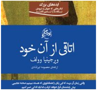 | Figure 4.2. The typographical features of the front cover page of Masoumeh Mehrshadi (2017) |
As figure 4.2 shows, Mehrashdi (2017), situates the translation of the title on the middle center of her book with a bolded font and the big size. Then, the name of the writer is placed, with a bolded font, little bit smaller than the title, and without introducing her as the writer; only her name is put on the title page. In addition, the name of the translator is brought with a tiny and un-bolded font. these typographical features can indicate that the translator intended to show this book as a masterpiece (writing the title with the big size and a bolded font), which belongs to a writer who is very famous (writing her name with a bolded font and the big size, without introducing her as the writer of this book). Consequently, she probably follows a particular ideology or has a special style of writing. On the other hand, the tiny font which is used for the name of the translator shows that she wanted to show her work as a translation rather than an original book; trying to convey the feminist ideological load of the source text as good as possible and reproduce it for the target readers. In addition, the color which is used for the written materials is white, that is not used for the formal writing. In fact, as mentioned before, the white color is defined in psychology, as the symbol of purity, integrity, innocence, and hope (Przybyla, 2018a), which can indicate to the woman’s purity, the innocence and holly nature of her gender, which is affected by the injustices of the patriarch societies, and also can be related to the feminist messages of the book such as, peace with the female sex and gender equality. In addition, these typographical elements are used on a blue background. Blue is referred to as the symbol of peace. For example, the flag of the United Nations as a peaceful organization contains the blue color. The blue color of the book can indicate to the peaceful character of the female sex. As Woolf (1995) stated, women must try to have the equal rights in the society, and both sex must respect each other (Woolf, 1995). In addition, some information is brought on the front cover page, which can prove that the translator tried to show the feminist messages of the original text clearly to her target readers for provoking, influencing, and motivating them.Furthermore, this sentence, “ایده های بزرگ کتابهایی که جهان و شیوه ی نگاه ما را تغییر می دهدند” is written on a brown background. Brown is introduced in psychology, as the symbol of bad feelings, such as, loneliness, sadness, and isolation (Cherry, 2017). This color can indicate that the female sex suffers from the mental illnesses like, loneliness, sadness, and depression which are the results of the bad conditions that imposed on her by the opposite sex and the patriarch society, and also can indicate to the wrong beliefs that brings some bad feelings and dissatisfactions for the female sex. But, she intentionally or unintentionally obeys them. On the other hand, the white color of the sentence can indicate to the message of the sentence and the reformist role of this feminist book.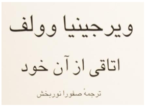 | Figure 4.3. The typographical features of the front cover page of Safoora Noor Bakhsh (2013) |
As figure 4.3 shows, Noor Bakhsh (2013) situates the writer’s full name, with a bolded font and the very big size, on the top of her cover page, without introducing her as the writer of this book. Then, the translation of the book title is written after her name, little bit bolded than the writer’s name. After bringing the name of the book, the name of the translator is written with a tiny size and an un-bolded font, which can indicate that the translator intended to show her work as a translation rather than a product of the localization for the target readers. In addition, these typographical elements can show that, this book is introduced as a masterpiece, since the title is written with a bolded font and the big size, and also this work belongs to the famous feminist writer, “Virginia Woolf”, since her name was written firstly with a bold font and the very big size. Consequently, the feminist ideological load of the text is probably preserved in the translation without any significant ideological manipulation. The color of the typographical elements is black which is used on a white background. The black color is used for the formal style of writing, for drawing the attention. On the other hand, it can portray a dark society in the age of the writer and also the translator; a patriarch society. Moreover, it can indicate to a type of the social dissatisfaction which originates from the writer and translator’s bad social conditions. It seems that Noor Bakhsh (2013) is the follower of the writer’s feminist ideological orientation. In other words, these typographical features can show the translator’s feminist attitude, which also through her words choices in the process of her translation is clearly reflected. These typographical features directly indicate to the feminist messages of the book and the importance of reading this feminist book as an influential and essential book for women, those who may suffer from bad conditions which are imposed by the opposite sex, and the patriarch system of their society.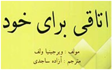 | Figure 4.4. The typographical features of the front cover page of Azadeh Sajedi (2005) |
As figure 4.4 proves, Azaeh Sajedi (2005) sets the title on the upper center part of the cover page with a bolded font and the big size. Then Sajedi (2005) brings the name of the writer with a bolded font, but with the tiny size, which is parallel and balance with the name of the translator. It is obvious that the translator tried to reduce the negative aspects of the writer’s name, by the normalization through which, this book like many literary books is translated and prepared for the target readers. In addition, the typographical features can indicate that both of them (the writer and the translator) have a common ground in the feminist area. The color of the title is black, which is used on a bright yellow background. As mentioned before, the yellow color as the symbol of illness indicates to the patients, and diseases, like, Lcterus. It can also be interpreted psychologically. It can be the symbol of death, fatigue, and nostalgia. For example, the yellow color of leaves is recognized as the symbol of death, nostalgia, and fatigue for people. This color which was used for the background can indicate to a sick society, that ignores women’s rights and pays not any attention to them. The black color, which is used for the title, indicates to the importance of the message of the title. The brown color, which is used for the name of the writer and translator, is defined in psychology as the symbol of depression, loneliness, sadness, and isolation (Cherry, 2017). This color can indicate that the translator like the writer suffers from some bad feelings like, isolation, sadness which are the results of the gender discriminations that are imposed by the patriarch religious society of Iran.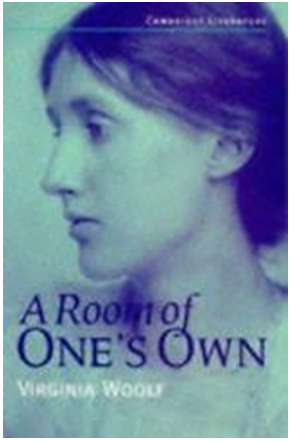 | Figure 4.5. The front cover page design of the book, A Room of One’s Own (Woolf, 1995) |
As figure 4.5 shows, the portray of Virginia Woolf, as the symbol of feminism, is selected for the front cover page design of her book, and the title with a very bolded font is set on the bottom of the cover page design, on the image of Virginia Woolf. This decoration shows that the image authoritatively makes the real meaning of the book title. In addition, it can show that, this book has the feminist content. The blue color, as the symbol of peace and virtue, which is used for the front cover page design, can indicate to her peaceful and virtuous nature, and also her peaceful attitude: gender equality. On the other hand, the purple color which is used for her portray can show her wishes, ambitions and her independency as a woman who accounts herself equal with her opposite sex. Generally, this selected image reflects to the feminist ideology of Virginia Woolf. In other words, her feminist ideological orientation can be understood through these visual signs, as the discursive elements of her book, A Room of One’s Own reflect it. For example, she said that:“I pondered why it was that Mrs Seton had no money to leave us… if we have the habit of freedom and the courage to write exactly what we think; if we escape a little from the common sitting-room and see human beings not always in their relation to each other but in relation to reality; if we face the fact, for it is a fact, that there is no arm to cling to, but that we go alone and that our relation is to the world of reality and not only to the world of men and women, then the opportunity will come and the dead poet who was Shakespeare's sister will put on the body which she has so often laid down” (Woolf, 1995, pp. 32-117).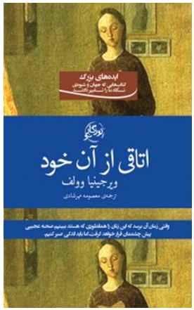 | Figure 4.6. The front cover page design of Masoumeh Mehrshadi (2017) |
 | Figure 4.7. The back cover page design of Masoumeh Mehrshadi (2017) |
As figure, 4.6 and 4.7 show, both language signs and image are used for the design of the front cover page and back cover page of Masoumeh Mehrshadi’s (2017) book. Based on Kristeva’s (1998) Intertextuality, discourse as a social dependent phenomenon is connected to the past and present related discourses. We can generalize it to the front cover page design and back cover page design of this book, since, this book as the translation of its original can be affected by the social, cultural, and historical conditions of the target readers, and also the translator’s ideological tendenc(y/ies), who belongs to the target society. Consequently, some visual features can be added or omitted, or the visual design of the original text can be completely changed for the target readers. In other words, the visual features, and the visual concepts like discursive elements can be manipulated and changed by the translators’ selections, choices, and decisions.For example, the translator does not choose the photo of Virginia Woolf for the design of her front cover page, since it may bear the negative aspects of Virginia Woolf’s character such as, a woman who suicided, a woman who was raped by her half-brother, or a woman who had the western ideology about the female sex. Thus, the translator chooses an unrealistic image; a very young lady who is reading a book probably, A Room of One’s Own, which the translator aims to influence her, in a positive way. As mentioned before, the yellow color is defined as the symbol of death, isolation, fatigue, and sadness. This color is used for the cover pages of this book and surrounded the space of the house. It can indicate that this young lady is isolated by her opposite sex, and her mind is deflected by his attitude. She spends most of her time in the house. Then, the house has become a boring place for her. Contrarily, Mehrshadi (2017) uses the portray of Virginia Woolf for the design of her back cover page. This selection can show that, she did not want to bold the negative aspects of Woolf’s character through the selection of her portray for the front cover page of her book, but she uses it for the back cover page of her book for showing the feminist content of the book to the target readers.So, this image has the symbolic function. It represents Virginia Woolf’s feminist ideology, and her wishes; having the chance of doing her favorable works. Moreover, Mehrshadi (2017) brings some information on the back cover page of her book, that this book can change the reader’s point of view and bears the feminist ideological load. It seems that, she adds some information for provoking, influencing, and motivating the target readers. Based on what Woolf (1995, p. 38), as a researcher, asked: “have they souls or have they not souls? are they capable of education or incapable?” and then, tried to answer these questions, the front cover page and back cover page of this book are designed for affecting and challenging the target readers.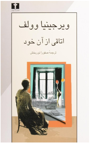 | Figure 4.8. The front cover page design of Safoora Noor Bakhsh (Noor Bakhsh, 2013) |
As figure 4.8 proves, Virginia Woolf is watching a boring landscape which is colored with the black and gray colors. In addition, her books and notes that are scattered on the floor, show a room belongs to a woman; a private place for a woman who can do anything in it, such as writing fiction in the age of the women’s rights ignorance. Moreover, the red flower in the pot shows her passion of writing; the red color is the symbol of passion (Przybyla, 2018b), and the yellow flower as the symbol of hatred and depression (Haller, 2012), can indicate that, she suffers from a bad feeling; probably a type of dissatisfaction with the patriarch system of her society, that imposes many restrictions for women and ignores their rights. The other colors which are used in this picture are the light blue and the brown colors. The blue color, as the symbol of peace, and the brown color, as the symbol of depression, sadness and isolation, can indicate to the peaceful character of the female sex who wants the equal rights, but she lives in an isolated and suppressive society, which is controlled by the male sex. Thus, her wish may not come true.The black color, as the symbol of fear, depression, serious power, and control (Przybyla, 2018c), and the grey color, as the symbol of depression, the lack of confidence, and energy, (Przybyla, 2018d), that are used in this image, can show a society, that is controlled by the patriarch system, and Virginia Woolf as a woman does not feel any comfortable in that society. Thus she probably suffers from bad feelings, and the lack of self-confidence. It seems that Noor Bakhsh (2013) translates Woolf’s (1995) A Room of One’s Own expressively and increases the feminist load of the text in the process of her translation. This selection can also show that, she wanted to affect and provoke her target readers. As Woolf (1995, p. 13) stated: “A woman must have money and a room of her own if she is to write fiction”, since she was not permitted to write or to do her favorable works in the patriarch societies: “women never have an half hour… that they can call their own” (Woolf, 1995, p. 73). Moreover, her character was humiliated by her opposite sex: The best woman was intellectually the inferior of the worst man (Woolf, 1995, p. 60). Generally, this selection can indicate to the bad conditions of the female sex in the patriarch societies, and also the translator’s feminist position against the patriarch-religious society of Iran.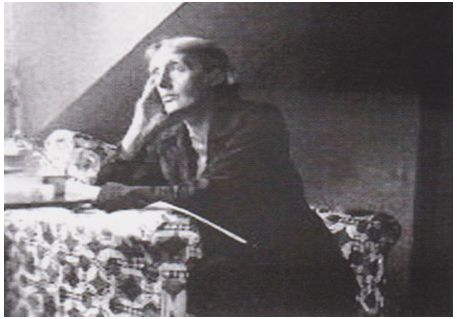 | Figure 4.9. The back cover page design of Safoora Noor Bakhsh (Noor Bakhsh, 2013) |
As figure 4.9 shows, Noor Bakhsh (2013) chooses a realistic photo for the back cover page design of her book. This photo has the conceptual feature. Virginia Woolf as the symbol of feminism is selected for the back cover page. The back cover page design of Noor Bakhsh (2013) can show that the translator with choosing this image intended to show her work to the target readers- those who have different attitudes on the subject of woman- as a translation. In addition, this picture shows Virginia Woolf in the mode of thinking and probably writing in a private room, that can indicate to the feminist message of the book, A Room of One’s Own and its significance, since Woolf, as a woman, was isolated and limited, and she was not permitted to educate and do her favorable works, such as writing fiction. Thus, she had to spend most of her time, as a submissive wife, in the house of her husband, or she had to have a room for her own and enough money for writing fiction, or for doing her favorable works. It seems that Noor Bakhsh (2013) intended to show the feminist message of the book clearly to the target readers for drawing their attention.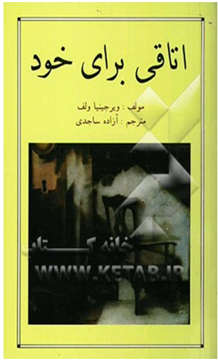 | Figure 4.10. The front cover page design of Azadeh Sajedi (Sajedi, 2005) |
As figure 4.10 proves, this picture shows A Room of One’s Own. In addition, this picture is made by the photoshop software, since this is an unrealistic image. The front cover page design of Azadeh Sajedi (2005) can show that, the translator chose this picture, because she wanted to stress on the bad conditions of women in the patriarch-religious society of Iran. In other words, she intended to convey the feminist message of the book, through this selection, more influential than the cover page design of the original book reflects it, for provoking and challenging the target readers. Moreover, the colors, which are used in this image, are the black and the dark brown colors, which cover the space of the room and its furniture. As mentioned before, the brown color, which is used in this picture, is psychologically defined as the symbol of bad feelings, like loneliness, sadness, and isolation. It indicates to the message of the book, A Room of One’s Own, that a woman must have a room for her own, if she wants to write fiction, since she is not permitted to write in the patriarch society, and she must isolate herself in a room, when she wants to write fiction or do her favorable works. In other words, she has not any other path for escaping from the discriminations and suppressions which are imposed by the patriarch system of her society, and she is probably depressed. On the other hand, the black color, as the symbol of depression, serious control and power, indicates to the awkward situation of a woman, who is restricted by the patriarch system of her society, which ignores her rights and suppresses her, and she probably suffers from bad feelings, like depression. Furthermore, this picture does not show any action, since it is symbolic. In fact, the design of this cover page contains the feminist ideological load of the text and indicates to the age of the women’s rights ignorance and gender discriminations. In other words, she definitely must have some money and a room in the suppressive patriarch societies, if she wants to write fiction or do her favorable works.
4.2. Inside of the Texts
Textual features, are considered very important, since they show the writer’s particular ideological orientation(s). On the other hand, textual features can be manipulated and changed by the translator for (a/the) particular ideological tendenc(y/ies). In this regard, the textual features of these three translated versions were compared with the textual features of the correspondent English book, A Room of One’ Own. Thus, the results were brought with details in bellow:
4.2.1. Masoumeh Mehrshadi (2017)
Masoumeh Mehrshadi (2017), did not hew to the typographical features of the marked and bolded parts of the original book, A Room of One’s Own. For example, the writer used the uppercase style for the term, “WOMEN AND FICTION”. But, this style did not keep in her translation. The manipulations which were done by Mehrshadi (2017) showed that the translator wanted to reduce the feminist ideological load of the book, which was lied behind the semiotic features of its language signs.
4.2.2. Safoora Noor Bakhsh (2013)
Safoora Noor Bakhsh (2013) did not hew to the typographical features of the marked and bolded parts of the original book, A Room of One’s Own. The term, “WOMAN AND FICTION” was only bolded in her translation. The manipulations which were done by Noor Bakhsh (2013) showed that she tended to reduce the feminist ideological load of the original book, which was lied behind the semiotic features of its language signs.
4.2.3. Azadeh Sajedi (2005)
Azadeh Sajedi (2005) did not hew to the typographical features of the marked and bolded parts of the book, A Room of One’s Own. Instead, she bolded the other items. The bolded items carry the message of gender equality. For example, she did not hew to the typographical features of the terms, “WOMEN AND POVERTY” or “WOMEN AND FICTION”. Instead, she bolded “a great mind is androgynous” in this way:.“یک ذهن بزرگ ذهنی است که به صورت نر و ماده باشد”It should be noted that, the researchers did not find any significant difference at the other levels of this semiotic analysis such as the glossary, and the typographical features of the number of chapters, which could indicate to (a/the) particular trace(s) of ideology or (a/the) particular ideological implication(s).
5. Discussion, Conclusion(s), and Implication(s)
Visual language is considered as the inseparable part of our everyday lives. Visual language, like verbal language, is created to affect and influence the audiences, and as the tool of communication, can bear different ideologies for different aims. The textual features, and the cover page design of these three Persian translated versions of the feminist book-length essay, A Room of One’s Own are definitely chose and selected for sending the particular messages to the target readers and also for drawing their attention. It seems that the front cover page design and back cover page design of Safoora Noor Bakhsh (2013) were more realistic than the front cover page design and back cover page design of the two other translations. However, the feminist ideological load of the English book, which was lied behind its textual features, and cover page design, was affected by the translators’ decisions, choices, and selections. In other words, the translators’ choices increased and decreased the feminist ideological load of the English book. In addition, the roots of increasing and decreasing the feminist ideological load of the English book were the feminist positions, which were took by the Iranian translators, against the traditional beliefs and the patriarch-religious system of Iran, and also for inhibiting the target readers from reacting against the patriarch-religious system of Iran, the translators manipulated the textual features, and completely changed the cover page design of the original book. But, these manipulations and changes did not significantly and seriously influence the subject, the feminist ideological load, and the feminist messages of the original book. The results of the study may be good for the translators who want to choose and select the cover page design of their works for influencing their readers in a true way. This study can be conducted for critical analyzing the visual features of the advertisements, or for critical analyzing the images, which are used for the political aims by the news agencies.
References
| [1] | Baker, M. (2005). Contextualization in translator- and interpreter-mediated events. Journal of Pragmatics, 38, pp. 321–337. doi: 10.1016/j.pragma.2005.04.010. |
| [2] | Baykal, N. (2016). Multimodal construction of female looks: An analysis of Mascara advertisements., Dilbilim Araştırmaları Dergisi,27(2). pp.39-57. Retrieved from http://dad.boun.edu.tr/download/article-file/263977. |
| [3] | Fawcett, P. (1998). Ideology and translation. In M. Baker (Ed.), Routledge encyclopedia of translation studies (pp. 106-110). London: Routledge. |
| [4] | Guerin. W. (2005). A handbook of critical approaches to literature. New York: Oxford University Press. |
| [5] | Halliday, M.A.K. (1978). Meaning and the construction of reality in early childhood. In H.L. Pick &E. Sal & man (Eds.), Modes of perceiving and processing of information (pp. 67-96). Hillsdale, NJ: Erlbaum. |
| [6] | Kress, G. (1993). Against arbitrariness: The social production of the sign. Discourse & Society, 4(2), pp. 169-191. |
| [7] | Kress, G., & Van Leeuwen, T. (2006). Reading images: The grammar of visual design. London/ New York: Routledge. |
| [8] | Machin, D. (2007). Introduction to multimodal analysis. London: Hodder Arnold. |
| [9] | Mason, I. (2009). Discourse, ideology and translation. Amsterdam and Philadelphia: Benjamins. |
| [10] | Pérez, C. M. (2003). Apropos of ideology: Translation studies on ideology –ideologies in translation studies. London & New York: Routledge. |
| [11] | Schäffner, C. (2003). Third way and new centers ideological unity or differences? In M. Calzada-Perez (Ed.), Apropos of ideology (pp. 23-42), London & New York: Routledge. |
| [12] | Woolf, V. (1995). A room of one’s own. London: Cambridge University Press. |
| [13] | Woolf, V. (1995). A room of one’s own. Mehrshadi, M. (Trans.). (2017). Tehran: Nashre Roozegare No. |
| [14] | Woolf, V. (1995). A room of one’s own. Noor Bakhsh, S. (Trans.). (2013). Tehran: Entesharate Niloufar. |
| [15] | Woolf, V. (1995). A room of one’s own. Sajedi, A. (Trans.). (2005). Tehran: Entesharate Shid Asb. |
| [16] | Bourn, J. (2011). Color meaning: Meaning of the color purple. Retrieved from https://www.bourncreative.com/meaning-of-the-color-purple/. |
| [17] | Cherry, K. (2017). The color psychology of brown: How colors impacts moods, feelings, and behaviors. Retrieved from https://www.verywellmind.com/the-color-psychology-of-brown-2795816. |
| [18] | Haller, K. (2012). Colour psychology… the meaning of yellow. Retrieved from http://karenhaller.co.uk/blog/colour-psychology%E2%80%A6-the-meaning-of-yellow/. |
| [19] | Przybyla, D. (2018c). Black color psychology and meaning. Retrieved from https://www.colorpsychology.org/black/. |
| [20] | Przybyla, D. (2018d). Gray color psychology and meaning. Retrieved from https://www.colorpsychology.or g/gray/. |
| [21] | Przybyla, D. (2018b). Red color psychology and meaning. Retrieved from https://www.colorpsychology.org /red/. |
| [22] | Przybyla, D. (2018a). White color psychology and meaning. Retrieved from https://www.colorpsychology.o rg/white/. |
| [23] | Virginia Woolf biography. (2016). Retrieved from https://www.Thefamouspeople.com/profiles/virginia-woolf-30.php. |

 Abstract
 Reference
 Full-Text PDF
 Full-text HTML