-
Paper Information
- Paper Submission
-
Journal Information
- About This Journal
- Editorial Board
- Current Issue
- Archive
- Author Guidelines
- Contact Us
American Journal of Linguistics
p-ISSN: 2326-0750 e-ISSN: 2326-0769
2018; 6(2): 19-26
doi:10.5923/j.linguistics.20180602.01

Arabic Typography Development and Technological Compatibility
 Abstract
 Reference
 Full-Text PDF
 Full-text HTML
Hisham Ibrahim Izedin Mohamed Ali
PhD. in Calligraphy- Associate Professor, Sudan University for Science and Technology, College of Fine and Applied Art, Department of Arabic Calligraphy and Ornamentations, Sudan
Correspondence to: Hisham Ibrahim Izedin Mohamed Ali, PhD. in Calligraphy- Associate Professor, Sudan University for Science and Technology, College of Fine and Applied Art, Department of Arabic Calligraphy and Ornamentations, Sudan.
| Email: |  |
Copyright © 2018 Scientific & Academic Publishing. All Rights Reserved.
This work is licensed under the Creative Commons Attribution International License (CC BY).
http://creativecommons.org/licenses/by/4.0/

This study aims to identify the extent to which Arabic typography conforms to the developments in printing technology. It comprises eight purposive samples that illustrate the development of Arabic typography designs through different historical phases. Content analysis and descriptive methodologies along with regular observation method is used to describe and analyze the content of the eight samples under study. Moreover, the study discussed the opinion of various critics and researchers, which blames the advanced printing technology for the lack of beauty in Arabic printing letters when compared with the gracefulness of classic Arabic calligraphy. The main conclusion of this study is that Arabic typography managed functionally to keep pace with the technological advancement of printing design and production equipment. Much was achieved since the first samples of computer aided Arabic typography compared with the latest developments. It also concludes that ugly and poorly designed fonts are not a consequence of the advancement in printing technology instead it's a shortcoming from the part of the specialists. Furthermore, the development of Arabic typography design should be judged by its readability, printing economics and other functional attributes, not by the tough rules of classic Arabic calligraphy traditions alone. The study recommends that designers of Arabic typography should endeavour to achieve greater formal similarities between the current and future designs of Arabic typography and the traditional forms of Arabic calligraphy.
Keywords: Arabic calligraphy, Letter design, Arabic typography
Cite this paper: Hisham Ibrahim Izedin Mohamed Ali, Arabic Typography Development and Technological Compatibility, American Journal of Linguistics, Vol. 6 No. 2, 2018, pp. 19-26. doi: 10.5923/j.linguistics.20180602.01.
Article Outline
1. Introduction
- Shortly after its invention, the computer became one of the most admired tools due to its vast capabilities, which made complicated jobs achievable, especially in the field of visual communication. As for printing processes the computer plays a vital role in communication and exchange of knowledge that influenced the huge technological advancement in typography in general and Arabic typography in specific. New, pioneers enabling present researchers and designers to carry on for better results developed designs, theories, and research in Arabic typography. This study endeavours to explore how far Arabic typography kept pace with the recent advances in printing technology.ProblemModern technology, with computer technology as one of its greatest achievements, affected the form and means of writing Arabic letters. Critics and researchers have different opinions regarding the ability of Arabic letters and scripts to conform to the constant developments in printing technology in terms of function and technicality. However, Arabic typography has witnessed rapid developments that stirred many questions, one of which represents the problem of this study quoted in the following question: Did Arabic printing letters fulfilled its expected functional role conforming to the rapid advances in printing technologies?Hypotheses1. Arabic Typography has succeeded to conform to the technological advances in printing and fulfilled its functional role.2. Arabic Typography did not fulfil its expected functional role, and found types are of low quality.Aims:This study aims to:1. Identify the extent to which Arabic typography conforms to the advances in printing technology.2. Study and thoroughly examine the supporting applications of Arabic typography software programing.Importance:The importance of this study stems from the following:Illustrates the capacity of Arabic typography to conform to the advances in Printing Technology.Studies, criticizes and analyzes the supporting computer applications of Arabic typography.
2. Terminologies
- The following terms shall have the meaning given for each:Arabic TypographyMeans any type of Arabic letters designed to advantage written scripts. It includes the whole alphabet as well as punctuations, numbers and symbols.TypographyIs the art of designing and printing of letters [1] it’s the process by which written scripts are designed and produced mechanically or digitally according to the measurements and dimensions of letters. It also deals with pictures, texts, drawings and colors layout and graphic techniques to simplify reading and understanding contents of scripts.Arabic CalligraphyArabic Calligraphy is the elegant written form of Arabic scripts handwritten by professional calligraphers in different types of beautiful assemblies. It mainly includes the Arabic alphabet that is written and governed by certain rules and fixed geometrical ratios. It was also referred to as Alaqlam (pens). Different types of calligraphy styles include (Kufi, Naskh, Thuluth, Taaliq, Diwani, and Riqaa) [2].KashidaIt is the horizontal line connecting the letters for aesthetic purposes and to extend certain connectable letters to create a good design layout or adjust the linear length of words.TypefaceIt is a uniform font consists of integrated amount of letters, numbers, punctuations, marks and symbols designed conceptually as a unified whole. It is used by printing presses, different types of printers, computers and related graphic production means.
3. Theoretical Framework
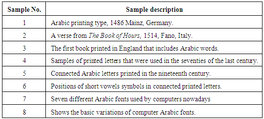
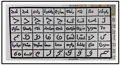
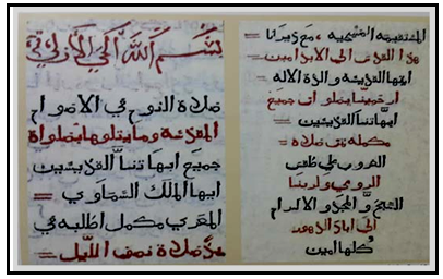
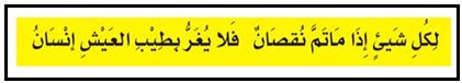
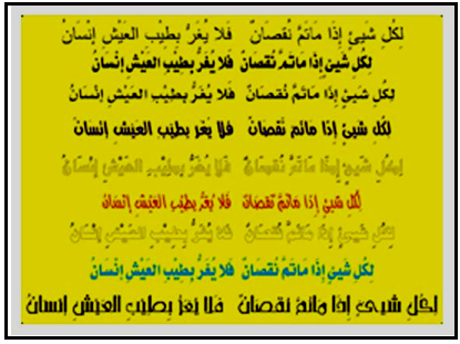
- Aesthetical and functional aspects of Arabic lettersAs writing has always been one of the two main means of language communication between civilizations, it needs constant care to be exact and correct. Writing which transfers texts, events, experiences and heavenly instructions, should have a certain level of perfection in order to safeguard social communication between individuals, groups, and nations.Obviously, understanding a written text can only be achieved through eyes, which see the letters first and transfer those letters to the mind to understand the meaning. Letters are known to be the type of form that facilitates reading and understanding the meanings of spoken languages. Accordingly, it's very essential to study letters carefully, examine it thoroughly and perfect its shapes and combinations to facilitate ease of reading and understanding. In other words, communication necessitated transferring information by the easiest and clearest means, expressions and gestures [3]. Ancient Arabs realized the importance of writing, thus they gave every single letter a distinct shape or shapes and joining methods to create different words [4].The main functional task of writing is recording and documenting information. Thus, enables individuals and groups to communicate successfully. One of the conditions to realize this task is clarity and readability that enables reading texts easily without any uncertainty, misunderstanding, or confusion. Arab writers and calligraphers made great efforts to not only perfect their written texts and calligraphy for readability but also to create artistic works that make reading enjoyable. The art of Arabic calligraphy has witnessed great fluctuations in its path of development; various different styles of calligraphy were created and perfected to achieve several objectives. This process continued until the aesthetic aspect of Arabic calligraphy has prevailed [5]. However, function and aesthetics were conceptually interwoven harmoniously in Arabic calligraphy. Accordingly, certain features of both functional and aesthetic dimensions of written Arabic scripts can be identified clearly as follows:FunctionArabic written scripts should be readable and easy to understand in a short period of time in other words, the reader should be able to read fluently and understand quickly because the time allocated for encountering writings is decided by the time spent on reading satisfactorily.AestheticsAesthetics is related to the variations of forms and compositions of the written texts in an isolated way from the reading process that overlooks the functional aspects of clarity and readability for the aesthetic and decorated appearance. One of the main features of aesthetics is diversity and variety of forms. Therefore, it's important to differentiate between the term (writing), which is spontaneous and relatively stable, and the term “calligraphy”, which reflects aesthetical and decorative diversity [5].The birth of Arabic printing lettersThe first printed Arabic written text was found in 1486 Mainz, Germany. The letters were designed by Erhard Reusch and were printed by Peter Schöffer who was apprentice of Johann Gutenberg. The letter that was cut from wood, looked naïve and was affected by gothic styles, which were dominant at Johann Gutenberg’s era [6], (Sample No. 1). According to [7] printed Arabic letters were found among other samples at the end of the fifteenth century and the beginning of the seventeenth century, shortly after the death of Johann Gutenberg. This marks the beginning of the western interest in printing Arabic manuscripts for explorer's books and for the Arab Christians in the Middle East [8] However, the first complete book written in Arabic letters was the Kitab Ulswaai (The Book of Hours) in 1514, (Fano, Italy) (sample No.2) which is considered the first printed book with separated Arabic letters found in Europe intended for Arabic-speaking Christians in the Middle East. There is still no definite information about this book, regarding the designer and why it was printed in Fano by Georgio de Georgio although Venice was the first printing centre in Italy.In England the first book printed in Arabic was designed by Wynkyn De Worde who worked as assistant for the first English printer, William Caxon, and took over his work after he died in 1491. This book was characterized by its separate letters with spaces between them [6], (Sample 3).At the beginning of the seventeenth century printing in Arabic letters was widely spread in Europe. Competition between Lyon, Rome, Paris and London in printing Arabic and Hebrew books increased further. This resulted in more interest in Arabic letters. Designers made more efforts to produce more adequate letters for printing. This again contributed to the increased interest in Arabic letters [6].After the invention of movable type printing, calligraphers continued to design the letters before being prepared for the letterpress. The engraver, who played a crucial role in this process used to engrave letters and prepare the metal casting mold, which produces the types in its desired shapes and parameters. In the sixteenth century in Europe, typesetters, printers and typographers had a key role in the printing process. Those craftsmen were neither Arabs nor Muslims, hence they couldn’t read Arabic. Accordingly, Arabic types were not good enough and the printed materials were not clearly readable. Although, letterpress printing did not witness major changes for almost four centuries, Arabic types were made and printed away from its homeland. Arabs at that time were not aware enough of the possibilities the letterpress could provide. That may have been caused by their self-content with the high level of perfection reached by Arab calligraphers and book copiers [9].Arabic printing types in the Arab WorldArabs used wooden molds for printing in the tenth century in Fatimid Egypt. Military orders were hand written on paper, and then fixed on an even surface of a wooden block. The space around the text was engraved creating a relief text. A wooden cylinder coated with ink was rolled on the raised text surface afterward; sheets of paper were pressed on the text to produce several copies. [10] According to [11] the first attempt to use Arabic printing types was in 1580, in Lebanon. The first Christian teachings book was printed in the Jesuits pastors’ printing press. The first printing press in Lebanon was established in 1610 in the (Monastery of Qozhaya) where Arabic books were printed with Syriac alphabet letters. The Book of Psalms was printed there.Syria was one of the first countries where printing Arabic types were used. The first printing press was established there in 1702. The first printing types were made by the deacon (Abdalla Alzakher). Boulaq Printing Press, which was established in 1821 in Egypt by Mohamed Ali Pasha, is the most famous printing press in the Arab World for using Arabic printing types from its start [8].Arabic writing in the light of ideal writingLinguists have developed certain rules and conditions for correct writing, known as vocal writing, or phonetic writing. According to these rules every sound should have a specific code and should not have more than one code. (One to one correspondence)?? If one of these rules was not followed in any alphabet this shall be considered a defect in writing according to scientific measures. This defect is referred to as under differentiation [12]. Another defect in writing is to have one sound that referred to with more than one letter (Allographs). According to these measures, [13] explains the problems of Arabic writing in the following:a) Short vowelsThere are three short vowels; each one has a special sign, Fatha, Kasra and Dhamma. These short vowels are not parts of the letters. This means there are two types of writing, one of them without short vowels and the other one with short vowels. Both of them raise questions and forms problems.b) Different shapes of the same letterArabic writing represents an ideal form of writing because every sound has a special letter. But each letter has different shapes depending on its position in the word, because it is either connected with the rest of the letters or not connected. This makes it difficult to learn and it raises the costs of production of the different shapes of the letters. The whole printing process with Arabic printing letters costs more than printing with other letters.c) Similarity of letters in their shapesMany Arabic letters look very much similar to each other. However, they differ in having certain dots. This again needs great efforts to place the dots in their proper positions. Moreover, the similarity between the letters and the dots are exhausting for vision, and a lot of concentration is needed to differentiate between the letters. Sometimes the dots dominate the letters.d) Letters are not proportional in sizeSome Arabic letters are very small and others are so large. Some of them are written over the line and others are written under the line. These ups and downs are not clearly governed by exact rules.Appeal to improve Arabic printing typesIn the thirties of the last century, the Academy of Arabic Language in Cairo invited linguists and other professional Arabs to submit proposals for improving the visual appearance of Arabic printing types. AAL called for moving from the old traditions of handwriting towards more advanced applications. Some of the many proposals made, were presented by the writer and novelist Mahmoud Taimoor, the writer Ali Algarim and the calligrapher Nasri Khattar who designed a typeface called the unified alphabet (Alabjadya Almutamathila) or the unified calligraphy or line (Alkhat Almutamthil). He proposed one shape for each letter which can be written not connected, like Latin letters, and which enables writing from left to right [13].It's worth mentioning that all the above-mentioned attempts were focused on changing the way of writing among Arabs and Muslims. These new solutions and designs for Arabic writing were very similar to the Latin counterparts. Those who made such proposals did not pay attention to the deep-rooted culture of Arabic writing traditions and that such changes could not easily replace the cultural values of the society. A clear example can be seen in what was written by [14], “The traditional Arabic letters were almost sacred due to the long tradition, although they are just symbols and not a genuine part of the language”.Such statements lead the conservative societies, who cherish their cultural heritage, to reject the novel proposals. One of those main proposals called for reducing the number of the symbols of Arabic letters from 300 symbols to 169 symbols. This was considered a useful step that would simplify the work of designers, producers and users of the Arabic printing types [15].Arabic letters and the development of digital printing systemsPrinting with Arabic types faced a lot of problems since its early start in the sixteenth century. One of the main difficulties was connected with the difficulty of capturing the exact beauty of the handwritten Arabic letter. Accordingly, the new designs, which conform to the technical constraints of printing technology, were not adored when compared with the beautiful handwritten forms of Arabic calligraphy [1]. Despite, the continuous decrease in the technical constraints related to the modern processes of printing, the development of Arabic printing types was very slow. The amount and quality of printed materials and type development, through five centuries up to the end of the nineteenth century, was very poor compared with published materials in other languages. Attempts to develop Arabic printing types faced a lot of difficulties due to the great number of symbol combinations for each letter. Designers were not able to achieve complete applications to one traditional calligraphy form. Although many attempts were made to solve this problem especially for the Naskh calligraphy, the result was disappointing. Moreover, different combinations of letters were not available especially for ligatures, because of the limited size designated to the typesetting tray, which doesn't allow for several combinations of types [9].The lack of a linear beauty in the current designs of Arabic printing types, compared with the beauty of the traditional calligraphy, is one of the main obstacles that need to be overcome. Some may blame the technical limitations of printing technologies that failed to provide solutions for printing the ideal shapes of Arabic types. However, those inherited limitations are only related to the nature and qualities of Arabic lettering techniques itself. These inherited limitations are summarized as follows:a) Arabic calligraphy by its nature is very flexible. This extendable flexibility is directly responsible of its transformation by calligraphers and artist into a subject of fine art.b) It was difficult to design combinations of more than two letters (ligatures) as one unit in traditional printing processes.c) The great empty space around Arabic letters, compared with Latin letters.d) The space between Arabic letters is designed according to Kashida, which guides the design layout, thus it complicates the design of types for printing based on Latin letters specifications.e) Arabic printing letters still lack a concrete system that enables the production of good designs [1].Philosophy of design of Arabic printing lettersThe deep-rooted calligraphy culture among readers in the Arab regions help them to notice very clearly the large difference between the beauty and elegance of traditional Arabic calligraphy and the poor designs of Arabic printed types. Even during the time of metal types printing (letterpress) printers faced the problem of having all letters on the same level despite the difference between Arabic ligatures. Sometimes the letters were disconnected from each other. Many printed materials suffered at that time from this problem. Only designers, calligraphers and printers cared for the aesthetic values of their work. Now more people like authors and readers are interested in having clear beautiful elegant letters that enable them to read better and easier [9]. This is why till today the Holy Quran and the special valuable documents are written by hand. The history of printing with Arabic types has witnessed a very slow and little success through its journey from the sixteenth century to the nineteenth century [1]. The absence of specialized institutions with a clear vision and philosophy that aims at improving the quality and printability of Arabic typography is possibly one of the main reasons for this dilemma. Most of the attempted solutions in this regard were based on Latin lettering principles and techniques. In addition, the accumulated results of these attempts were not comprehensively assessed and criticized by specialists [15].Hence every era has its own concepts and needs; great efforts are required to restore the beauty of Arabic calligraphy on computer screens. Today's users of computers are very difficult to satisfy because they expect the best results possible. Moreover, a perfect Arabic writing design that satisfies its users functionally, aesthetically and culturally is no longer a mere luxury. Researchers and specialists in this field have to start developing better methods, techniques and designs to fill this gap and to keep the traditional skills and heritage alive in the twenty first century [15].Preserving traditional methods of writing connects people with their heritage. This is why former and current calligraphers kept developing and preserving old types of Arabic calligraphy throughout history. The different symbols and marks used to distinguish between letters like the small circle symbol, which is used on top of silent letters, in addition to several punctuations, were developed from Latin languages. Nevertheless, these efforts did not change the original types of Arabic writing and its main features that are preserved by the Quran [16]. It is very important to mention here that utilizing computers to assist Arabic writing brings forward a number of assumptions that need to be carefully addressed. The use of computer should mainly serve the methods and techniques of Arabic language in general and not to be forced to conform to technological limitations without a struggle. This should be the task of the linguists, researchers and calligraphers, who are not necessarily obliged to adhere to other specialists' requirements; nevertheless, they have to fight for their noble goals [16].According to [15], Arabic designers should not necessarily follow the methods and techniques of traditional calligraphers to produce better Arabic typography. They can be inspired to design new printing types according to new aesthetic concepts and visions. The new designs can take new shapes that reflect simplicity, clarity, and suitability for its environment.In this regard [17], stated that the rule of (simplicity of forms is the key in printing) hinders the search for a more practically successful solution that ensure the required needs of printing technology and also preserve the beauty of the handwritten Arabic. Moreover, the attempts to avoiding these constraints practiced by some contemporary designers who limit printability to certain traditional types, such as the Old Kofi type (developed in the Third Hijri century) and its variations, are held responsible for the current wide spread of weak Arabic typeface designs.Methodology and proceduresThis study utilizes both content analysis method and descriptive methodology, in which formal characteristics of samples are objectively described and analyzed [18]. According to [19], content analysis is used by researchers in various fields to describe and analyze forms and contents of the studied materials based on research questions and hypotheses. The descriptive methodology in which certain phenomena is scientifically described, analyzed and interpreted [20] is used as a secondary approach.Research toolsAccording to [21] research tools are the means used by the researcher to find facts, information and data, which are needed for the study. In this study, the researcher used observation as a tool to describe the samples. Observation is the use of the senses and the mind to study a certain group of phenomena to examine their characteristics and features, regardless of its clarity, ambiguity, and the amount of effort it need to be identified [22]. Nevertheless, there are many types of observation. The researcher used the “exact and regular observation” as defined by [23] as the most exact observation of the different aspects of the study phenomena, in order to reach exact assumptions. This type of observation needs description, precise and well-organized records.Study samplesThe Study's samples are purposively selected examples of Arabic printed scripts from different historical eras. These purposive samples are chosen based on the researcher's experience, knowledge and familiarity with its contents. According to [24], purposive sampling selection guidelines are decided by the researcher according to certain aspects found in the samples content that fulfil the study objectives successfully.Size and description of samplesThere are eight samples of study with different sizes shown below:
 | Sample No. 1 |
 | Sample No. 2 |
 | Sample No. 3 |
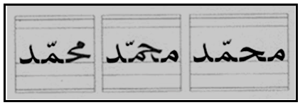 | Sample No. 4 |
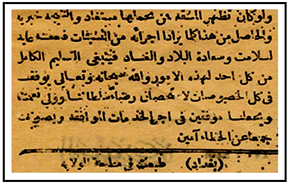 | Sample No. 5 |
 | Sample No. 6 |
 | Sample No. 7 |
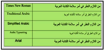 | Sample No. 8 |
4. Discussion
- As previously explained in the theoretical framework of this study, it's apparent that many researchers have pointed to shortage of well-designed Arabic typefaces used in computer aided typesetting in one hand. On the other hand, the number of the less appealing, badly designed and defected typefaces is increasing. This increase is said to have been caused by the increase in the number of well-developed software and its users. In this regard [17] says the availability and affordability of technology nowadays made it easy for everyone to produce pseudo-designs especially in the field of graphic design in general and font design in specific. Although it's impossible to prevent armatures from designing, the responsibility falls on the shoulders of experts and Arabic language specialists to stand against this flood of digital ugliness and promote professionalism through all available means. Continual production of badly designed Arabic printed materials with badly designed typefaces and fonts does not only result in harming the inherited values of Arabic writing system, but also destroys the traditional Arabic calligraphy and the Arabic language as well. Therefore, Arabic language speakers, in general, should be aware of the consequences. More specifically, design awareness and design appreciation should be raised among commercial circles and businesses since they indirectly encourage such ugliness through hiring and accepting the work of amateurs. Accordingly, the advances in technology can't be held responsible for being abused by such amateurs.Based on the historical analysis of the study, it's realized that typesetting techniques were originally developed to facilitate printing Latin letters. Later on, this technology was further developed to conform to a large number of other languages' lettering techniques. However, one of the most asked questions by researchers is, whether printing technologies should conform to Arabic writing necessities, or the vice versa? This study shows that both approaches were attempted successfully. In one hand, several developments were made by printing technologists to facilitate printing Arabic texts in the best possible way. On the other hand, many alterations were also made to the Arabic letters design and writing techniques to conform to printing technologies. For example, the position of the Kasheeda in Arabic handwriting is drawn as a curve, whereas in digital printing design it is drawn as a straight line. This proves that the convergence between the two has become a reality, and consequently, printed materials quality has considerably improved. However, specialists should do more efforts to achieve more convergence in ways that preserve and strengthen the cultural bond between the principles of traditional handwritten Arabic and modern digital means and techniques of design and printing. Critics and concerned experts occasionally doubt the positive role of printing technologies on Arabic calligraphy especially, in terms of adding equivalent aesthetic values. This doubt stems from a misconception that Arabic calligraphy and Arabic writing is comparable. Arabic calligraphy has become well established in the Fine Arts. Much esteem Art schools around the world teaches courses in Arabic calligraphy principles and techniques. However, efforts have been exerted more towards perfecting the printing of Arabic letters meant for general writing purposes and not the Art of Arabic calligraphy. Arabic writing is a general term that includes the lettering system that transfers knowledge and documents scripts. Arabic writing focuses more on the functional aspects of letters that facilitate readability and economics of printing. This functional role of Arabic writing has always been the driving force for its numerous formal developments throughout history. In other words, formal developments of Arabic writing were merely a consequence.
5. Conclusion and Main Results
- The samples of this study aims to give a brief historical background to the main development phases of Arabic printing letters. Sample No.1 shows the early beginnings of Arabic printing letters, whereas sample No. 8 represents the latest developments. It's obvious that Arabic printing letters faced different challenges and constraints since its early beginnings. The first printed letter designs were justifiably immature. Its appearance was not aesthetically fulfilling compared with the traditional Arabic handwritten letters. Furthermore, the development of Arabic printing letters (see samples from 1 to 5, before the use of computer aided designs) was so slow compared to the accelerated developments after the implementation of digital technologies (see samples from 1 to 8). The resultsThe results of the study are shown as follow:1. Computer technologies, although, were originally developed to aid the design and printing of Latin letters, have significantly aided the development of other written languages around the globe. 2. Digital technologies mustn't be held accountable for the immaturity of Arabic printing letter designs. 3. Aesthetical, functional, economic and cultural aspects of Arabic typography are witnessing a significant progress in the age of digital technologies prevalence. 4. Arabic printing letters fulfilled their functional role conforming to the technological development in printing.5. Arabic typography in general has witnessed a great leap from the first attempts to transfer handwritten scripts into printed copies mechanically to digital production. RecommendationsThe following recommendations are based on the accumulated results: 1. Arabic typography should be assessed according to its functions as opposed to its fine artistic formal qualities that distinguish the Art of Arabic calligraphy.2. Specialists should do more efforts to achieve more convergence between printing technologies and Arabic typography without compromising culture. 3. Further researches and scientific studies are crucially required to clarify the terminologies of Arabic typography and to develop more advanced concepts.