-
Paper Information
- Paper Submission
-
Journal Information
- About This Journal
- Editorial Board
- Current Issue
- Archive
- Author Guidelines
- Contact Us
International Journal of Traffic and Transportation Engineering
p-ISSN: 2325-0062 e-ISSN: 2325-0070
2016; 5(3): 47-63
doi:10.5923/j.ijtte.20160503.01

A Comparison of Traffic Performance in Highly Congested Urban Areas
 Abstract
 Reference
 Full-Text PDF
 Full-text HTML
Melissa Humphrey1, Scott Dona2, Amarjit Singh3, Thin Thin Swe3
1Project Engineering Intern, Layton Constrn. Co., Honolulu, USA
2Project Engineering Intern, Hawaiian Dredging Constrn. Co., Honolulu, USA
3Dept. of Civ. Engrg., Univ. of Hawaii, Honolulu, USA
Correspondence to: Amarjit Singh, Dept. of Civ. Engrg., Univ. of Hawaii, Honolulu, USA.
| Email: |  |
Copyright © 2016 Scientific & Academic Publishing. All Rights Reserved.
This work is licensed under the Creative Commons Attribution International License (CC BY).
http://creativecommons.org/licenses/by/4.0/

Each year, traffic conditions continue to worsen around the world due to growing populations, denser concentrations in urban areas, and deteriorating road conditions. Traffic congestion contributes to negative outcomes on every scale of the economy -- global greenhouse gas emissions and atmospheric pollution, millions of dollars lost annually in commute times and vehicle repairs, and even stress-related health problems on the individuals affected. Of the ten major cities in USA that have the highest levels of congestion and impacted travel times, six are located in the western region of the country. This paper will analyze the contributing factors such as travel distance, urban and commuter populations, and public transportation utilization to correlate their effects on overall commute time, congestion percentages and costs, and the health impacts on the communities in those six cities. It is observed that these factors that contribute to congestion levels are interdependent, and therefore cannot be individually isolated for study. It is for this reason that a Data Envelopment Analysis approach was utilized to analyze the traffic system performances and their relative efficiency, in order to determine which cities perform better than others and for what reasons. However, it was discovered that all six cities perform the same, for good or bad, yielding a relative efficiency, E, of 1.0 each, implying that there is no distinguishing feature or pattern of any one city over another, as related to traffic performance.
Keywords: DEA, Linear Program, Efficiency, Western United States
Cite this paper: Melissa Humphrey, Scott Dona, Amarjit Singh, Thin Thin Swe, A Comparison of Traffic Performance in Highly Congested Urban Areas, International Journal of Traffic and Transportation Engineering, Vol. 5 No. 3, 2016, pp. 47-63. doi: 10.5923/j.ijtte.20160503.01.
Article Outline
1. Introduction
- There are several arguments surrounding congestion and its primary cause, as well as numerous proposals regarding the best solution. However, most arguments tend to either be politically motivated or myopic; focusing only on the problem that is the most relevant to their situation, and ignoring the relationships of the mutually dependent components across the system. For example, an argument for implementing tolls in highly congested areas (King et al. 2007) was suggested as a way of deterring commuters and generating millions of dollars in yearly revenue, which would then be put back into road maintenance and other public works programs. However, the authors explicitly stated that their argument was founded “not in abstract fairness but political calculation” (King et al., 2007), as it ignored the impacts that toll stations would contribute to congestion levels and the increased cost effects community-wide. Another study by Mondschein et al. (2015) focused primarily on the effects of congestion on local businesses and industries, and simply discovered that congestion had no substantial impacts on economic activity in congested areas. While only analyzing the congestion percentages in LA county and its impacts on accessibility to economic services, the Mondschein et al. study was more comprehensive than King et al. in its review of the effects felt by the community, and argued that congestion only directly impacts the members of the community, rather than the overall economic system. In both of these cases, the conclusions drawn were very promising, yet limited to the fact that the number of parameters analyzed was quite minimal. As the American economy continues to thrive and grow, the people fueling it are finding desirable and affordable housing options harder to come by. Urban city centers are often where the majority of high paying jobs are located, but often do not have the residential infrastructure to support the influx of workers in these cities. This housing shortage contributes to inflated living costs, as cities like San Francisco have seen the median rent price of an apartment increase 50% in the past four years (Cima and Crockett, 2015). It is because of this trend that families and potential homebuyers have to look farther and farther away from these cities in order to find affordable housing options. “Families with high levels of education and high levels of professional achievement, who think of themselves as homeowners, face a widening gap between what they earn and what housing costs,” (Shenin, 2015). As more families look for housing farther away from their jobs, traffic congestion and commute times have seen a steady climb across the country for several years. A Data Envelopment Analysis (DEA) of transportation systems was done to analyze road system performance and safety risk evaluations (Fancello et al. 2012), by studying road networks surrounding eight Italian cities. The study considered a multitude of factors such as number of vehicles, public transportation options, accidents, and average travel time to analyze which cities were most efficient in providing safe options for access to their cities. However, the cities chosen for Fancello’s study were all of similar size in population and net area in order to allow for a direct comparison, which is only relevant to a small cross-section of the country. No other study involving DEA for measuring traffic performance was discovered in the literature. This paper will attempt to recognize multiple parameters within the traffic systems surrounding notoriously congested cities, all of which vary in size and population, in order to discover which city, if any, are relatively more efficient than others, and, if so, for what reason(s).
1.1. Background
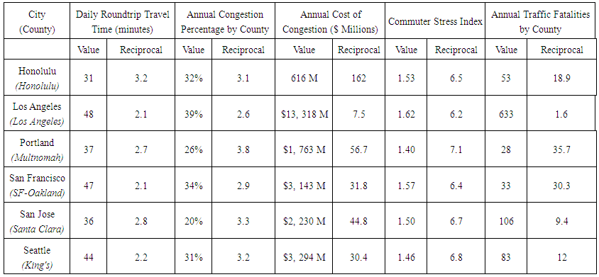
- Each year, several new rankings are released identifying the cities with the worst traffic congestion in America, based upon their own set of criterion. The ranking selected for this paper was the TomTom® 2015 Traffic Index, which ranks the worst cities in America based upon congestion percentages by cities that experience the highest levels of congestion. The cities selected for this study were those in that top ten that belong to the Western United States, as given in Table 1.
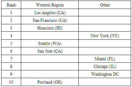 | Table 1. U.S. Cities in Top Ten for Worst Congestion Levels |
1.2. Objective
- The aim of this paper was to study the relative performance efficiencies of the counties surrounding heavily congested cities within the Western United States, and to identify the parameters contributing to their performance. This was done to establish an understanding of their relative transportation systems, in order to measure if they are operating inefficiently given their current conditions, or if there is a particular parameter operating so poorly that it is compromising the rest of the system. There is no extension given herein for policy prescriptions or suggested remedies. The study is purely comparative because that is an interesting question in and of itself that the public at large is often interested in.High traffic performance is defined as a system that has low congestion, fewer traffic bottlenecks, fewer accidents and fatalities, faster commuting times, lower commuter stress, and lower lost labor productivity hours. The efficiency of this performance is measured against input values such as travel distance, available lane miles, road repair maintenance budgets, public transit ridership, number of commuters using personal vehicles, and population density, as these are what we build into the traffic system to input as the design characteristics that eventually result in the differing performance levels. The analysis is anchored in conventional traffic congestion and capacity concepts. As such, paradoxes of capacity addition are not considered in this research.
1.3. Scope
- The project scope was limited to the top six cities in the Western United States having the worst congestion levels. This was done to allow an in-depth analysis of the systems and their various characteristics within the time available to the researchers, while answering an interesting question pertaining to the Western United States. The input and output variables compiled for this report were based upon county statistics rather than the individual cities called out on the traffic index. This was based on the assumption that the members of the surrounding county were the ones commuting into the city centers, rather than the city residents who would not need to commute, and therefore contribute to overall congestion. This report also considered both surface roads and highways within the county when calculating lane miles, congestion percentages, and associated costs. It was observed that current transportation data was more readily available at the county level, rather than at the individual city levels, which is why data and congestion analysis was performed at the county level. In all cases, the most current data available was included in this study. (The year of current date varied from 2009 to 2015. Not all data is collected yearly).
2. Methodology
- The Data Envelopment Analysis (DEA) approach was adopted, through the use of the common linear programming software, Lindo1. The DEA is a common mathematical technique in operations research to interrelate complex inputs and outputs. As such, the DEA is a very powerful tool to compare the performance of similar systems. DEA has been used extensively in numerous industries for scientific comparison analysis (Winston, 1991). The DEA analyzes the input-output performance of complex and simple systems while leaving the interrelationships between the inputs and outputs intact. This approach allows for an analysis of a complex system (in this case, the traffic system) without having to isolate the various parameters. A common engineering method of analyzing efficiency is in understanding the ratio of outputs to inputs, where groups that produce high levels of desired outputs without requiring high levels of inputs are considered to be very efficient. Similarly, groups that require high levels of input resources while only producing minimal desired outputs are considered to be inefficient, as they are under-utilizing the resources available. By comparing all parameters in the same linear program, it allows deficiencies to be discovered while still considering their relationships and impacts on each other and their systems. This is done by creating a hypothetical composite county, which is a weighted average of the combination of all units in the reference group (in this case, the six congested counties). The inputs and outputs for the composite county are determined by the weighted averages of the inputs and outputs of all counties, along with the varying weights associated to them based upon their overall impact on the system (Winston, 1991). This composite county serves as the base group, against which all individual counties will be compared. If the efficiency levels of the counties are found to be less than those of the composite county, those counties are considered to have deficiencies. If the efficiency values of counties are equal to those of the composite group, those counties cannot be considered more inefficient than their composite group. The success of the linear program model is dependent upon the relationships of the inputs and outputs, and that all variables contribute towards the same overall outcome. For instance, some input values directly contribute to higher levels of congestion, while some serve as active remedies. It is for this reason that the reciprocal of some input and output values are required for the sake of consistency in the linear programming model, and are described further in their respective sections.
3. Inputs
- The selection of inputs is a critical, yet difficult process. There are an infinite number of causal factors to any given scenario, if not limited to an appropriate and reasonable scope. To select the appropriate inputs, it must first be determined what data is available, and then how to apply specific parameters to the data that would be productive and useful to this research. The following input variables were identified as the primary causal factors for congestion, as they directly affect the outcomes and resulting impacts on their communities. Eight particular variables were chosen for analysis, as they were considered the most prominent factors in congestion calculations. These inputs and their values are qualified and explained in further detail in the following sections.
3.1. Population Density within County
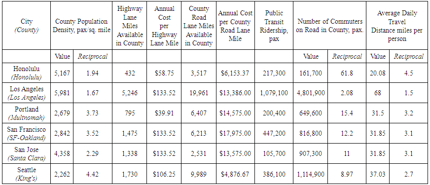
- Population density is a crucial factor that must be considered when analyzing any one particular concentration or city/county. Density control plays an important role in community development and zoning, as it helps determine the appropriate allocation of available resources amongst a given population, so that these communities are sustainable and live within their means. Considering the scope of this paper was to analyze the relative efficiencies of the county traffic systems, the density of each county was identified as a necessary factor for this study.Population density quantifies the number of residents per square mile within the county limits, and was based upon the information compiled in “Urbanized Areas” (2014) by the U.S Department of Transportation. The density values were obtained by dividing the county populations by the square mileage of each county that the city in question resides in (Table 2). This is an effective and practical method for finding this parameter and using it in the DEA2. It is presumed that the counties with higher densities would experience higher congestion levels, as the transportation resources available within the county limits would be more impacted due to higher levels of occupancy and daily use. The reciprocal of this value was used to the DEA model because higher densities contribute to higher levels of congestion. In order to obtain high efficiency, low levels of congestion are required, and thus need to be measured against reciprocated densities.
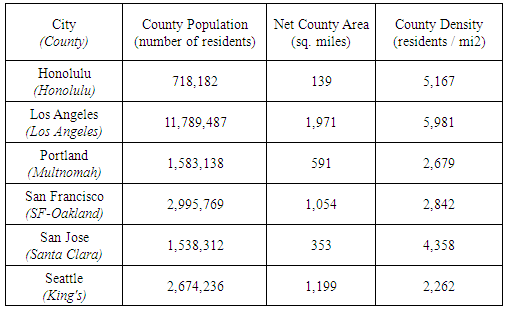 | Table 2. County Density Calculations |
3.2. Available Highway Lane Miles within County
- The highway lane miles were considered for this report as it differs from the actual travel distance, because it quantifies the number of available lanes per highway within the given county. For example, twenty miles of a five-lane highway would actually contribute one hundred available lane miles, rather than the actual length of twenty miles, which would allow for a higher number of commuters at a given time, and arguably decrease congestion levels. The number of highway lane miles is tracked in “Urbanized Areas” (2014) by the U.S. Department of Transportation, and is defined by the amount of available highway miles within the county limits. It was assumed that as the number of available lane miles increased, those counties would experience less overall congestion, as there would be more infrastructure to support their commuter populations. This conventional view of traffic supply and demand has been adopted in this article for good reason because it is able to simulate a vital behavior in traffic performance. Consequently, the researchers find there to be no pressing need to consider arguments of more involved factors in this comparative study, such as induced demand3. This is because the behavior of drivers in all cities is the same across the Western United States. So, the relative difference in traffic increase between one city and another is expected to remain the same irrespective of whether induced demand or conventional demand principles are applied. The actual values of available highway lane miles within each county are given in Table 3.
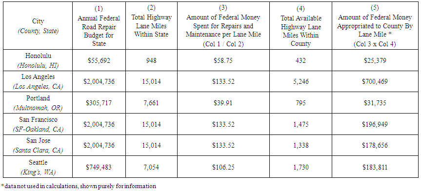 | Table 3. Federal Budget Appropriation Calculations by County |
3.3. Annual Federal Road Repair Budget per Lane Mile
- When considering congestion, it is not enough to consider only the quantitative data of how many lane miles are available; would you be more willing to travel on several damaged roads littered with potholes or one brand new one? It is for this reason that the conditions of the available lane miles must also be considered, as poor road conditions potentially contribute to higher numbers of accidents, traffic bottlenecks, and ultimately, increased levels of congestion. The Federal Government is charged with the repair and maintenance of federal roads, which are classified as interstate highways, and administers money to the states in one annual lump sum each year. The distribution of federal money to each state and county is based upon a specific formula that was not available for this research, so this value was manually calculated based on a logical approximation, used in a similar case study performed at the University of Wisconsin (Adams, 2011). This value was found by first obtaining the most current annual federal budget, and the percentage allocated to highway repair and the number of available highway lane miles within that respective state. By appropriating the dollars spent for highway lane miles statewide proportionally to the number of highway lane miles within the county, an estimated value of federal money allocated to highway repairs per lane mile was discovered. Higher annual budget amounts were assumed to result in better road conditions, as the money would be spent towards improving poor or dangerous road conditions, resulting in less congestion and delay time. Though road use also impacts the quality of roads, it is seen that governments will spend money on repair of roads in proportion to the damage caused by use. Hence, tracking the budget dollars on road repairs is a valid measure of road quality.
3.4. Available County Road Lane Miles
- While highways are often cited as the primary locations of congestion, it would have been illogical to assume that congestion is isolated to exist only in those locations or that surface road congestion and highway congestion are unrelated. For this reason, the available lane miles of all county freeways, arterial roads, and surface streets were also considered, as several commuters seek alternative routes to and from work on these roads every day. In some cases, commuters seek to travel by only utilizing surface streets. However, often times these roads were not designed to accommodate the increased levels of traffic, especially during peak hours. It is for this reason that the number of available lane miles of all roads - excluding the previously quantified federal highway lane miles - was calculated in order to identify their capacities to support their county population densities. The number of available roadway miles within each county was manually calculated, based upon data gathered by the U.S. Department of Transportation Federal Highway Administration in “Urbanized Areas, Selected Characteristics” (2014). For each of the six cities under review, the total city and county lane miles were calculated by subtracting the total highway lane miles (found earlier) from the overall total number of roadway lane miles. Refer Table 4.
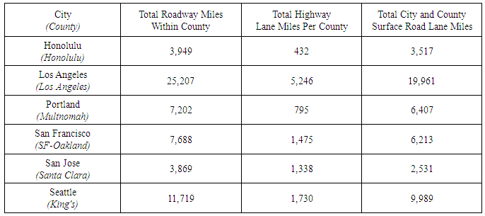 | Table 4. City and County Lane Mile Calculation |
3.5. Annual County Road Repair Budget per Lane Mile
- In order to analyze the available county road lane miles, the conditions of these roads must also be considered, as their conditions ultimately determine their performance. The maintenance and repair of all city and county roads is tasked to the state and county governments. The amount of money allocated per lane mile for county roads was found by first identifying the county road repair budgets, and dividing them by the number of surface road lane miles available within that county (Table 5). The premise behind this value is that counties with higher road maintenance budgets per lane mile would have better road conditions, and therefore experience lower levels of congestion and accidents, resulting with better traffic performance.
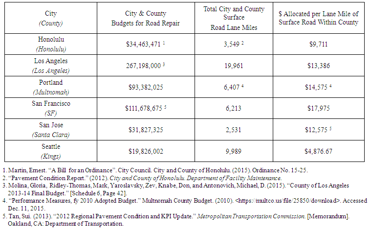 | Table 5. County Budget Appropriation per Lane Mile of County Road |
3.6. County Public Transportation Ridership per Year
- The percentage of commuters who utilize public transportation must also be considered, as this number reduces the number of vehicles on the road, and therefore theoretically reduces overall congestion, which theoretically serves to reduce accidents. The annual ridership statistics were reported in the “National Transportation Statistics” (2015) produced by the Department of Transportation, and quantify the average number of commuters within each county that get to work by riding public transportation each year - bus, train, subway, etc. The Department of Transportation includes taking taxis as public transportation, which averaged around 1% of the total population for each county in question. Considering this value is consistently small for all counties, it was ignored on the assumption that it would have no significant impact on the efficiency measures, since the left and right sides of the DEA equation would be equally less by 1%, making for essentially the same equation. But, the premise behind the variable of public transit ridership is that as it increases the congestion levels decrease. Thus, the traffic performance will be better if public transit ridership increases.
3.7. Commuters Traveling in Personal Vehicles in County
- This number is an approximation of the population commuting in their personal vehicles every day, ultimately those affected the most by high levels of congestion and elongated commute times. This value was chosen, rather than the number of registered vehicles within the county, as it was recognized that not every vehicle is driven on a daily basis, and would not serve as an accurate representation of commuters. The number of people who commute were calculated by the Texas Transportation Institute (“Mobility Data”, 2015a, 2015b, 2015c, 2015d, 2015e, 2015f), which produces a Mobility Scorecard for hundreds of urban areas across the county each year. By subtracting the number of commuters who report to riding public transportation, it provides an estimate of the number of commuters who travel to work by car, as seen in Table 6. The assumption made for county populations was made for the number of commuters within the county; cities with larger commuter populations are likely to experience higher levels of congestion, which means decreased traffic performance. It is for this reason that the reciprocal value was included in the report, again for the consistency amongst variables. The number of commuters by public transportation may include “occasional” users of public transportation systems – such as those who use public transport systems once a week or once a month. However, such data cannot be extracted from the Mobility Data to get the real daily number of private vehicle users in the county. Further, because this information is likely to have the same approximate pattern across the major cities, the effect will neutralize in the DEA.
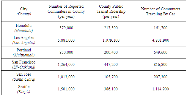 | Table 6. Number of Commuters Traveling by Car |
3.8. Average Daily Travel Distance per Commuter
- While there are several complex characteristics that affect the congestion and overall commute times for certain riders, average travel distance directly impacts the commute time experienced on a daily basis. For instance, the commuter who is traveling fifty miles to work should logically expect to spend more time traveling than the commuter who is traveling only twenty miles of commuting in scenarios of comparable resources and conditions. Considering this, longer commute times for riders translates to more commuters and vehicles on the road for longer periods of time, translating to higher and longer periods of potential congestion. The average commute distances were calculated by the Federal Highway Administration (“2009 NHTS Daily Person Trips per Person”, 2009), and represent the number of miles a person travels daily in their commutes (one-way) to work within that county. It must be noted that the distances serve as an overall average of the county, which includes some people who commute five miles to work and those who travel fifty miles. This average naturally did not include those who work from home or remotely. As travel distance increases, the overall performance suffers, as there are higher levels of congestion because of longer travel times. It is for this reason that the reciprocal of this value was taken for the DEA model. Values are presented in Table 7.
 | Table 7. Compilation of All Input Values Used in DEA Model |
3.9. Input Summary
- All of the input values are compiled in Table 7. Reciprocal values are taken for three parameters for the DEA analysis -- population density, number of commuters, and average daily travel distance.
4. Outputs
- Outputs are considered the resulting values, which are the resulting observed performance and behavioral characteristics of a system. The performance of these values is very important when analyzing the efficiency of an overall system, as any system is designed in order to produce the desired set of outcomes on a consistent basis. If the output system deteriorates then something is to be said for what can or should be done with the inputs. The following parameters were selected as output parameters, as they were considered accurate representations of traffic systems. Further, they are frequently interrelated, feeding into each other, thus playing an integral role in overall system performance.
4.1. Travel Time
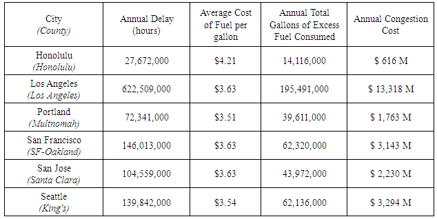
- As a result of congestion delays, travel times to and from work are growing longer and longer over the decades for commuters in these six congested American cities. The average travel times were based off the data provided in the most recent U.S. Census (“Quick Facts,” 2014), and reported the average time from home to work (including waiting for public transportation, picking up carpool members, etc.) in one direction by workers aged 16 years and older within that county. For this study, the one-way travel time value was doubled in order to reflect the average time spent traveling to and from work every day. The average travel time was obtained by dividing the total number of minutes reported by the total number of workers, but obviously did not consider those who work from home or remotely. The travel times reported by the Census were considered average travel times during free flow periods, and did not represent true travel times experienced during peak hours or the travel times of those commuting long distances.It is for this reason that delay time was factored into overall congestion cost, which will be explained in the following section. It was assumed that travel times and congestion percentages were mutually dependent variables; as one increases, so does the other, and vice versa. Longer times spent traveling mean there are more cars on the road for longer periods of time, which translates to increased potential for contributing to congestion levels. In reverse, as well, as congestion levels increase, it is likely that travel times will become longer.
4.2. Annual Congestion Cost per County
- While the primary losses due to congestion are often measured in time, the financial equivalent must also be considered in order to fully comprehend the impacts of congestion felt on a community-wide scale. In conjunction with the classic phrase, “time is money”, this variable attempts to identify the value of lost labor productivity while sitting in traffic to and from work each day. The values for this variable were originally calculated by Texas Transportation Institute (TTI) (“Mobility Data”, 2015a-f). Annual congestion costs were calculated by considering excess fuel consumed in traffic while also assigning an hourly value for time lost. The hourly wages were $17.67 per car driver and $94.04 per hour per truck and commercial truck driver; fuel prices were based upon the state average cost per gallon. While TTI’s exact calculations were not available for verification, the values and costs they used for calculating annual congestion cost are listed in Table 8.
 | Table 8. Feed for Congestion Cost (Texas Transportation Institute “Mobility Data,” 2015) |
4.3. Congestion Percentage
- This variable quantifies the drastic changes in congestion levels seen during peak commute times, in order to analyze the efficiency of the system’s capability to accommodate their massive commuter populations. The congestion percentages were calculated per city and surrounding county by TomTom for their annual traffic index, and were calculated based upon the increased travel time and number of cars on the road during peak hours compared to times of free flow travel (“TomTom Traffic Index”, 2015). The higher percentage values correlate to cities that experience greater levels of congestion. Surface roads and highways can handle only a certain number of cars. The higher the congestion percentage is, the more likely a roadway will reach its capacity. Too many cars in the system will lower the roadway’s level of service, which is a measure of the quality of traffic.
4.4. Commuter Stress Index
- Commuting causes stress due to the unpredictability of the travel times and conditions during congested periods, and has both short-term and long-term effects. People often show signs of frustration, boredom, and depression if forced to sit in a car alone for long periods of time. Longer expected commute times also result in commuters leaving their homes earlier and arriving home later, sacrificing time for sleep, health, and personal relationships in order to make it to and from work on time. Aside from the mental effects of congestion, the human body experiences serious health effects from higher stress levels and longer periods of sitting.This variable denotes the differences in stress levels experienced by commuters during peak hours versus those in free flow periods. The higher index values indicate that commuters experience a greater level of stress during peak times due to congestion (“Annual Urban Mobility Scorecard”, 2015). It was observed that there is a direct correlation between commuter stress and congestion percentages. Table 9 carries the data for the commuter stress index.
4.5. Annual Traffic Accidents Resulting in Fatalities
- Higher levels of congestion translate to larger volumes of cars on the roads and distracted, aggressive, aggravated drivers. These increase the possibility of accidents, some so severe that they result in fatalities. The National Highway Traffic Safety Administration provides the total amount of traffic fatalities in each county resulting from car crashes, including those that result from speeding, rollovers, and roadway departures to intersection related crashes (“State Traffic Safety Information”, 2014). Though this data doesn’t reveal the number of accidents, the amount of fatalities provides a statistic that can be used to measure safety performance. The more traffic fatalities a county has, the worse its traffic performance is, including, perhaps, at the overall level, as well. It is understood that traffic fatalities may result from human error, but transportation systems still can protect drivers from incidents by having wider lanes, shoulders, more lane miles, and the capacity to move people through their systems quickly enough to decrease the possibility of these incidents. While the traffic systems are primarily designed for efficiency, the safety of those traveling on these road networks must be a large priority. Thus, traffic fatalities are an important parameter that must be considered when analyzing system performance. Table 9 carries those statistics.
4.6. Output Reciprocal Values
- All of the selected output variables previously mentioned are considered to be negative results from poor traffic system performance. DEA models are used to determine overall efficiency, and measure the relationship between inputs utilized and the production of desired outputs. In the case of this analysis, none of the output values are desired, and therefore need to be minimized. It is for this reason that the reciprocal for each output value was used for the DEA model, and can be seen in Table 9.
 | Table 9. Compilation of All Output Values Used in DEA Model |
4.7. Other Parameters not Included for this Research
- While this study formulated a comprehensive analysis considering a multitude of causal factors and results of congestion, it was recognized that not every variable could be included. This is due to the fact that data for some parameters was either unavailable or difficult to quantify, or if included, would not likely make a comparative difference. However, it is believed that their relationships and impacts need to be mentioned for the sake of a complete understanding.
4.7.1. Weather
- Weather plays a large part in roadway conditions and traffic congestion. However, this data and its relative effects were difficult to quantify, especially in relation to specific cities. For example, the effects of snow and heavy rains of the roadway conditions in the Pacific Northwest were difficult to compare to the impacts of heat waves in California or the rains in Honolulu. It was also difficult to calculate the scale of impact, as the California Highway Patrol reports a 203% increase in the number of accidents and delays on rare occasions of rain (Smith, 2015), while Seattle experiences an average of 156 days of rain per year (Sistek, 2015), and Honolulu 154 days. In addition to simply slowing down traffic, rain and snow deteriorate asphalt pavements. It was due to the understanding that each area has their own set of perennial challenges unique to their weather systems that the impacts caused by weather are equal across the cities, besides being too difficult to quantify, and were therefore excluded from this study.
4.7.2. Daily Trips Per Person
- All data taken at the county level - commute time, average distance, number of vehicular commuters, associated congestion costs - was assumed to be an analysis of those commuters who only make one trip to and from work each day. This assumption excludes those members of the population who make multiple trips per day, if in the case that they work multiple jobs or need to make multiple trips (to drop off/pick up family members, errands, etc.). While multiple trips in congested areas could contribute to higher commute times and costs per commuter, these values would have been quite impossible to discern and compute from the given averages, and therefore was not considered in the parameters of this study.
4.7.3. Construction Projects and Associated Delays
- Most of these city centers are constantly dealing with construction projects - both new and renovation - in order to maintain and expand to match their growing populations. It is assumed that construction projects contribute to overall congestion, by either causing lane closures or roadside distractions for drivers. This is considered a global constant, as each city experiences their own unique problems with their own construction projects and locations. These specific projects and their impacts are considered equal in all cities, besides being too difficult to quantify, and therefore were not included in this research.
4.7.4. Special Events and Attractions
- All of the major cities selected for this study are centers of economic activity, have large population centers, and thus often have attractions, venues or events to generate a steady flow of revenue and income. Considering there are various types of attractions and events in each city on an almost daily basis, their effects were too difficult to quantify, and their impacts on congestion too difficult to discern from the regular congestion. It is for this reason that special attractions and events were not considered for this study.
5. Input-Output Relationships
- As previously mentioned, several of the input and output parameters all share some relationship with one another, and their influences impact the performance of the overall system. The interactions are definitely very complicated. It was recognized that various input variables not only affect output variables, but that they also impact other input values. The same is true for output variables. For instance, increased population densities and number of commuters on the road will naturally reduce congestion, travel time to work, commuter stress, traffic fatalities, and thus the cost of repair and renovation of the traffic system. The more the highway and surface road lane miles, the lesser is the density of cars on the road, and so there is lesser congestion and lesser chance of fatalities, more opportunity to take alternate roads so as to reduce travel time, and thus reduced lost labor productivity. As the repair and renovation budget increases at the federal and state level, all the output values can be expected to reduce because various improvements create for a more effective traffic system. The increase of public ridership has the same effect on output values as the repair and renovation budget.There is an intra relationship between the output values, as well. For example, any time congestion increases, the travel time, commuter stress, fatalities, and congestion costs stand to increase. The same can be said for all other output parameters when travel time or fatalities increase. However, commuter stress doesn’t rise on its own unless some other factor causes it. Congestion cost increase/decrease is a function of producer prices and the minimum wage, but increase any time traffic slows down, congestion increases or fatalities increase; commuter stress, by itself, doesn’t stand to raise congestion costs.Intra-input relationships are more complex. For many of them, there is no direct relationship, and it is quite difficult to say what the indirect effect may be; and, in some cases there is no relationship at all between different input parameters. The relationship between the input and output values are reflected in the reciprocal values taken for each. It is because of these interdependent relationships that the DEA method is particularly applicable for study, as these variables are analyzed while maintaining all relationships within the system.
6. Formulation of Linear Program
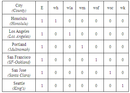
- Linear programming analysis strategies have been commonly used in several civil engineering subjects, in order to measure the relative efficiencies of complex systems. Only after the variables and parameters have been defined and quantified, and the relationships between the inputs and outputs been considered can the DEA analysis begin. In applying DEA, a linear programming model was developed to evaluate efficiency for each county’s traffic performance. In addition, each county is assigned a weight in order to determine each county’s proportion on the total system. In constructing the linear programming model, the weights used to assess the composite county’s efficiency were the following variables, defined as:wh = weight applied to inputs and outputs for Honolulu Countywla = weight applied to inputs and outputs for Los Angeles Countywm = weight applied to inputs and outputs for Multnomah Countywsf = weight applied to inputs and outputs for San Francisco Countywsc = weight applied to inputs and outputs for Santa Clara Countywk = weight applied to inputs and outputs for King’s County. The sum of the weights must equal 1.0. Thus, wh + wla + wm + wsf + wsc + wk = 1.0, provided that no weight is a negative value. This will be used to determine the inputs and outputs of the hypothetical composite county (Winston, 1991). The input/output relationships included in the model had the following general form:input/output of the composite county = (input/output for Honolulu).wh + (input/output for Los Angeles).wla + (input/output for Multnomah).wm + (input/output for San Francisco).wsf + (input/output for Santa Clara).wsc + (input/output for King).wkThe relative efficiency for each county was determined after conducting an analysis for each county - Honolulu County, Los Angeles County, Multnomah County, San Francisco County, Santa Clara County, and King’s County – where each of these counties is compared to the composite county.
6.1. Objective Function of the Linear Program
- For a system to be considered truly efficient the relationships between the inputs and outputs must be analyzed - those systems that can receive the same outputs, while contributing less inputs are more efficient than those who contribute more and receive less. It is because of this reasoning that the objective function is chosen to minimize, rather than maximize, the relative efficiency. The variable E is the efficiency index that determines the fraction of the input from the analyzed county with the composite county’s input. The decision rule was as follows:If E = 1, the composite county requires as much input as the county being evaluated. There is no evidence that the county being evaluated is inefficient.If E < 1, the composite county requires less input to obtain the output by the analyzed county. This makes the composite county relatively more efficient. Conversely, the evaluated county is judged relatively inefficient.Thus, the objective function is written as:
 | (1) |
6.2. Constraints
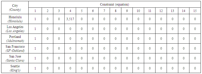
- Constraints are recognized as the conditions unique to the situation, which limit and define the calculations in a way that is relevant to the problem at hand. If constraints are not applied correctly to a linear programming model, it is likely that either an optimal solution would not be found, or that the solution found would not be applicable to the given problem. It is for this reason that the constraints for this traffic performance analysis were made after considering the particular capacities and limitations of each county in question. Each of these constraints will be discussed in more detail in the following sections. The following constraints are sample constraints that were used to analyzed Honolulu county.
6.2.1. Weight Constraint
- It was recognized that the sizes of counties compared in this report were not of comparable size; for instance, the county population of Honolulu accounts for 6% of the county population of Los Angeles. It is also recognized that each county’s data will be proportional to its size, and that the weight adjustment must be included in the DEA in order to account for these differences. The weight constraint distributes each county as a percentage of the composite county. It portrays the proportion of influence that each county has on the total system performance. This constraint determines the percentage that each county contributes to the overall system. Thus, the weights allow each county to affect the composite performance in accordance with the following rule:Weight Constraint;
 | (2) |
6.2.2. Input Constraints
- The resources for the composite county are a multiple of the resources utilized by the analyzed county. The eight input constraints compare the means of the evaluated county with the resources accessible to the composite system. If E = 1, the inputs available to the composite county are the same as the resources used at the evaluated county. If E is greater than 1, the composite county has fewer inputs available proportionally; whereas, if E is less than 1, the composite county has available proportionally more inputs. The following are the input constraint equations in the DEA analysis for Honolulu County.Reciprocal Honolulu County Population Density Constraint;
 | (3) |
 | (4) |
 | (5) |
 | (6) |
 | (7) |
 | (8) |
 | (9) |
 | (10) |
6.2.3. Output Constraints
- The five output constraints below require the linear programming solution to provide weights such that all the five outputs for the composite county will be greater than or equal to the analyzed county. If a solution satisfying the output constraints is determined, the composite county produces as much or more output as the county being evaluated. The goal is to check whether the county in question can achieve the same or better results than the composite county. The output constraints below have been developed for Honolulu county:Reciprocal Travel Time to Work Constraint;
 | (11) |
 | (12) |
 | (13) |
 | (14) |
 | (15) |
7. Results
- Table 10 shows the results of the linear program. It displays the values for E and the weights when analyzing each county.
 | Table 10. Results of Linear Program |
7.1. Slack and Surplus
- The LINDO output has a value for Slack which refers to how close the problem is to satisfying a constraint as an equality. If a constraint is fully satisfied as an equality, the slack value will be zero. This means that if the constraint is changed, the optimal solution will change. A negative slack means that the constraint is infeasible and has been violated. A positive slack reveals that if this constraint is changed, the optimal solution will not be affected. Table 11 shows the slack results from each of the counties.
 | Table 11. Slack Results |
8. Analysis
- The output from LINDO displays that each time the linear program was run for a specific county yielded E=1. As stated above, a value of 1 for E means that the composite county requires as much input as the county being evaluated. In such case, there is no proof that the county being evaluated is inefficient. When analyzing Honolulu, it was revealed that the composite county was formed from the weighted average of Honolulu (wh = 1). When the program for Los Angeles executed, the composite county was formed from the weight of Los Angeles County (wla = 1). The same can be said when analyzing all the other counties. The value of 0 for the weights means that a county doesn’t contribute to the composite county. Because E=1 for each county analyzed, it has been determined that all the counties are equally efficient, or inefficient as each other. This result is not surprising considering that all of these counties rank in the top ten of worst congestion in the United States. These counties have about the same outputs relative to their size, thus producing the same efficiency. For example, Los Angeles has more travel and more traffic fatalities compared to Hawaii because LA is a much larger county with more people and more lane miles.It would have been nice to get a diagnosis for some of the counties, where we could have posited that some counties are better than others, but that was not to be. It appears that the traffic systems have reached equilibrium to each other. In a large country, and over many decades, it can be probably understood that if any one city/county becomes better than others, migration will occur into that city, resulting in a congested city over time. Given the mobility of jobs and opportunities, this is possible at a faster rate in the modern day.
9. Testing
- Because each linear program solved resulted in E=1, signifying that all counties are equally efficient (or inefficient) as each other, a doubt arose as to whether the results were accurate. As a result, a secondary test of the program and equations was performed to ensure that there was nothing specifically and intrinsically wrong with the program and equations. For this, “dummy” counties were substituted for the existing counties. Thus, in the first instance, King’s County was removed and substituted with a dummy city, Da, which had high input and low output parameters – indicating a county with very undesirable traffic performance. In the second instance, King and Santa Clara Counties were removed and substituted by two dummy counties, Da and Db, which were similarly undesirable. It was hypothesized that the dummy cities, in both instances, should register E values less than 1.0, because they had been artificially created as low performance cities. The results bore this out and were as follows: in the first instance Da yielded an efficiency of 0.23 while in the second case, Da registered an efficiency of 0.23, with Db registering an efficiency of 0.28. The weights also showed finite values for multiple counties, giving credence to the solution. The input and output values taken for Da and Db are shown in Tables 12 and 13 respectively, for the interested readers, and the efficiency and weights in the two instances are shown in Tables 14 and 15. Therefore, it was demonstrated that the linear program equations and LINDO solver were working as intended. Other tests can be run by the interested reader, where it is expected that the validation of the model will be confirmed. Consequently the results obtained are reliable for the data analyzed.Another test was run by using alternate values for (i) Federal Budget Appropriations, and (ii) County Budget Appropriations. Instead of taking the dollars allocated per lane mile in each, the full budget values were taken. Once again, the results gave an E of 1.0, indicating further that the answer is indifferent to budgeted dollars per lane mile v. total budgeted dollars.
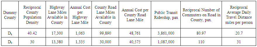 | Table 12. Inputs for Dummy Counties |
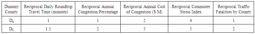 | Table 13. Outputs for Dummy Counties |
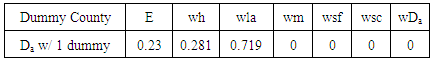 | Table 14. Results for Da with 1 Dummy in Program |
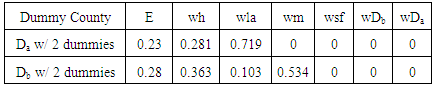 | Table 15. Results for Da and Db with Two Dummies in Program |
10. Summary and Conclusions
- DEA was used to analyze the traffic performance of six counties with the worst traffic congestion in the western United States. Congestion is a major problem for a variety of reasons, as its impacts are seen on a variety of different scales. On an individual level, congestion is often cited as a primary source of stress-related health problems, aggression, and depression. On a community level, congestion contributes to a variety of excessive costs, as it is an accumulation of lost wages, excess fuel consumption, and car repairs from extended use. On a broader scale, the burning of so many gallons of excess fuel is often cited as a large contributor to greenhouse gas emissions and global warming. The goal was to rank these counties by traffic performance in order to determine which counties required the most improvement to their transportation systems. To do this, a Data Envelopment Analysis exercise was undertaken that considered identical input and output parameters for each county. The DEA is in general a powerful tool in operations research that can compare the performance of similar systems, while leaving intact the interrelationships between the inputs and outputs. The results revealed that each county is operating at equal efficiency levels, or in this case deficiency, due to their low performing systems, characterized mainly by their high congestion and commuter frustration. The only difference noted between the counties was their relative sizes and ratios, but this appeared to play no part in the overall system performance, as their relative weights were addressed in the model. The major contribution of this study was to establish a comparison of traffic system performance in six major cities in the western United States. The DEA modeling system was used with the intention of identifying the different parameters of traffic performance, to see if any one particular parameter was compromising the overall efficiency of the system. Interestingly, the DEA’s comprehensive system-wide analysis revealed that each county had overall the same traffic performance with respect to congestion, fatalities, stress, commute time, and lost labor productivity, given the input parameters of population density, available lane miles, budgets for maintenance and repair, travel distance, commuters using roads, and public transportation ridership, and that no particular parameter stuck out as being less deficient to any other.
11. Nomenclature
- The following symbols are used in this paper:MIN = minimization E = Efficiency indexwh = weight applied to inputs and outputs for Honoluluwla = weight applied to inputs and outputs for Los Angeleswm = weight applied to inputs and outputs for Multnomah Countywsf = weight applied to inputs and outputs for San Franciscowsc = weight applied to inputs and outputs for Santa Clara Countywk = weight applied to inputs and outputs for Kings County
Notes
- 1. LINDO Systems, Inc., http://www.lindo.com/2. In addition, weighted density measurements are not available for all the cities considered.3. As argued in Cervero (2003) and Naess et al. (2012).
References
| [1] | “2009 NHTS Daily Person Trips Per Person.” Federal Highway Administration, National Household Travel Survey. (2009). <http://nhts.ornl.gov/tools/ptpp.shtml>. Accessed Dec. 04, 2015. |
| [2] | “2013 Databook.” Washington State Department of Transportation, Office of Financial Management (2013). <http://www.ofm.wa.gov/databook/pdf/transportation.pdf>. Accessed Dec. 11, 2015. |
| [3] | “2013 NTD Data Tables.” American Public Transportation Association. (2013). <http://www.apta.com/resources/statistics/Pages/NTDDataTables.aspx>. Accessed Dec. 09, 2015. |
| [4] | “2013 Public Road Data-Revised.” California Department of Transportation Highway Performance Monitoring System Data Library. (2014). <http://www.dot.ca.gov/hq/tsip/hpms/hpmslibrary/prd/2013prd/2013PublicRoadData.pdf>. Accessed Dec. 11, 2015. |
| [5] | Adams, Teresa (2011). “Estimating Cost Per Lane Mile for Routine Highway Operations and Maintenance.” Midwest Regional University Transportation Center, University of Wisconsin. <http://www.wistrans.org/mrutc/files/CPLM_Final.pdf>. Accessed Dec. 9, 2015. |
| [6] | Anderson, David, Sweeney, Dennis, Williams, Thomas. (1991). “An Introduction to Management Science. Quantitative Approaches to Decision Making.” |
| [7] | “Annual Urban Mobility Scorecard.” Texas Transportation Institute. (2015). <http://mobility.tamu.edu/ums/>. Accessed Dec. 04, 2015. |
| [8] | Bureau of Transportation Statistics. National Household Travel Survey. h ttps://www.rita.dot.gov/. Accessed Dec. 11, 2015. |
| [9] | Cervero, Robert (2003). “Are Induced-Travel Studies Inducing Bad Investments?” Access. Number 22, Spring 2003. Pp. 22-27. Induced Travel Studies.pdf. Accessed April 11, 2016. |
| [10] | Cima, Rose and Zach Crockett. “The San Francisco Rent Explosion Part III.” Priceonomics. 12, Aug. 2015. <http://priceonomics.com/the-san-francisco-rent-explosion-part-iii/>. Accessed Dec. 05, 2015. |
| [11] | Dickens, Matthew. (2015). “Public Transportation Ridership Report. Fourth Quarter & End-of-Year 2014.” [Data File]. American Public Transportation Association. 2014-q4-ridership-APTA.pdf.Accessed Dec. 11, 2015. |
| [12] | “Estimated Vehicles Registered by County For the Period of January 1 through December 31, 2014.” California Department of Motor Vehicles. (2015). est_fees_pd_by_county.pdf. Accessed Dec. 04, 2015. |
| [13] | “The Executive Program & Budget, 2015.” City and County of Honolulu. (2015). <https://www.honolulu.gov/rep/site/bfs/fy2015oper.pdf>. Accessed Dec. 10, 2015. |
| [14] | Fancello, Gianfranco, Barbara Uccheddu, and Paolo Fadda (2014). “Data Envelopment Analysis (D.E.A.) for urban road system performance assessment.” Elsevier: Social and Behavioral Sciences, 111 (2014) 780-789. <http://www.sciencedirect.com/science/article/pii/S187704281400113X>. Accessed Dec 1, 2015. |
| [15] | Garrett, Matthew. (2013). “2013-2015 Legislatively Adopted Budget. ” Oregon Department of Transportation. Legislative lyAdoptedBudget.pdf. Accessed Dec. 08, 2015. |
| [16] | Hahn, Peter. “2014 Proposed Budget.” (2014). Seattle Department of Transportation. <http://www.seattle.gov/financedepartment/14proposedbudget/documents/SDOT.pdf>. Accessed Dec. 09, 2015. |
| [17] | Hawaii Police Department Traffic Information. <http://www4.honolulu.gov/hpdtraffic/default.htm>. Accessed Dec. 11, 2015. |
| [18] | King, David, Michael Manville, and Donald Shoup (2007). “The political calculus of congestion pricing.” Elseiver: Transport Policy, 14 (2007) 111–123. <http://www.mrbrklyn.com/resources/PoliticalCalculus.pdf> Accessed Dec. 04, 2015. |
| [19] | Koyanagi, Nelson. H. “The Executive Program and Budget.” City and County of Honolulu, Operating Program and Budget. 1, (2014). 126. <https://www.honolulu.gov/rep/site/bfs/fy2015oper.pdf>. Accessed Dec. 05, 2015. |
| [20] | Kubly, Scott. “City of Seattle 2015-2016 Proposed Budget.” (2015). Seattle Department of Transportation. <http://www.seattle.gov/financedepartment/15proposedbudget/documents/SDOT.pdf>. Accessed Dec. 09, 2015. |
| [21] | Lomax, Tim, Schrank, David, Lasley, Phil, Eisele, Bill. (2013). “Developing a Total Peak Period Travel Time Performance Measure.” Texas Transportation Institute (TTI) For FHWA Mobility Measurement in Urban Transportation Pooled Fund. <http://d2dtl5nnlpfr0r.cloudfront.net/tti.tamu.edu/documents/TTI-2013-5.pdf>. Accessed Dec. 15 2015. |
| [22] | Martin, Ernest. “A Bill for An Ordinance”. City Council. City and County of Honolulu. (2015). Ordinance No. 15-25. |
| [23] | “The Mobility Data for Honolulu, HI.” Texas Transportation Institute. (2014). <http://d2dtl5nnlpfr0r.cloudfront.net/tti.tamu.edu/documents/ums/congestion-data/honolulu.pdf>. Accessed Dec. 04, 2015a. |
| [24] | “The Mobility Data for Los Angeles-Long Beach-Anaheim CA.” Texas Transportation Institute. (2014). <http://d2dtl5nnlpfr0r.cloudfront.net/tti.tamu.edu/documents/ums/congestion-data/los-angeles.pdf>. Accessed Dec. 04, 2015b. |
| [25] | “The Mobility Data for Portland OR-WA” Texas Transportation Institute. (2014). <http://d2dtl5nnlpfr0r.cloudfront.net/tti.tamu.edu/documents/ums/congestion-data/portland.pdf>. Accessed Dec. 04, 2015c. |
| [26] | “The Mobility Data for San Francisco-Oakland CA.” Texas Transportation Institute. (2014). <http://d2dtl5nnlpfr0r.cloudfront.net/tti.tamu.edu/documents/ums/congestion-data/san-francisco.pdf>. Accessed Dec. 04, 2015d. |
| [27] | “The Mobility Data for San Jose CA”. Texas Transportation Institute. (2014). <http://d2dtl5nnlpfr0r.cloudfront.net/tti.tamu.edu/documents/ums/congestion-data/san-jose.pdf>. Accessed Dec. 04, 2015e. |
| [28] | “The Mobility Data for Seattle WA.” Texas Transportation Institute. (2014). <http://d2dtl5nnlpfr0r.cloudfront.net/tti.tamu.edu/documents/ums/congestion-data/seattle.pdf>. Accessed Dec. 04, 2015f. |
| [29] | Molina, Gloria, Ridley-Thomas, Mark, Yaroslavsky, Zev, Knabe, Don, and Antonovich, Michael, D. “County of Los Angeles 2013-14 Final Budget.” [Schedule 6, Page 42]. <http://www.lacountyannualreport.com/2013/files/Budget/2013-14%20Final%20Budget%20112713.pdf>. Accessed Dec. 15 2015. |
| [30] | Mondschein, Andrew, Taner Osman, Brian Taylor, and Trevor Thomas (2015). “Congested Development: A Study of Traffic Delays, Access, and Economic Activity in Metropolitan Los Angeles.” Institute of Transportation Studies, UCLA Luskin School of Public Affairs. 01 Oct, 2015. Haynes_C ongested-Development_1-Oct-2015_final.pdf. Accessed Dec 6, 2015. |
| [31] | Naess, Peter et al. (2012). “Traffic forecasts ignoring induced demand.” European Journal of Transport and Infrastructure Research. 2012. Cost_Benefit_Analyses.pdf. Accessed April 11, 2016. |
| [32] | “National Highway System Lane-Length-2013 Lane-Miles by Functional System.” Federal Highway Administration, Policy and Governmental Affairs, Office of Highway Policy Information. Highway Statistics 2013, Table HM-43. (2014). <http://www.fhwa.dot.gov/policyinformation/statistics/2013/hm43.cfm>. Accessed Dec. 05, 2015. |
| [33] | “National Transportation Statistics.” United States Department of Transportation Bureau of Transportation Statistics. (2009-2015) < /a>national_transportation_statistics/index.html. Accessed Dec. 09, 2015. |
| [34] | Newton, Damien. (2010) “Density, Car Ownership, and What It Means for the Future of Los Angeles.” Streetsblog LA. <http://la.streetsblog.org/2010/12/13/density-car-ownership-and-what-it-means-for-the-future-of-los-angeles>. Accessed Dec. 11, 2015. |
| [35] | “Pavement Condition Report.” (2012). City and County of Honolulu. Department of Facility Maintenance. <http://www.oahumpo.org/wp-content/uploads/2013/02/Pavement-Condition-Report-Final.pdf>. Accessed Dec 11, 2015. |
| [36] | “Performance Measures, fy 2010 Adopted Budget.” Multnomah County Budget. (2010). <https://multco.us/file/25850/download>. Accessed Dec. 11, 2015. |
| [37] | Peterson, Lynn. “2015-2017 Biennial Budget Request.” (2014). [Data File]. Washington State Department of Transportation. WSDOTSupplementalBudgetRequestExecutiveSummaryREV.pdf. Accessed Dec.11, 2015. |
| [38] | “Public Road Length 2013-Miles by Ownership.” Federal Highway Administration, Policy and Governmental Affairs, Office of Highway Policy Information. <https://www.fhwa.dot.gov/policyinformation/statistics/2013/hm10.cfm>. Accessed Dec. 05, 2015. |
| [39] | “QuickFacts. Honolulu County, Hawaii.” United States Census Bureau. (2014). <http://www.census.gov/quickfacts/table/PST045214/15003,4159000,06037,00>. Accessed Dec. 11, 2015a. |
| [40] | “QuickFacts. Los Angeles County. California.” United States Census Bureau. (2014). <http://www.census.gov/quickfacts/table/PST045214/06037,00>. Accessed Dec. 11, 2015b. |
| [41] | “QuickFacts. Multnomah County. Oregon.” United States Census Bureau. (2014). <http://www.census.gov/quickfacts/table/PST045214/4159000,06037,00>. Accessed Dec. 11, 2015c. |
| [42] | “QuickFacts. San Francisco County. California.” United States Census Bureau. (2014). <http://www.census.gov/quickfacts/table/PST045214/06075,00>. Accessed Dec. 11, 2015d. |
| [43] | “QuickFacts. Santa Clara County. California.” United States Census Bureau. (2014). <http://www.census.gov/quickfacts/table/PST045214/06085,00>. Accessed Dec. 11, 2015e. |
| [44] | “QuickFacts. King County. Washington.” United States Census Bureau. (2014). <http://www.census.gov/quickfacts/table/PST045214/06085,00>. Accessed Dec. 11, 2015f. |
| [45] | Rapino, Melanie, Fields, Alison (March 2013). “Mega Commuters in the U.S. Time and Distance in Defining the Long Commute using the American Community Survey.” Presented at the Association for Public Policy Analysis and Management Fall 2013 Conference. <http://www.census.gov/newsroom/releases/pdf/paper_mega_%20commuters_us.pdf> Accessed Dec. 04, 2015. |
| [46] | “Report on the State of Physical Infrastructure in Hawaii. Final Report to the Economic Development U.S. Department of Commerce.” Hawaii Institute for Public Affairs. (2010). <http://hipaonline.com/images/uploads/InfrastructureReport-7-7-10.pdf.> Accessed Dec. 11, 2015. |
| [47] | “San Francisco Transportation Fact Sheet.” San Francisco Municipal Transportation Agency. (2013). SAN FRANCISCO TRANSPORTATION FACT SHEET.pdf Accessed Dec. 05, 2015. |
| [48] | Sheinin, Richard. “Bay Area Commuting Nightmares: Jobs in City, Affordable Homes in Exurbia.” Editorial. San Jose Mercury News, 30 Sept 2015. [Data File]. bay-area-com muting-nightmares-jobs-city-affordable-homes. Accessed Dec. 04, 2015. |
| [49] | Singh, Amarjit and Stacy Adachi. (2011). “Pipe Efficiency Analysis at a Water Utility.” American Society of Civil Engineers, Journal of Pipeline Systems Engineering and Practice. February 2011. 2(1): 23-34. |
| [50] | Sistek, Scott. (2015). “Seattle: Not exactly Rain City USA this year.” Editorial. Komo News, 05 June 2015. Seattle-Not-ex actly-Rain-City-USA-this-year-306325411.html. Accessed on Dec. 10, 2015. |
| [51] | Smith, Edward. (2015). “Rainy Days and Mondays in Fair Oaks.” Editorial. Sacramento Injury Attorney’s Blog, Nov 04, 2015. <http://www.sacramentoinjuryattorneysblog.com/2015/11/rainy-days-and-mondays-in-fair-oaks.html>. Accessed Dec. 10, 2015. |
| [52] | Spaulding, Danny and King, Heather. “2014 Oregon Mileage Report.” (2014). Oregon Department of Transportation, Transportation Data Section Road Inventory & Classification Services. <http://www.oregon.gov/ODOT/TD/TDATA/rics/docs/2014_OMR.pdf>. Accessed Dec. 09, 2015. |
| [53] | “State Traffic Safety Information For Year 2014.” National Highway Traffic Safety Administration. USA WEB REPORT.HTM. Accessed Dec. 08, 2015. |
| [54] | “State & Urbanized Area Statistics.” Federal Highway Administration. (2015). <https://www.fhwa.dot.gov/ohim/onh00/onh2p11.htm>. Accessed Dec. 08, 2015. |
| [55] | “Statistics Brief, April 2015.” Hawaii State Department of Business, Economic Development and Tourism, Research and Economic Analysis Division. (2015). <http://files.hawaii.gov/dbedt/economic/data_reports/briefs/Commuting_Patterns_Apr2015.pdf>.Accessed Dec. 11, 2015. |
| [56] | Tan, Sui. (2013). “2012 Regional Pavement Condition and KPI Update.” Metropolitan Transportation Commission. [Memorandum]. Oakland, CA: Department of Transportation. 05b_2012_LS_R_Reg ional_PCI_KPI_Memo.pdf. Accessed Dec. 11, 2015. |
| [57] | “TomTom Traffic Index - Measuring Traffic Worldwide. United States Ranking Large Cities (Large Population > 800K).” TomTom Traffic Index. (2015). <https://www.tomtom.com/en_gb/trafficindex/#/list>. Accessed Dec. 01, 2015. |
| [58] | “Traffic Records.” National Highway Traffic Safety Administration. <http://www.nhtsa.gov/Data/Traffic+Records>. Accessed Dec. 11, 2015. |
| [59] | “Urbanized Areas, Selected Characteristics. ” United States Department of Transportation, Federal Highway Administration. (2014). <http://www.fhwa.dot.gov/policyinformation/statistics/2013/pdf/hm72.pdf>. Accessed Dec. 03, 2015. |
| [60] | Winston, Wayne L. (1991). Operations Research: Applications and Algorithms, 2nd ed. Boston Massachusetts. Print. |