Saeideh Shahmari Kalestan, Ata Yakup Kaptan
Ondokuz Mayıs University, Fine Arts Teaching Department, Art Teaching Branch
Correspondence to: Saeideh Shahmari Kalestan, Ondokuz Mayıs University, Fine Arts Teaching Department, Art Teaching Branch.
| Email: |  |
Copyright © 2020 The Author(s). Published by Scientific & Academic Publishing.
This work is licensed under the Creative Commons Attribution International License (CC BY).
http://creativecommons.org/licenses/by/4.0/

Abstract
There exist several story books published for children in Turkey. These story books for children which constantly increase in number bring about also certain qualitative problems in terms of their designs. Various details that need attention in the design of story books come into play. The design of story books prepared especially for early age groups is likely to have positive or negative effects on the learning process. Therefore, the need emerges for the design of new story books which are designed by taking into consideration the developmental characteristics and needs of the target audience. Upon researches performed under this study, it was discerned that the number of story books which were composed by paying attention to the developmental characteristics of the target audience and in conformity with design elements and principles was far from being satisfactory. This study addressed problems encountered in the use of external structure, internal structure, typography and illustration elements in story books published for children which made up the research sample and were analyzed on the basis of specified criteria. In this qualitative research, the review of literature and study field was carried out. Techniques used in children’s story books were evaluated.
Keywords:
Story Books for Children, Visual Design Elements and Principles
Cite this paper: Saeideh Shahmari Kalestan, Ata Yakup Kaptan, Design and Illustration Qualities of Story Books Published for Children Aged 5-7 Years in Turkey, Education, Vol. 10 No. 3, 2020, pp. 59-69. doi: 10.5923/j.edu.20201003.02.
1. Objective of the Research
Revealing existing problems through the analysis of story books on the basis of visual design elements & principles and identifying elements that need attention in the design of these books make up the primary objective of this research which is performed to ensure that the education is offered to children in better quality in their story books which occupy a crucial position in today’s educational processes.
2. Coverage and Limitations
This research was limited to the group of pre-schema children aged 5-7 years. In the research, story books published for children were selected as the research sample.
3. Research Model
In the research, qualitative research method was utilized. Qualitative research is the method in which qualitative data collection tools such as document analysis and observation are employed and which pursues a qualitative process so as to reveal events and perceptions realistically and in their entirety (Yıldırım, 1999). In this research in which the visual design of story books published for children aged 5-7 years and selected as the sample was analyzed, the observation analysis, a qualitative data collection technique, was implemented. In the research, local/foreign books and periodicals, university publications, papers and dissertations were reviewed, current resources available in the internet were obtained, relevant recently-published story books were analyzed and related data were accessed. Images of contents and illustrations of story books intended for the targeted age group were captured and made available to the interpretation under the qualitative research. Collected data were visually analyzed.
4. Introduction
Being instructive and informative and including moral value judgments are not sufficient for a work of children’s literature to be deemed as good quality, but it also needs to have a literary value and be composed with aesthetical taste and thinking (Yalçın & Aytaş, 2008, p. 16-17). Illustrated books contribute also to the development of children’s thinking and speaking skills and encourage them to be literate (Beyazova, 2006, p. 533-535; Karatay, 2011, p. 472-480). A large part of the books sold as children’s books in the market are not well-suited to children in terms of their contents or formal characteristics. It is observed that elements which are inconvenient to the Turkish culture exist in children’s books translated from Western languages to Turkish. In such books which are heavily under the influence of American culture, characters who are violently and forcefully engaged in adventures set as examples to children (Mahserece, 2000, p. 409-425).While children’s books composed with the sole purpose of making money give rise to erroneous identification by the child, they also distress child’s emotions. Sever (2000, p. 639) states that, along with this situation, children’s sensitivities are disconcerted, their pure world is covered with thick walls and certain information and behaviors which are in conflict with today’s values are transferred to them through a mixed and inattentive language.It is highly essential that families and teachers who guide the child about books be conscious and selective in this respect. In order to determine whether a book is convenient for children or not, it is necessary to be familiar with characteristic features which are supposed to exist in publications intended for children (Sınar Çılgın, 2007, p. 77).Today, along with the dominant belief that children’s books could be easily composed, a big number of authors of children’s books came into existence. However, those composing works of children’s literature should be equipped with certain qualities. Just as whoever is able to hold a pen cannot necessarily succeed in composing children’s books, an author who is highly competent in his/her own field is not expected to write perfect children’s books. So as to successfully compose a good quality children’s book, it is essential both to be a good author and to be very acquainted with children’s inner world. Each bookwright who is interested in producing works well-suited to children should first get down to children’s real world and be aware that writing intended for exposing such type of reality imposes a serious responsibility. While reading the book, the child must not think that the author looks down on him/her, rather, author should get down to children’s level, and hence, a line of communication should be established between the author and child (Sever, 2003, p. 22). Children’s books are those books going down to the core. When the book goes down to the core, its weaknesses show up. If an author is to be tested and his/her quality as an author is to be measured, the author should be asked to write a children’s book. If the author succeeds in this job, it is proved that he/she is a professionally competent author. The best children’s book is not the one offering the best education, rather, it is the one which offers the best understanding of children and achieves in getting down to children’s level (Kurt, 2000, p. 306-315).It is likely to be confronted with numerous typographical errors in certain children’s books published irresponsibly with the thinking that the child does not notice whatever error is made. Inaccurate spellings which are perceived by children in books are received as information by them. Thus, whatever children’s age levels are, children’s books must be prepared with special care in terms of their content and formal characteristics. Literary works intended for children must be designed in structures aligned with cognitive, affective and psychomotor development levels of children. Neydim (2003, p. 94) explains this situation as in the following: Literary texts must be in such a way as to shape the character of children, not to view them just as objects, to hold them in high esteem, to utter their experiences and worries and to act as the bridge allowing them to express themselves.As noted by Lene Mayer Skumanz, every type of fact can be communicated to the child individual. However, what matters is not what is to be communicated, but how it is to be communicated (Yavuzer, 1990).
5. Book Selection Process and Analysis Criteria
Illustrated story books which were published in Turkey for children aged 5-7 years and that could be casually obtained from any bookstore, namely, “Germs with Mobile Phones”, “What did Kaloghlan See in the Crystal Ball?”, “Dreams of Monkey Mini”, “Fairytales Flavored with the Smell of Cinnamon”, “Who is It Coming?”, “Giant Carrot”, “A Difficult Fish”, “What Happened to the Pompom Cat?” and “Three Cats, One Wish” were addressed in this study.These books will be examined in two phases, that is, external structure and internal structure. In this process, features of internal structure will be discussed as well as taking into consideration the physical structure and basic design principles.Features of External Structure of Children’s Story Books: Physical attributes, cover & binding, size, weight.
6. Features of Internal Structure of Children’s Story Books
Theme, topic, language, heroes, paper, texture, surface, typography, illustration, page setup, color selection.Basic elements to be kept in mind while reviewing these story books are as below:• Content – address to children, creativity, informational accuracy and so on.• Story – interesting, relevant, easy to understand and so on.• Language – smoothness of the language, use of a rich language, repetition and so on.• Illustration – attractiveness, clarity, prejudices/ stereotypes and so on.• Production and layout – paper quality, legibility of the text, font size & font type and so on.• Consistency of texts and illustrations – Drawings support a better understanding of the text. • Age, content, concept and so on.• Rhythm – In illustrations, in typography and so on (Shahmari Kalestan, 2018).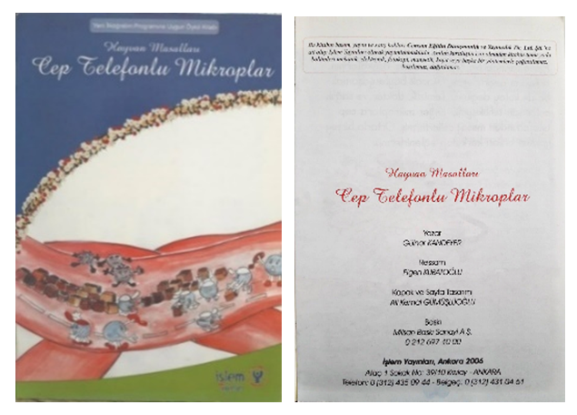 | Figure 1. Cover and inner cover of the story book titled “Germs with Mobile Phones” |
The inquisitiveness, joy, richness of emotions, general feeling and other features of the book were also considered under the analysis.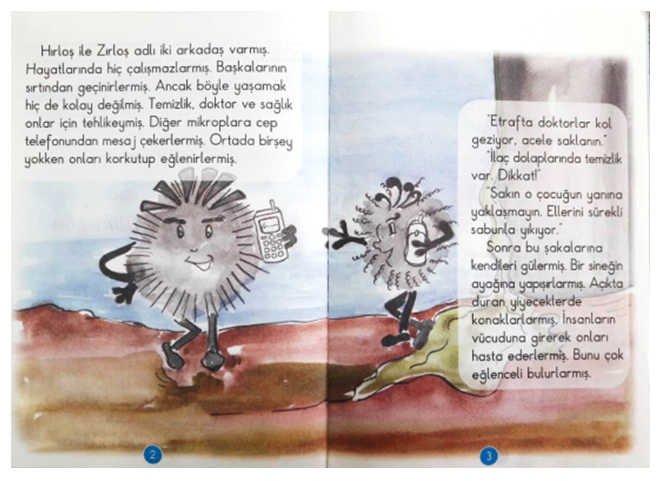 | Figure 2. Inner pages of the story book titled “Germs with Mobile Phones” |
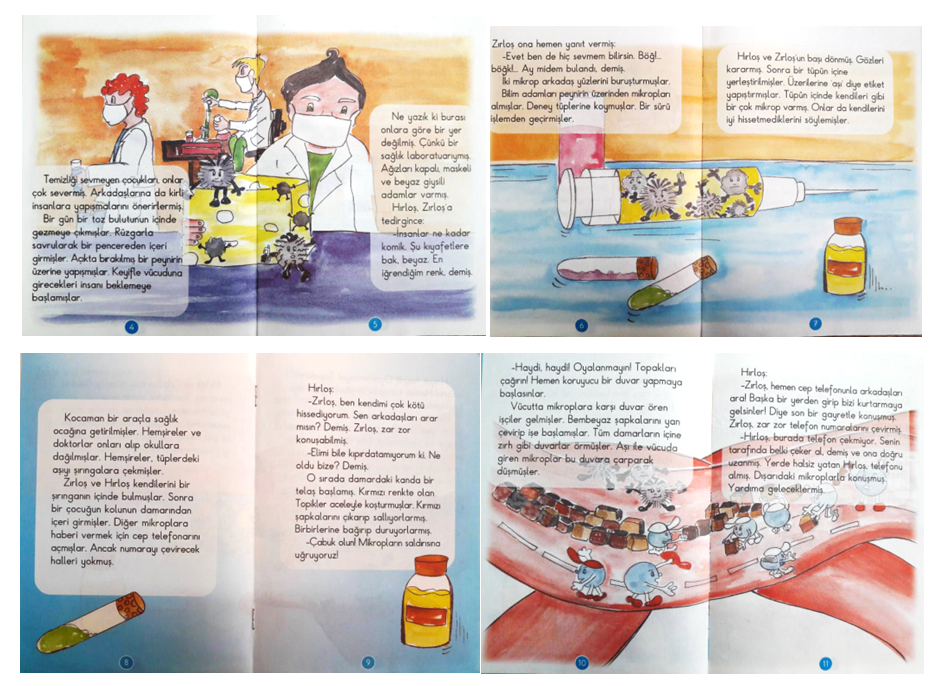 | Figure 3. Inner pages of the story book titled “Germs with Mobile Phones” |
a) Upon the analysis of “GERMS WITH MOBILE PHONES” in terms of visual design elements and physical structure, the below findings were obtained and discussed.• The book titled as “Germs with Mobile Phones” was produced with watercolor painting technique.• Font characters existing on the book cover and selected for the book title are not well-suited to the targeted age group. Sans serif fonts should be selected for this age group. Calligraphy fonts are not suitable for titles on the basis of their legibility. • In the inner part of the book and on its cover, the targeted age group was not specifically noted. This creates a problem for parents, teachers and students who are supposed to select a book.• Uniformity in visual setup of pages was not ensured. Pages were designed in a hectic, disconnected and disorganized manner.• Typographic setup of pages does not comply with principles for the text layout and balance & hierarchy of visuals.• Font & visual relationship and font & background relationship do not sufficiently enhance legibility and create typographical problem.• Because of the disharmony and sharpness of colors which dominate the page setup and because colors are not in conformity with the text at sufficient level, visual chaos and challenges come to the forefront in terms of legibility of texts.• The text is placed within frames and so enough space for reading and perception is not left out. Therefore, disconnections occur and the flow of reading is adversely influenced.• Since texts are placed on images, reader’s perception gets disoriented and the legibility of texts is negatively affected.• The legibility of texts is adversely influenced as the text is extended out of the area specified in the page setup and there does not appear to be uniformity between pages.• As page numbers which are important to the page setup and continuity principle are designed in a careless and random manner and placed over images, they are sidetracked by reader’s perception.• Texture and sharpness of the background selected for the book cover and the consequent visual chaos have negative effect both on the legibility and the visual flow.• On pages 2, 3, 4, 5, 12 and 13, horizontal text continues and visually outreaches the vertical frame. It is discerned that texts are designed disconnectedly on the page, the continuity principle is not respected and so the flow of reading is adversely affected.• It is discerned that the ratio of contrast between fonts and background is not at satisfactory level.• Color chaos in illustrations, desaturation in printed colors and the selection of colors inconvenient for the targeted audience, children, create visual confusion.• As there exist no uniformity and continuity between text blocks selected as typographic design styles (blocking from left or equal blocking from both left and right), an imbalance is observed across the entire book. • Spacing and typographical errors made in vertical basic letters selected for the text create disorder within words and negatively affects the pace of reading. • So as to be fitted within frames, words were divided and therefore, texts were narrowly designed.• A different page design is discerned on pages 8, 9 and 16, and thus, continuity and uniformity principles are neglected.• Low-grade light-yellow paper is utilized in the book. This type of poor-quality paper adversely affects the visual perception of colors and printing quality, and is not durable enough.• Again, as the light easily permeates through low-grade light-yellow paper, illustrations in a page create shadows over illustrations in the next page, and so the perception of images in pages is blurred.• Disharmony between illustrations of cover page and inner pages distorts the continuity and uniformity principle. • In this type of books which is bound by staples, it is relatively easy for the book to disintegrate and get deformed, and so the staple binding is not in general preferred. Also, the likelihood that the staple will harm the child should not be neglected.• Illustrations and story characters are confusing and not sufficiently clear.• That author’s name which is important to the identification of the book is not typed on the book cover is also another crucial problem (Kandeyer, 2006). | Figure 4. Inner pages of the story book titled “What did Kaloghlan See in the Crystal Ball?” |
b) Upon the analysis of “WHAT DID KALOGHLAN SEE IN THE CRYSTAL BALL?” in terms of visual design elements and physical structure, the below findings were obtained and discussed.• Story book titled “What did Kaloghlan See in the Crystal Ball?” was designed with the technique of colored pen drawing.• As colors did not coincide exactly with points where they were supposed to be in the printing process, flickers in colors and unclear images appeared to be the case. This issue creates problems for the perception of images and the reading of texts. • Perspectives used in illustrations are not well-suited to the targeted age group. Two-dimensional images should be preferred for this age group.• As fonts are typed in a highly dark tone of black, they create a stark contrast on the white background, and prevent images from being better perceived by readers. • Spacing between illustrations and texts creates confusion in the mind of children who are in pre-schema age group and affects their pace of reading.• As texts in pages are designed in a disconnected manner and there exist no continuity between text blocks selected as typographic design styles (blocking from left or equal blocking from both left and right), an imbalance is observed across the entire book and so the reading of the book by children is adversely affected.• As the text which is of significance to the continuity principle is installed on the page at long intervals, children who just learnt how to read tend to skip lines and so the reading of the book by them is negatively influenced.• As the low-grade paper is used for the book, printing quality and visual perception of colors is adversely affected.• Disharmony between illustrations of cover page and inner pages distorts the continuity and uniformity principle. • Staple binding is not in general preferred in books produced for children aged 5-7 years, and in this sense, the book is not physically well-suited to this age group.• The targeted age group and names of the author and illustrator are not typed on the cover page or inner pages (Yüksel, 2006).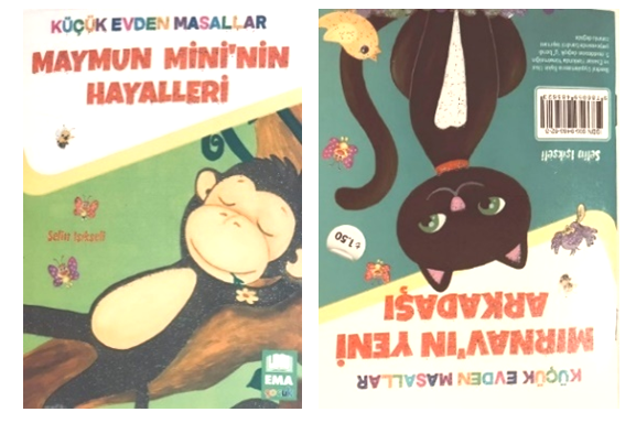 | Figure 5. Front and back cover pages of the story book titled “Dreams of Monkey Mini” |
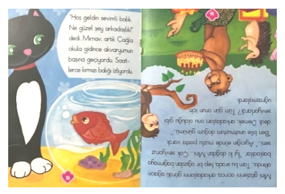 | Figure 6. Inner pages of the story book titled “Dreams of Monkey Mini” |
c) Upon the analysis of “DREAMS OF MONKEY MINI?” in terms of visual design elements and physical structure, the below findings were obtained and discussed. • Story book titled “Dreams of Monkey Mini” was designed with gouache and colored pen drawing technique.• The story titled “Dreams of Monkey Mini” shares the same book as the story titled “Mırnav’s New Friend”. That being the case, the back cover page of this story book which contains two stories at a time is printed upside-down. At first sight, this gives the impression that there was a printing error.• Two stories end just in the middle of the book, however, illustrations of two stories are tangled with each other in the end and arouse a feeling of surprise. This is not well-suited to the perception level of targeted children.• Illustrations of the book are designed in an interrupted and careless fashion and on wrong spots.• The text is placed within frames and so enough space for reading and perception is not left out. Therefore, disconnections occur and a visual chaos comes into play.• The targeted age group and names of the author and illustrator are not typed on the cover page or inner pages (Işıkseli, 2018).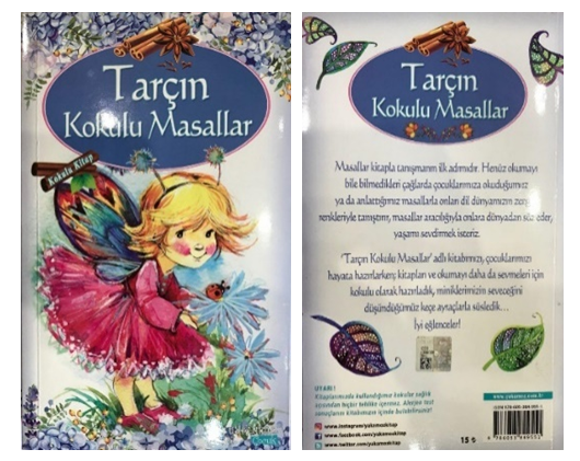 | Figure 7. Front and back cover pages of the story book titled “Fairytales Flavored with the Smell of Cinnamon” |
 | Figure 8. Inner pages of the story book titled “Fairytales Flavored with the Smell of Cinnamon” |
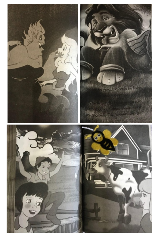
d) Upon the analysis of “FAIRYTALES FLAVORED WITH THE SMELL OF CINNAMON” in terms of visual design elements and physical structure, the below findings were obtained and discussed.• Although black & white illustrations, felt bookmarks and the smell of cinnamon are used for demonstrative purposes, inertia prevails over the book. • On pages dominated by dark colors, drawing of characters with almost the same color tones as the background creates perception and attention problems for children.• Image on the cover page is not designed in conformity with the subject matter.• The fact that fonts on images are black and have the same color tone as the background creates problems for legibility and typography.• Intimidating images of characters and personalities used in the book are likely to have bad influence over the psychology of children.• Although, in the introductory note on the back cover page of the book, it is stated that “Through fairytales that we read for our children or tell them in periods when they do not even know how to read, we familiarize them with rich colors of the world of our language, talk about the world and wish to make them enjoy the life.”, the preparation of images inside the book entirely with monograms and grey tones is a serious problem (Anonymous, 2016). 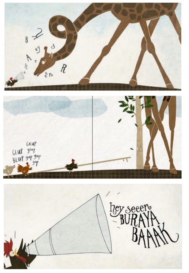 | Figure 9. Inner pages of the story book titled “Who is It Coming?” |
e) Upon the analysis of “WHO IS IT COMING?” in terms of visual design elements and physical structure, the below findings were obtained and discussed.• The story book titled “Who is It Coming?” was produced with digital collage and drawing technique. • That the last page is folded and, when the folded page is opened, a big drawing comes into play makes the book effective. • The most important feature of a textless book is that it does not communicate through texts. In this book, the story is not told through words, rather through illustrations. • Certain sound effects (Git Gup, Bag Bag, Glup Blup) used for amplifying the impact of actions of characters established connection between sounds, text, figures and typography.• Illustrator preferred to use a simple way of expression in order to attract the attention of children to the story itself.• In the context of the layout of illustrations on the page, square-shaped page is preferred as it offers enough space for both adventurist drawings and giraffes in terms of their proportions.• Opaque color palette is preferred for filling children with natural emotions.• Animals are selected on the basis of their characteristic features. For instance, frog is the smartest character which plans everything in advance and has the ability to jump in order to reach a target. Rooster and crow are characters with communication skills. In the end, pig is the silly character of the team which is used for challenging tasks requiring manual labor.• In order to stress the importance of communication, the rooster was depicted with a giant megaphone.• It is discerned that the ratio of contrast between fonts and background is at satisfactory level.• The selected colors are not well-suited to the targeted audience, that is, children (İrten, 2017).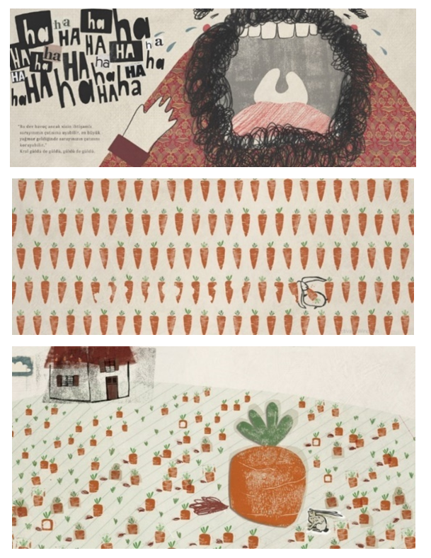 | Figure 10. Inner pages of the story book titled “Giant Carrot” |
f) Upon the analysis of “GIANT CARROT” in terms of visual design elements and physical structure, the below findings were obtained and discussed.• The story book titled “Giant Carrot” was produced with the application of collage and linocut printing techniques. • Typographic setup of pages is aligned with principles for text layout and balance & hierarchy of visuals.• The movement triggered by the “ha-ha, ha-ha” text which is selected as the typographic design and its relevant nursery rhyme brought life to the character, king, as well as attracting attention to this character, and hence, life is hidden behind king’s smile.• As there is uniformity and continuity between illustrations and texts, it is discerned that there exist stability and balance across the entire book.• It is discerned that the ratio of contrast between fonts and background is at satisfactory level.• Drawings are produced with care and attention.• Rough and textured appearance of images adds a different atmosphere to the story.• Bright colors, sporadically detailed images and a large and clear font type which facilitates the reading of children are employed. • The creativity and skills of the illustrator adds an incredibly beautiful atmosphere to the book. • In terms of the compatibility of illustrations with the targeted audience, it is discerned that illustrations were designed without any real perspective and in a simple format.• The use of simple abstractions is explained by the way the illustrator cares about and responds to interests of pre-school children (İrten, 2017).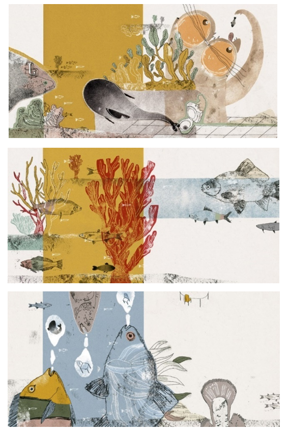 | Figure 11. Inner pages of the story book titled “A Difficult Fish” |
g) Upon the analysis of “A DIFFICULT FISH” in terms of visual design elements and physical structure, the below findings were obtained and discussed.• In the story book titled “A Difficult Fish”, linocut print and monoprint techniques were applied. • Details and bright & lively colors in illustrations are well-suited to children who make up the targeted audience.• Warm and cold colors are designed in harmony.• It is discerned that illustration with its bright and lively colors and lines is well-suited to children.• The design of background texture with rolling cylinders provides images of the book with some kind of a specific texture.• Reticulations and textures in illustrations make characters seem to be moving and alive on the page.• Drawings outreach the next page, and, while children turn pages, they urge children to make a prospective search for images.• Care and meticulousness dominate the overall design of the book (Tarçalır Erol, 2017).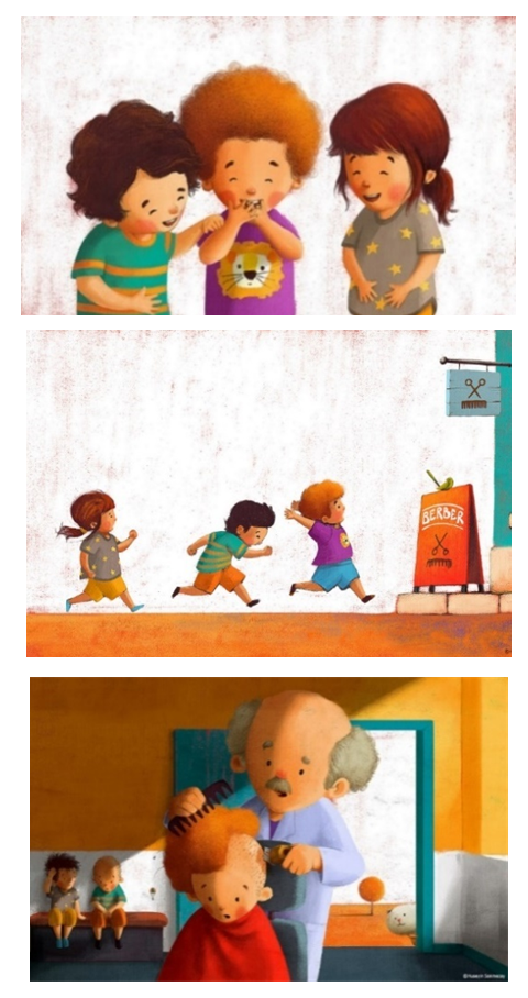 | Figure 12. Inner pages of the story book titled “What Happened to the Pompom Cat?” |
h) Upon the analysis of “WHAT HAPPENED TO THE POMPOM CAT?” in terms of visual design elements and physical structure, the below findings were obtained and discussed.• In the story book titled “What Happened to the Pompom Cat?”, as the illustrator makes drawings with colored pens and lead pencil on the acrylic paint in order to represent human beings, objects and natural world, he/she creates soft shadows and crossings.• Bright colors, naughtiness in characterization, a kind of childish humor and simple forms portray that the book is intended for pre-school children.• The use of paper with texture and a different brush is the prominent feature of the book.• Illustrations and facial mimics of personalities and characters reveal emotions felt across the book.• Colors prevailing over the page setup are designed in harmony and well-suited to serve the needs of children aged 5-7 years (Okcu, 2017).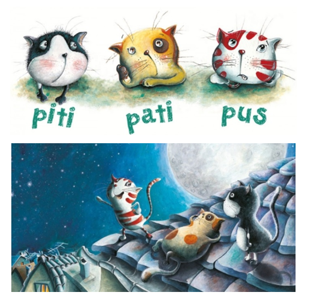 | Figure 13. Inner pages of the story book titled “Three Cats, One Wish” |
i) Upon the analysis of “THREE CATS, ONE WISH” in terms of visual design elements and physical structure, the below findings were obtained and discussed.• In the story book titled “Three Cats, One Wish”, colored pen and lead pencil drawings were applied over watercolor paint. • Glossy paper is used for the cover page whereas white paper is utilized for inner pages. Even if glossy paper offers a better opportunity to keep pages clean to some extent, it is likely to disturb child’s eyesight as it reflects the light while the child reads it.• Images are quite clear and in general installed in a successful manner to cover the entire page.• Inverted sentences are quite common throughout the book, and this is likely to create confusion preventing children from understanding the story better. However, the vocabulary of the book is well-suited to the world of targeted age group, children. • Topic of the story book is interesting enough for children. Even if it does not necessarily offer the opportunity to enlarge the knowledge base of children, important messages are given to children through the story.• As pre-school children can think about tangible items, they are likely to fail to comprehend imaginary elements in the book. In this respect, it has limitations for the enhancement of children’s creativity.• For the promotion of children’s motor development, puppets are included in the backside of the book. However, finger puppets which exist at the end of the book and need to be cut from the book before being played can deliver a wrong message implying that books can be cut (Şahinkanat, 2016).Throughout this process, researchers had several observations on various aspects of children literature, issues such as story lines, language flow, illustrations, tendencies, presentation styles and accuracy of information. Several crucial observations are comprehensively shared hereby.• Even though there are several animal stories, more current experiences of children who have different backgrounds are not often reflected in an original and enticing manner. Books with a healthy dose of humor which can be addressed and well-suited to children are scarce. • Illustrations are important elements which grab children’s attention, feed them visually and encourage them to like books. Illustrations should be consistent especially for children aged 5-7 years, are not supposed to be prejudiced and be well-aligned with the text. Thus, children’s understanding of the book will likely be enhanced. Together with content and language, the promotion of visual appeal should be prioritized in illustrations. Several books have illustrations which are incompatible with the text. Artificially-drawn images and characters, unnecessary details and the overlap of frames inhibit the flow of story and damage continuity and integrity of the book.• Books that are cliché and in stark contrast to the basic principles of content development or illustration must not be selected. Stereotypical1 approaches often dominate books. In the book to be read by children, any stereotype should be avoided so that children would not be fixated on predetermined ideas and concepts, and instead, cultural diversity and substance of the content should be presented to children. For instance, overweight characters with pinkish cheeks and kohl-rimmed eyes etc. are still common in children’s books. • According to the specialist view, as “criteria for children’s publications” are not clear enough and due to uncertainties presented in books, it is discerned that criteria are not respected.• It is thought by the specialist that the author/publisher is supposed to mention about such type of information on initial pages of the book. Thus, the emergence of confusion will be prevented and also, authenticity of traditional classic works which exist under the category of children’s literature will be protected. • Children should possess good quality books which include strong and comprehensive illustrations supported with class, type, diversity, language styles, story type, themes, figure and format.• A brief note including book’s age level, topic, theme etc. will facilitate the book-selection process of families and teachers. Therefore, it is essential to have this information posted on the back cover page.• Books produced through staple binding quickly fall apart. Publishing houses in general prefer the method of staple binding. As stapling is cheaper and requires less effort than sewing as a binding method, this situation is likely to be the case. • Unfortunately, the number of books which are devoid of artistic and literary qualities is smaller than books with proper artistic qualities.• Even though high quality illustrated books are small in number in Turkey, their technical qualities, creativity and novelties, ideas and performance can be compared to those of European works which come to the forefront in this field. • Studies performed to analyze children’s story books on the basis of internal and external structure criteria indicate that most children’s books have various problems in terms of both internal structure criteria and external structure criteria. The research by Erdoğan (1999) which state that “Publications intended in Turkey for children have quantitative and qualitative deficiencies.” can be presented as the basis of this assertion.
7. Discussion and Conclusions
If a book is ‘for children’, to which age group it is addressed should be clearly stated, and its content should also be well-suited to the cognitive level of the relevant age group (Öçalan, 2006). Foundations of reading activities are laid in the first six years after birth (Sever, 1995). The most convenient period for making the reading essential to the life of a human being is the first grade of primary school which covers the pre-school period as well (Şeyda, 2003). This is also the period when children are the most imaginative and books foster the development of their imagination. In the pre-school period, social environment of the child is enlarged and his/her interests get differentiated. In this period, as well as parents, teacher starts to encourage the child to be more inclined towards books. This period which can be briefly characterized as ‘the reading of stories’ in its most general sense plays a crucial role in the development of child’s reading and writing skills.Books should be dominated by topics which raise children’s interests and make up their agenda in parallel to their age groups. Topics covered by books to be prepared for children above 6 years should mostly contain cases and situations likely to be confronted by them in their own natural environments. Hence, a healthier relationship between child and book can be established. Children aged 7 years or above enjoy encountering new situations and characters and express their interests in adventures. They create imaginary heroes, and even identify themselves with these imaginary characters. They like short stories. This is the most important period when children’s reading, comprehension and writing habits are developed. Books to be selected should help these habits become embedded. Literary works intended for children should be designed in a manner which is well-suited to cognitive, affective and psychomotor development levels of children by paying attention to their private needs. Neydim (2003, p. 94) explains this by saying that literary pieces should shape child’s perception, not conceive of him/her as an object, hold him/her in high esteem, talk about his/her experiences and worries and act as a bridge for him/her to narrate himself/herself. According to Dilidüzgün (2000, p. 255), children’s literature is first of all a different and particular field of the entire universe of literature. In other words, it is a product prepared with particular attention drawn to children’s specific needs. In this respect, a big qualitative difference exists between them and literary works composed for adolescents. This study aims to provide those studying or performing researches in the field of children’s literature with the opportunity to see children from a different standpoint and to act as a light guiding them to different fields of study. • Today, especially the developments in printing and computer technologies enabled the design of books with more novel painting techniques. Therefore, for assuring the development and sustainability of this art, it is highly essential that original illustrations be preferred in children’s books prepared for different levels of age.• In research efforts to be directed to children’s books, content, illustration and physical features of children’s books which are translated into Turkish can be compared. In this respect, similarities & differences of these books and whether they should be preferred can be revealed.• As well as being in cooperation with authors and illustrators, print houses should attach importance to the enhancement of the visual attractiveness of books by using high quality printing techniques. Moreover, they should introduce high quality books and inform the relevant people about new books through bulletins to be published on a monthly basis.• Designers should work systematically on content and format in phases of implementation. Thus, both translated books and original Turkish designs should be satisfying certain standards.This research addressed problems faced in the use of external structure, internal structure, typography and illustration elements of story books published for children in Turkey. Problems and recommended solutions are summarized as the following:• Story books should be designed by paying attention to characteristic features of each age group and these age groups should be certainly stated clearly on the front cover and inner cover.• The technique to be employed in books to be published should be well-suited to child’s age group, and often professional techniques should be adopted.• Colors to be used should be well-suited to readers’ age group.• In illustrations, creativity should prevail over solutions. • Compositions should be designed in a manner well-suited to child’s age group.• Paper as part of the physical structure of the book should be well-suited to child’s age. • The proper cardboards should be selected for book covers on the basis of child’s age group.• Illustrations on covers should be well-aligned with book content.• Typography (font design and font) well-suited to child’s age group should be selected. • Visual design of characters and personalities should be creative and capture the attention of children in the targeted age group.• In illustrations, there is not supposed to be any eye-straining repetition.• While having illustrations with exactly the same theme as the story on a one-to-one basis creates negative outcomes, it is essential that events out of the story be placed in the imagination of the targeted audience, that is, children. • It is necessary to pay utmost attention to details and not to miss them in illustrations (details of character’s body, texture of animal’s body and so on.)• Authors’ and illustrators’ names which are of importance to the identification of the book must certainly be typed on the cover page of the book.
Note
1. Stereotype: The situation in which certain behaviors are pointlessly repeated, recurring cliché motions.
References
| [1] | Anonymous, (2016). Fairytales Flavored with the Smell of Cinnamon. Istanbul: Yakamoz Publications. |
| [2] | Beyazova, U. (2006). Book & Child Relationship. 2nd National Child and Youth Literature Symposium. Ankara University Memorandum Book. Ankara. |
| [3] | Dilidüzgün, S. (2000). Literary Quality in Children’s Books. 1st National Children’s Books Symposium. Ankara. |
| [4] | Erdoğan, F. (1999). Content Analysis of Copyrighted Books Published for Children in Turkey in 1996-1998, Unpublished PhD Dissertation, Istanbul University, Istanbul. |
| [5] | Işıkseli, S. (2018). Dreams of Monkey Mini. Istanbul: Ema Çocuk. |
| [6] | İrten, G. (2017). Giant Carrot. Istanbul: Hep Kitap. |
| [7] | İrten, G. (2017). Who is It Coming? Istanbul: Günışığı Bookstore. |
| [8] | Kandeyer, G. (2006). Germs with Mobile Phones. Ankara: İşlem Publications. |
| [9] | Karatay, H. (2011). Transfer of Values in Turkish and Western Children’s Literary Works: Character Education in Turkey. Educational Research and Reviews, 6(6), 472-480. |
| [10] | Kurt, K. (2000). Thoughts, Concerns and Little Happinesses of a Writer of Children’s Books. 1st National Children’s Books Symposium Problems and Solutions, Ankara University Faculty of Education Sciences and TÖMER (Research and Application Center for Turkish and Foreign Languages) Publications. Ankara. |
| [11] | Mahserec, N. (2000). Certain Points Which Are in Need of Attention in Children’s Books and Essential in Terms of Education. 1st National Children’s Books Symposium Problems and Solutions, Ankara University Faculty of Education Sciences and TÖMER (Research and Application Center for Turkish and Foreign Languages) Publications. Ankara. |
| [12] | Neydim, N. (2003). Children’s Literature. İstanbul: Bu Print House. |
| [13] | Neydim, N. (2003). Analysis-Research-Critique of Children’s Literature, Istanbul: Bu Print House. |
| [14] | Okcu, S.T. (2017). Ponpon kedi'ye ne oldu?. İstanbul: Timaş Çocuk. |
| [15] | Okcu, S.T. (2017). What Happened to the Pompom Cat?. Istanbul: Timaş Çocuk. |
| [16] | Öçalan, M; “Importance of Images to Children’s Perception, the Use of Images in Children’s Literature from the Standpoint of Educational Science”, Çukurova University Turcology Research Center, 2006, http://www.turkoloji.cukurova.edu.tr/, 01.02.2017. |
| [17] | Sever, S. (1995). Structural and Educational Features Which Must Exist in Children’s Books. Journal Abece. p. 107. |
| [18] | Shulevitz, U. (1997). Writing with Pictures. New York: Watson-Guptill |
| [19] | Sever, S. (2000). Linguistic and Visual Sensitivity in Children’s Books. 1st National Children’s Symposium. Ankara. |
| [20] | Sever, S. (2003). Child and Literature, Ankara: Kök. |
| [21] | Sınar Çılgın, A. (2007). Children’s Literature. Istanbul: Morpa Kültür. |
| [22] | Shahmari Kalestan, S. (2018). Story Book Practice for Children Aged 5-7 Years Through Relief Printing Technique. Unpublished PhD Dissertation, Ondokuz Mayıs University, Samsun. |
| [23] | Şahinkanat, S. (2016). Three Cats, One Wish. Istanbul: Yapı Kredi Publications. |
| [24] | Şeyda, E. (2003). Child and Book. Journal Yağmur. S18. |
| [25] | Tarçalır Erol, B. (2017). A Difficult Fish. Istanbul: Minty Bookstore |
| [26] | Yalçın A. and Aytaş G. (2008). Children’s Literature. Ankara: Akçağ. |
| [27] | Yavuzer, H. (1990). Children’s Psychology. Istanbul: Remzi Bookstore. |
| [28] | Yıldırım, A. (1999). Fundamental Characteristics of Qualitative Research Methods and Their Place and Significance in Educational Researches. Education and Science, 112(23), 7-16. |
| [29] | Yüksel, T. (2006). What did Kaloghlan See in the Crystal Ball? Istanbul: Cemre Publications. |

 Abstract
 Reference
 Full-Text PDF
 Full-text HTML