-
Paper Information
- Paper Submission
-
Journal Information
- About This Journal
- Editorial Board
- Current Issue
- Archive
- Author Guidelines
- Contact Us
International Journal of Arts
p-ISSN: 2168-4995 e-ISSN: 2168-5002
2017; 7(1): 17-22
doi:10.5923/j.arts.20170701.03

Role of Pictorial Symbols in the Web Interface Design
 Abstract
 Reference
 Full-Text PDF
 Full-text HTML
M. R. Mirsarraf, Mohammad Khazaei, Abotorab Ahmadpanah
Art Faculty, Tarbiat Modaress University, Iran
Correspondence to: M. R. Mirsarraf, Art Faculty, Tarbiat Modaress University, Iran.
| Email: |  |
Copyright © 2017 Scientific & Academic Publishing. All Rights Reserved.
This work is licensed under the Creative Commons Attribution International License (CC BY).
http://creativecommons.org/licenses/by/4.0/

In this article we study the pictorial symbol used in the web interface design. The media for communicating these signs are the web pages accessed by desktop, PC or mobile devices. The importance of using Pictorial symbol to facilitate interaction with web would be investigated. We talk about the different aspects of pictorial symbol designing for web sites. Then we talk about theory of semiotic and its usage for designing websites pictorial symbol. The affordance of sign to carry the required action would be discussed in the next part. We introduce the cognitive aspect and standardization of symbols in the end.
Keywords: Icon design, Human computer interface, Web interface design, Semiotics, Cognition, Icon Standardization
Cite this paper: M. R. Mirsarraf, Mohammad Khazaei, Abotorab Ahmadpanah, Role of Pictorial Symbols in the Web Interface Design, International Journal of Arts, Vol. 7 No. 1, 2017, pp. 17-22. doi: 10.5923/j.arts.20170701.03.
Article Outline
1. Introduction
- Today the internet has spread in many aspects of our life. The media of internet don’t have a legacy publication media and communication limitation and through web interface humans communicate with cyber space to fulfill their daily task. The range of activity through internet is so wide from performing money transfer and banking transaction to the reading news or watching movie or playing game. It is important that graphic and sign designing technology have a major roles to facilitate human web interaction.On the other hand signs are everywhere. They’re among the first things we learn and continue to play an important part of our daily lives. They tell us when to stop or go, whether something is safe or dangerous, and even tell us stories. Their simple visual nature makes them possibly the most effective way to communicate an idea, especially since they are able to transcend one of the most common communication barriers: language.Naturally, our dependence on signs has migrated to the Internet. You might even say that they are even more important online, since this is an experience that is almost entirely visual. Here, signs are what tell us where to go, what to do and how to do it. This is why it’s so important to understand the purpose of signs and why we must get them right in order to create the best experiences possible. Here we talk about the roles of Icons (pictorial symbol) in the internet.
2. Icons Support your Content of Websites
- When we look at the content of a website, it’s all about readability. How well can people grasp the main points and how easily can they read and process information. Icons can help in several ways to support your content presentation. Here we describe its three usages [1]: • Icons can put content in a nutshell:With icons you can quickly sum up what your text is about. Sometimes, icons can even be enough to communicate content, which makes reading additional text unnecessary. A great approach to relevant icons are metaphors. One of the most important things about icons is that you choose metaphors people can relate to, like a cart or an old fashioned letter.• Icons can draw attention:Pictures are worth a thousand words. So are icons. Websites without icons and pictures can be quite boring. Imagine a newspaper without any images. Besides catchy headlines, images draw our attention to certain content. That’s why we tend to read those articles first that show an appealing featured image. Therefore it’s important to integrate icons and images, or other visuals into your design. Icons can draw attention, but at the same time they can help you structure content and separate different functions or services.• Icons can increase readability:Lists can increase the readability of your content. However, standard bullets can be quite boring. Instead of using standard bullets, you can you can use engaging icons to draw attention to paragraphs and other blocks of content. Just don’t overdo it. Too many bullet lists can also become confusing and counterproductive regarding the readability.As you see in Figure 1 the homepage of yahoo website is full of Icons. For accessing each part of site on. Right vertical list of homepage yahoo designed a list of Icon which are the link to their related part of the site. You can go to different part of site which consist of Mail link, News link, Finance link,… , TV link and Movie link. These Icons support sites navigation. On the top left side of site you see the personalized Icon consist of Profile, Alert and Mail Icon which draw users ‘attentions. Inside the featured image of central part another category for interaction with the headline is designed. These Icons consist of Like, Comment and For Forward Icons.
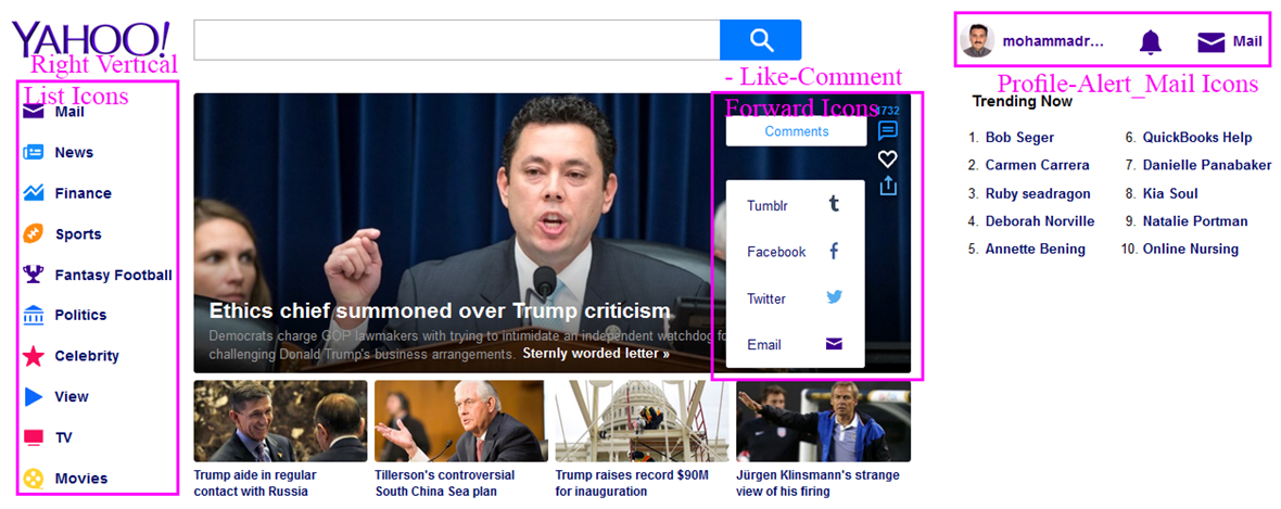 | Figure 1. Home page of Yahoo.com web site |
3. Sign Simplification and Its Usage for Websites
- Signs are all about simple communication. A good sign will capture a person’s attention and communicate an idea in the simplest way possible [2]. To better understand this concept, let’s take a look at one of the masters of simplification: Apple co. Part of Apple’s massive success is its ability to create products that are simple & intuitive to use. At the heart of it all is the drive to remove any unnecessary components: The iPhone is a giant screen with a few buttons; the magic mouse is one giant button with no right click button or scroll wheel; the magic track pad is one giant button and relies on hand gestures. In its Apple University internal training program, Apple teaches employees about Picasso’s “The Bull” drawings. Picasso was trying to draw a bull in the simplest way possible. In doing so, he went through much iteration (shown in fig.2) to go from a highly detailed illustration to one that had the fewest elements as possible.
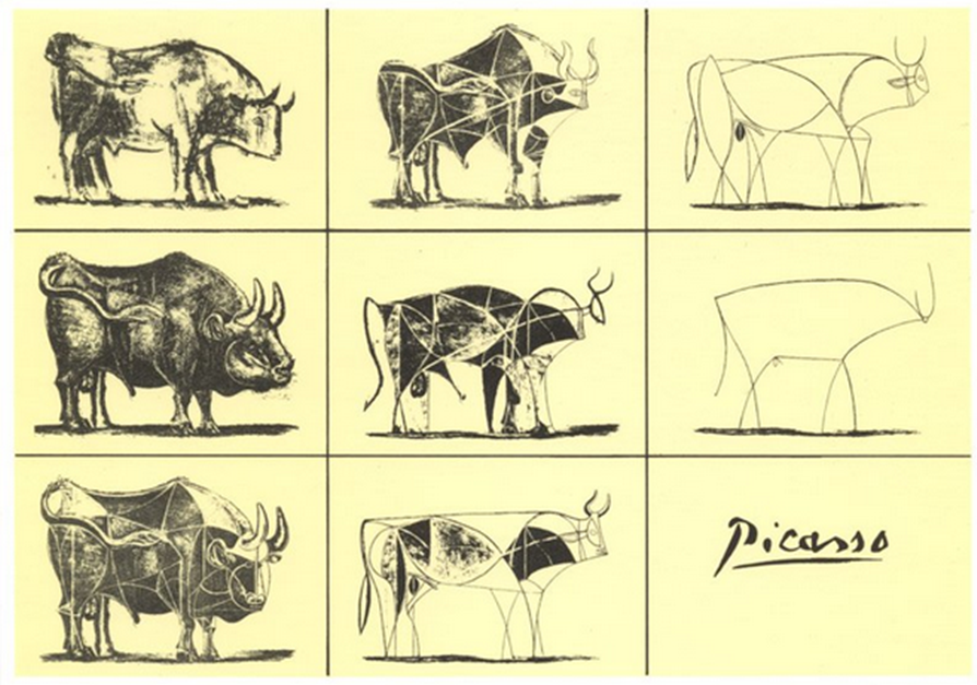 | Figure 2. Picasso simplification iteration of Bull drawing |
|
4. Semiotics and the Web
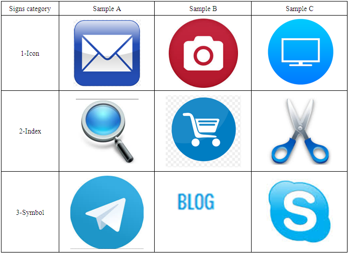
- Charles Sanders Peirce is an American philosopher recognized as the founder of modern semiotics [3]. Peirce was interested in how we make sense of the world around us and in this sense was less concerned with the linguistic aspect of semiotics pioneered in the early 1900’s by the Swiss professor of linguistics, Ferdinand de Saussure.Peirce proposed that signs could be defined as three categories; Icon, Index and Symbol.1.
 Icon - An Icon sign is a sign that resembles something, such as photographs of people. An icon can also be illustrative or diagrammatic, for example a ‘no-smoking’ sign. In our everyday life there are icons everywhere. You can find them on any interface, road sign, keyboard, you name it. Icons help us to better understand and interpret information. Not only offline, but also online can icons help us to support content. Therefore it is important to understand how and why to use them.2.
 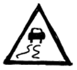 Index - An Index signs is a sign where there is a direct link between the sign and the object. The majority of traffic signs are Index signs as they represent information which relates to a location (e.g., a ‘slippery road surface’ sign placed on a road which is prone to flooding).3.
  Symbols - A symbol has no logical meaning between it and the object. Unfortunately the web is littered with bad examples of this type of sign, but there are good ones - a homepage icon which is a house for example. The text menu on the main bar of homepage is symbols convey the specific meaning for their audiences. Today many sites are multilingual in which these texts changes based on selected language.Table 2 Represents these different category of signs in the websites from semiotics point of view.
|
5. Icon and Information Architecture of Website
- The web is full of signs. Most users want to accomplish a task on a website, in order to do that they have to navigate to the right place. In order to do that, they have to follow signs. See?Not only visual signs either. Let’s consider Information Architecture for a moment.Information Architecture is the way information is distributed in the web site and we have to use the Word and directive to access this information.Words matter is probably more than anything. You can have a bad Information Architecture design in the web sites, but if the words are right and in the right place, the user will generally find what they need.The conclusion from this conversation was that Words are also signs on the web. The right word in the right place. Context is that what navigation is all about. Let’s move now into something a little more visual.Let’s take the example of designing an icon system for an online application. The parallels to software design are obvious - well designed GUI’s have pretty good icons, or in other word pictorial symbol. So what should you do to make these icons understood by the users? Three top roles for designing directive signs are: • In designing these signs you should be conspicuous and bold.• Leave ‘creativity’ to the bad designers - This is not the place to do something different. If a convention exists, use it.• Take care of location use the signs in the right place.Signage systems are as important as the individual signs. Collective meaning and overall association are the elements that make signage systems work.Here we consider the sign design in another perspective. This perspective is about the affordance of sign which can direct us through the websites.
6. Affordance of Icon in Websites
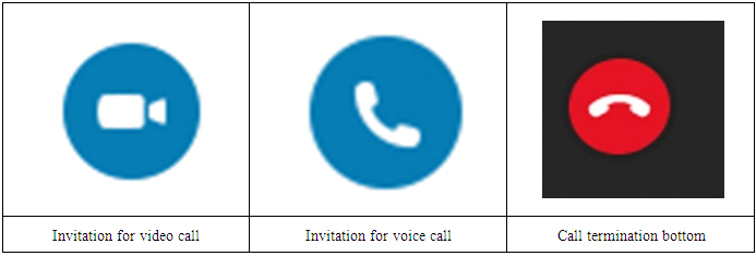
- Affordance is a term originally coined by a psychologist, J.J. Gibson, in the 1970s. He defined it as the relationship between an environment and an actor. In other term a situation where an object’s sensory characteristics intuitively imply its functionality and use [4]. In web interface this sensory characteristic is limited to two dimensional image of objects of computer display or mobile screen. The affordance of pictorial symbol direct the user as a cue to the usage of this icon in the interface. For example in skype application the Icon for call activation and call termination is shown in Table 3. As you see the color of call activation is blue but the color of call termination is red. For video call a camera is drawn inside a blue circle. Camera is a metaphor to be used by two side of connection to capture and transfer video images through the skype. On the other hand for voice call activation a telephone handset.
|
7. Cognition Issues of Icons
- Identifying the purpose being served by an Icon or pictorial symbol is useful for analyzing the role it plays in perception and cognition [5]. Icons and pictorial symbol s in web design are often a clear example of delineation of verbal and visual process. The well-known convention for hyperlinked text to be underlined is an example. If the hyperlink is not symbolized visually there would presumably need to be a text instruction for how to find more information on topic.Icons and pictorial symbols play an important role in wed navigation .Visual symbols can also be used to provide an egocentric marker which aid navigation .web sites often use progress bar to indicate a users’ progress through a sequence of web pages. These elements are simple and intuitive representation of common functions and navigation in websites, whether the Icons and pictorial symbols are learned and remembered or whether they visually indicate a process, they are able to aid working memory by balancing the cognitive work in comprehension between text (phonological processing) and graphics (visuo-spatial processing).Many pictorial symbols would constitute passive processing in cornoldi & vecchi [6] continuum mode of working memory. The symbols don’t need to be actively attended to in order to comprehend their meaning in the context of website. However in this passive processing Icon and pictorial symbols are able to communicate goals for functions of a web site, structure of web site and feedback on user progress through the site. Another interesting issue for analysis of icon and symbol in website is how they are learned and transferred to long term memory. Visual metaphor can communicate the meaning of Icon and pictorial symbol but it is only by using Facebook that an individual understand what is means for ‘like’ online content. This can be a challenge for web designers trying to minimize the need for text explanations and simplify visual representation while ensuring content is comprehensible for new users.On the other hand Iconic interfaces are one of the popular methods that are used for communication by the cognitively challenged population. These interfaces have many advantages, vis-à-vis traditional text-based messaging systems. By being visual rather than textual, they are more intuitive and overcome the need to be literate in order to carry forward the communication [7]. At the next section we talk about standardization activity for standardization of Information technology Icon and pictorial symbol s.
8. Standardization of Icons
- Designing the web icon and pictorial symbol is a part of human computer interface because when surfing through internet you are interacting with a remote computer in the web. There are many standardization which cover different aspect of this interaction. One of this standard define the standard Icon in the websites. ISO/IEC 11581 [8] defines pictorial symbol s for use on a screen, which users can manipulate and interact with. They are part of a graphical interface that can facilitate the user's ability to learn, understand and remember functional elements of the system, and aid in the manipulation of these elements. Their purpose is to facilitate interaction between computer-based applications (software products) and users.ISO/IEC 11581-5:2004 describes user interaction with and appearance of tool icons on the screen. These tool icons are a subset of the interactive icons that modify graphical or text elements of an application by association with real-life tool objects. These icons represent tool functions such as drawing, painting or modifying graphical elements. ISO/IEC 11581-5:2004 contains requirements and recommendations for 21 commonly used tool icons. It also specifies the relationship between tool and pointer icons.
9. Conclusions
- Here we surveyed the importance of pictorial symbol in directing user to surf through the web sites .we show how much Icons support your content of websites. It can be a complementary part of site backend information architecture which is a guide line in frontend interface of websites. We talked about semiotics theory and applied its calories in to different signs of websites. Then we considered the Affordance theory and its effect on websites Icons. In the end we introduced the cognitive aspect and standardization activity on designing Icons.